

American Flag Stroke Style

It’s easy to overlook InDesign stroke styles because, on the surface, the are seemingly so simple. Often, strokes are regulated to graphic frames and unobscure design elements. However, by making really thick strokes, we can display the beauty of complex stripe patterns created by a single stroke style.
There are about seven different types of stroke styles: Solid, Striped, Dashed, Hash, Dots, Wavy, and White Diamonds. This article will teach you how to recreate the stripes of the American flag using a striped stroke style. The American flag has thirteen stripes, representing the original thirteen colonies. The outermost stripes (odd stripes) are red, and the remaining stripes (even stripes) are white. Interestingly, this stripe design has also served as a standalone flag for American mariners around the time of our country’s founding. We’ll be creating the stripes using a single red stroke, with a custom striped stroke style and a gap color set to white.
When creating a striped stroke style in InDesign, you’re actually specifying the proportions of the stripes within the stroke. Once we’re done, you’ll be able to draw a stroke of any weight, apply the stroke style, and the proportions of the stripes will mimic the thirteen stripes of the American flag. Let’s get started!
Understanding Stripes
Striped stroke styles are based on the concept of each stripe occupying a certain percentage of the width the stroke. So for each stripe, you need to keep two percentages in mind: Start and Width.
I’ve taken screenshots of a few of InDesign’s default stroke styles and typed out the percentages of each stripe. You’ll notice that the total is always 100%, and within that 100%, you can specify as many stripes as you want. The black areas represent the stripes of the stroke. The white areas represent the gap of the stroke. I’ve included the percentage of the gap area merely for reference. You can’t set gap width in strokes styles. You can only set stripe width (as indicated by the yellow arrows and yellow text).
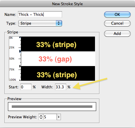
Thick - Thick

Thin - Thin

Thick - Thin - Thick
Thin-Thin
Creating Stripes
The Stroke Styles Dialog Box is fairly well hidden. It is found in the flyout menu of the Strokes Panel. You can also access it through the flyout menu in the Control Panel.
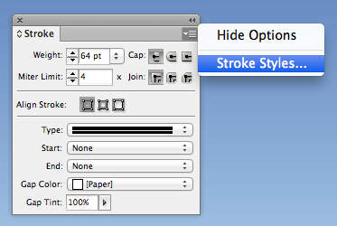
Accessing Stroke Styles through the Strokes Panel
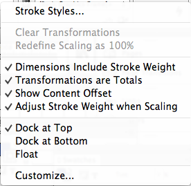
Accessing Stroke Styles through the Control Bar
Notice how all the default stroke styles are Stripes…and can’t be edited. You’ll need to click “New…” to create a new stroke style.

Default Stroke Styles
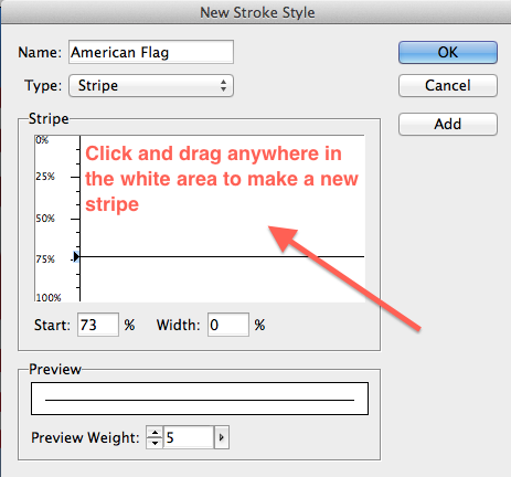
In the New Stroke Style dialog box, change the stroke “Type” to Stripe.

Make a new stripe by clicking anywhere in the white gap area and dragging either upward or downward. As you drag, InDesign will automatically fill in the text fields for the starting point and width of the stripe. If you drag too far and end up touching another stripe, the stripes simply merge together.
You can change the stripe starting point by dragging the top triangle. This will keep the bottom of the stripe in a fixed location, and will move the stroke starting point. The result is that the starting point and the width will both change.
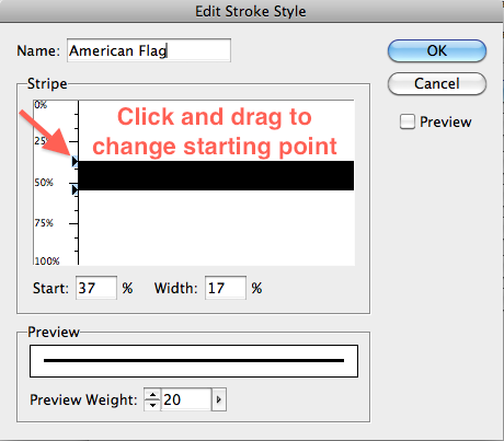
If you simply want to change the width, simply drag on the lower triangle to make the stroke thicker.

Once the stripe is made, you can move its location by clicking and dragging on the stripe itself.

Using Gaps
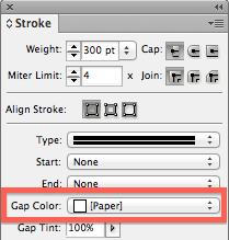
Gaps aren’t created. Basically, the gaps fill whatever space isn’t filled by the stripes. In the terms of traditional design training, gaps are the”negative space.” For the gap, you can choose to either fill it with a gap color, or leave the gap color set to None, in which case, the background will show through. For our striped stroke, we’ll be using a gap color.
Creating our Custom American Flag Stroke Style
Now that we have a basis for understanding how gaps works in relation to striped strokes, let’s create the custom striped stroke for our American flag. Since our stroke style has got such precise measurements, we’ll be using the keyboard to input the exact numbers that we need (rather than clicking and dragging).
To determine the width of each stripe, divide 100% by 13. Each stripe will be 7.69%. The white areas will be created by the gap, so we’ll just be creating the seven red stripes. Next we need to determine the starting point for each of the seven stripes.
- Stripe 1: 0%
- Stripe 2: 15.38%
- Stripe 3: 30.76%
- Stripe 4: 46.14%
- Stripe 5: 61.52%
- Stripe 6: 76.9%
- Stripe 7: 92.28%
Since all the red stripes will have the same width percentage, now we just need to go in and make seven stripes at 7.69%, placed at the starting points listed above. Once we’re done, the stroke style will look like this.

Apply the Stroke Style to a Stroke
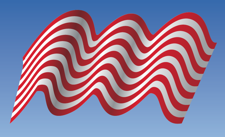
To get the visual effect of a flag, I made my stroke really big. I also placed the stroke on a sky blue background so you can see the visual effect of the gap color.

Extra Credit: Make it Wave
What’s really neat about using stroke styles is that you can apply effects to them and create the illusion of movement. To create the wavy flag shown at the beginning of the article, there were a few more steps. First I skewed and rotated the flag a bit.

Then I added some anchor points along the line to make it wavy.

Finally, I changed the stroke and gap colors to gradients to mimc the light and shadows that would appear on a real flag.


Be sure to check out Fritz’s great article on another interesting way to create flags within InDesign.
That …. is … amazing. I’ve never taken a custom stroke style “out that far”. Too bad you can’t Option-drag an existing stroke (or step and repeat!) Or turn a selection into a stroke, like how can turn a selection into a pattern in Illustrator and Photoshop.
One thing I want to throw in there is that if you want to share your custom stroke style (with a co-worker, or use it on a second computer), you’ll need to select it in the Stroke Styles dialog box and choose Save. That saves it as a standalone .LNST file (line stroke?) on your hard drive. Send it to the recipient to Load into their own copy of InDesign via the same dialog box.
It’s also a good idea to Save them out to make backups of them, since I believe custom stroke styles are deleted if you rebuild your Prefs.
Glad you liked the article! From my experience, the stroke styles are saved within each document, just like object, paragraph, and character styles. I didn’t know about saving them as out as standalone .LNST files. Thanks for sharing that.
One of the ways that I share stroke styles between computers is just by exporting the stroke as a snippet. It carries with it all the attributes: stroke style, stroke color, gap color, size… everything. Plus, you can place a snippet into an earlier version of InDesign.
I think stroke styles aren’t exploited to their full potential because the preview pane in the strokes styles dialog box is so small. You’re limited to previewing the stroke at 20 pts. And with the other types of styles (object, character, paragraph), there is an “Apply to Selection” checkbox, but that checkbox is missing for stroke styles. So there’s not much room for creative experimentation.
I put together some different ideas for using this custom stroke style. You can find them here.