

Applying Transparency to Text

Here’s a great question about transparency that arrived in my inbox.
In Quark you can make type different colors and different transparency values in the same text box. In InDesign I have not found a way to do this. I’ve tried everything I know how to do and just can’t seem to get it to work. Because transparency is applied using the content tool and not the type tool I cannot find a way to change the value on different words in the same text box. HELP!
It’s true. This is something that Quark XPress can do that InDesign cannot. In XPress opacity can be controlled at the color level (i.e. wherever you can specify a color, you can also specify an opacity level). But in InDesign, transparency effects are object-level attributes. You simply cannot apply changes to blending modes or opacity directly to individual characters or words, you can only apply them to all the text in a frame. That’s also why the Effects panel controls get grayed out if you have your cursor in a text frame, or if you have Formatting Affects Text selected in the Swatches panel.
But there’s always a workaround. In this case I can think of three, though none of them are perfect.
1. Use an anchored frame. Put each character or group of characters into an anchored text frame. Then select that frame, target the text in the Effects panel, and apply any desired effects.

The downside here is that you’re chopping up your text into separate stories and you might run into trouble later on if you need to export that text.
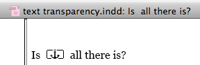
It’ll go MIA in RTF.

If you export to EPUB, you’ll have some clean-up work to do to reunite all the text into one paragraph.
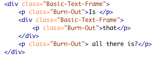
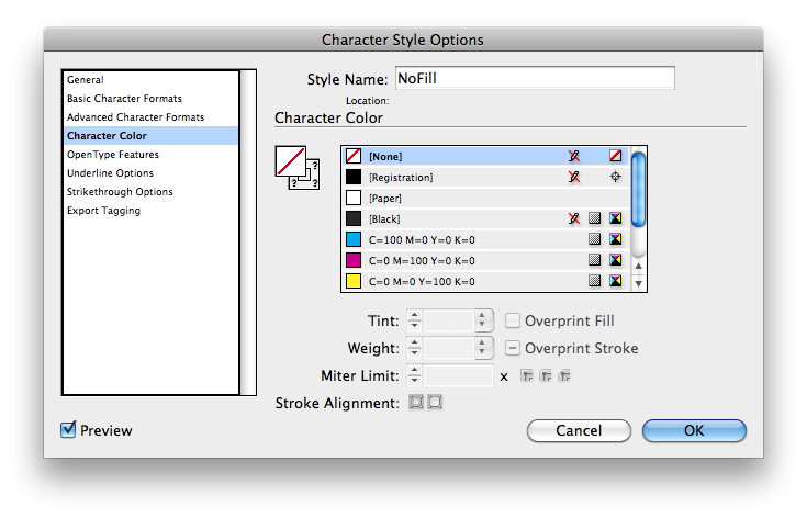
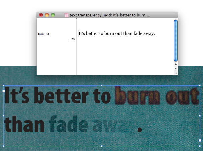
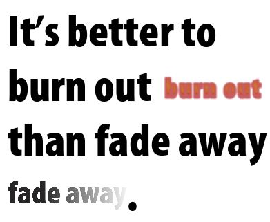
2. Convert the text to outlines. You’ll need to do this separately for each character or group of characters that you want to apply individual effects to. The coolest thing about this option is if you use the keyboard shortcut command+shift+option+o/ctrl+shift+alt+o (or hold option/alt while you choose Type > Create Outlines), you get not only the text converted to outlines, but the original text stays in place directly under the outlines. Then you can hide the original text by applying a character style that removes the fill (and/or stroke if necessary).
So you get to have your cake (transparency effects at the character level):

and eat it too (the original live, uninterrupted text flow).
There are a few potential problems here. One is that the outlined text is not anchored. So if your text reflows or the frame moves, you’ve got an alignment problem. So you might want to combine methods 1 and 2, and anchor the outlined text. Even so, you may run into trouble if the text reflows because your anchored frames aren’t going to wrap like live text. The other problem is that if you do anchor the frames, then you’ll have to rasterize the whole shebang in order to avoid getting both the live text and the rasterized effect text in an EPUB export.
And be aware that the No Fill character style will spawn spans.

3. Use a Gradient Feather. This one is probably the most “hacky” but I’m sure someone, somewhere will find it useful. Or maybe you can just use it to win a bet some day. It only works with a single line of text, and you can’t control anything other than opacity. But it works quite nicely in that situation.
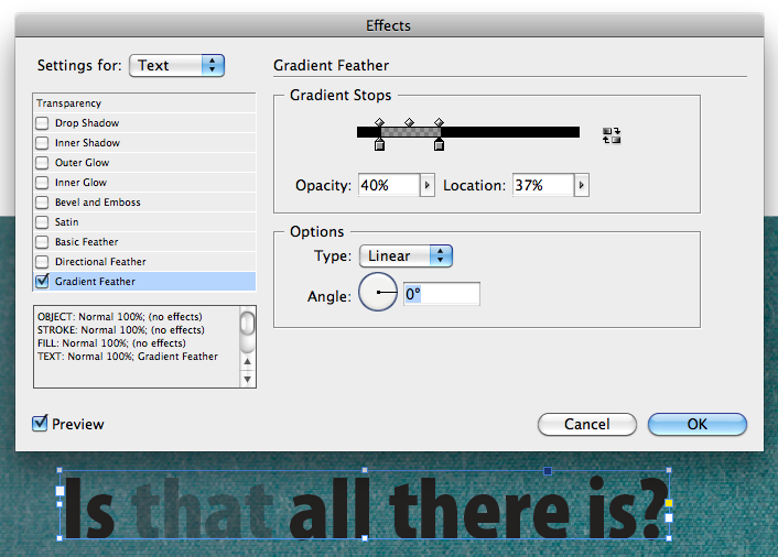
The key is have overlapping gradient stops (two gradient stops at the exact same location) with different opacity values. That way there is no feathering. It’s a sharp transition from one level of opacity to another. You’ll probably go insane if you try to drag the stops on top of each other. So instead, select the stops and enter specific values in the Opacity and Location fields, either by typing numbers or use your keyboard arrow keys.
The nice thing about the Gradient Feather method is that is has none of the liabilities of methods 1 and 2. No anchored frames, no duplicated text, no span-ifying character styles.
Fritz also wrote a post on this topic a while back, where he showed yet another option: using conditional text to hide an extra copy of the live text.
So try these methods if you need character-level control over opacity and other transparency effects. See which one best fits your situation. And maybe you can limit your use of Quark to the kitchen.
Wow, talk about synchronicity; I literally had just asked someone if it was possible to apply varying transparency on text in ID. And by ‘just’ I mean five minutes ago. Was checking IDSecrets for news while we thought about that, and BANG!
Perry-
Excellent! We aim to please ;)
I’m attempting to create a flyer and I would like the text to be completely transparent. I would like the text box to white and for the text to be transparent so that the background image becomes the color of the text. Is there a way to do this in indesign?
Thanks for your help!
Ana
Hi Ana-
Sure, just select the text frame, go to the Effects panel, and click on the Text level, then reduce the opacity to zero. That way the stroke and fill of the frame will remain opaque and the text will be transparent and show what’s underneath.