

Automatic Drop Cap Backgrounds


David’s tip about using custom underlined spaces instead of bullets (in his post, Repeating Nested Styles in a Loop) reminded me of a similar “twisted workaround” I came up with recently. This time, we’ll be bending InDesign’s Rule Above (Paragraph) feature to our will so it automatically adds a bit of graphic interest to the first character(s) of a paragraph as we apply a style. (Though an underline/nested style combo would work just as well, they’re not necessary.) It works the same in both CS2 and CS3.
What Doesn’t Quite Work: Anchored Objects
The idea started like this: A client had asked if there was a way to automatically insert an inline graphic behind a drop cap.
Hmmm. That’s actually two different issues: First, can you make a style automatically add a graphic? (Answer: no.) Second, can you insert an anchored object (inline or custom) so that it appears behind text, instead of in front of it or beside it?
The answer to the second question is “only if it’s an inline anchored object.” Custom anchored objects — the kind you can drag all over the place, even outside of a text frame — always appear in front of text. Inline anchored objects, the “normal” kind, can appear behind text but only if you apply severe kerning between the object and the adjacent text.
An example appears below. The starting graphic and paragraph (with a drop cap) is shown at the top. Down on the left, I’ve pasted the graphic into the previous paragraph, turned it into a custom anchored graphic (Object > Anchored Object > Options > Custom) and dragged it into position in front of the first word of the target paragraph. There’s no way to get the graphic behind the text — I could apply a text wrap to it so the text is forced to its right, but that doesn’t put the text in front of the graphic. On the right, I’ve pasted the graphic before the first character of the target paragraph (so it’s a regular inline anchored object), which automatically pushes the text to its right, then clicked between the object and the “D” and kerned it in mightily:
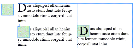
So, while there’s a way to get a graphic behind a drop cap as an anchored object (so it sticks with the character as the text is edited), it’s a fair amount of manual labor.
What Does Work: Rule Above, Twisted
InDesign’s paragraph formatting option, Rule Above or Rule Below (accessed from the Control panel menu when it’s in paragraph formatting mode in CS2, or any text formatting mode in CS3, or from the Paragraph panel menu itself) is normally used to create just that, a horizontal rule appearing above or below a paragraph. These are “inline objects” of a sort because they stick with the paragraph even as the paragraph’s position on the page moves as text is edited. You can choose any of your default or custom Stroke styles for the rule.
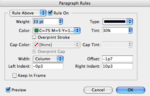
What a lot of users overlook in the Rule Above/Below dialog box are the controls for indenting the rule. Whether you set the width of the rule to match the text (as for short subheads) or the column, you can still apply left and right indents to it. You can even apply negative indents — add a minus sign or hyphen in front of the measure — to create an “outdent,” extending the rule instead of contracting it.
“Trippy,” as David would say.
Combine that with the more well-known trick of adjusting the rule’s offset so it appears behind the text (like underlines, rules appear behind text when they’re overlapping), and you now have the recipe for creating automatic backgrounds behind text. And, since a Rule Above/Below can be included in a paragraph style, it can be automatically applied whenever you apply a style.
Here’s some text to which I’ve applied a severely indented Rule Above so it only appears behind the drop caps:
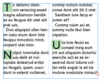
And here’s the Rule Above dialog box showing the settings for those squares behind the drop caps. I added a left outdent to extend the square slightly outside of the left edge of the frame, so the drop caps have some “air”:
Another example … below, I’ve created and applied a paragraph style to a numbered list that 1) Does the numbering automatically, using InDesign’s Numbered List feature; and 2) Applies the blue circle behind the numbers automatically, using a twisted Rule Above — the “Dotted” stroke style, with a heavy right indent so only the first dot appears.

Limitations
One problem with using Rules Above/Below to create these “automatic inline anchored objects” is that you can’t set an absolute length measure for the rule, you can only set indents. Since the indents are always relative to the width of the column (or the text, but I wouldn’t use that setting for this technique), the length of the rule will change as you modify the column width. If I increased the width of the text frame containing the numbered list, I might see two or three dots appear instead of just one.
That means you shouldn’t use this technique until/unless your column widths are set in stone. It also means that if you’re including the Rule Above/Below setting in paragraph style, and you apply that style to text in various places with different column widths, you’ll have to create multiple styles — one for each column width — just to keep the length of the rule the same wherever you use it.
While many publications are fairly static, if yours isn’t, you might consider using a twisted Underline style for the first drop cap or number instead. Remember, underlines appear behind text too. After you increase the underline’s weight and change its offset so it looks like a square or circle behind the character, save that as a Character Style, then have the Paragraph Style automatically apply it via a Nested Style.
The disadvantage with using Underlines, though, is that you can’t increase its width; there’s no “indent” field in Underline Options into which you can add a negative measure for an outdent.
The final limitation of this technique, whether you’re using rules or underlines, is that you can only work with InDesign’s limited selection of Stroke Styles. If you have a fancy piece of artwork you’d like to add behind your drop caps, there’s no way to turn it into a custom stroke style. (I wish you could do something similar to making a pattern in Illustrator.) Where’s that feature request form…
re: Inline anchored objects, the ?normal? kind, can appear behind text but only if you apply severe kerning between the object and the adjacent text.
Or, you can do it by putting the inline in a paragraph of its own with zero-leading and then dragging it down with the selection pointer as far as it will go. I find this easier than kerning, although you might have to mess around with the space before settings of your paragraphs, transferring any space before from the paragraph holding the text to the paragraph holding the inline.
Dave
Great post, AM.
For a few variations you can create subtle gradients and fill the rule with them instead of just a plain color and/or create a new stroke style and use rounded caps.
Just another example of only being limited by your own imagination.
You can also use both rule above and below in combination to create a shadow effect by making the rule below solid black and using settings that will slightly offset the rule below.
I guess it’s worth noting that this can be as good or bad as you make it. Given the tools the we now have, the ability to create beautiful or hideous artwork is right at your fingertips. :)
Dave: Thanks, that’s another way.
Bob: Re the shadow effect, cool idea, but impractical for anything other than one-line paragraphs. For a normal text paragraph (the kind in the examples above) Rule Below would have to have a huge offset measure to shove it to the first line of the paragraph instead of sitting after the last line; also, since paragraphs have different numbers of lines, you’d have to have different offsets for each paragraph (and of course, manually adjust them as your text edits changed the line count).
But for some sort of automatic artwork behind one-line subheads or something, it should work.
In the second image, what would happen if the drop cap was “I”? Would the rest of the text “invade” the square?
Alexandre, yes, some of the text would end up on the square. I had to kern out the text following the capital T above for the same reason. Luckily you just need to kern the first line, with automatic drop caps, the other lines next to the capital adjust in concert.
The “rule above” is just sitting there, behind the text … it’s not text wrapping or anything, that would be impossible to do.
This seems to work easily. Make your box graphic, insert it as a custom anchored object, and as mentioned, it will appear in front of the drop cap. Select the box graphic, go to the effects menu, and choose “multiply” from the drop down. You can save the box object style and simply adjust the width based on the width of the dropped character.
This is all very interesting and illuminating, so thanks, Anne-Marie!
I’d like to suggest a very useful addition to the content of you articles: that you give your readers downloadable source files containing the exact recipes you discuss. That would save us some boring typing and fumbling on our pathetic own. INDD files are of course a bit bloated, alas, and might impact your bandwidth severally, but if you made INX files for download then all the megas would shrink to puny kilos. How about it, Anne-Marie and David?
I tried the underline-technique now with a gradient color, and it works fine — except it seems all gradients get a “horizontal” default, with no way to change the angle into a vertical one? Does anyone have a solution to this? To practice what I preached above, I’m placing an INX of my tiny test project here:
http://www.klausnordby.com/files/firstcap_gradient_test.zip
ZIP’ing further crunches down the INX file to about a quarter (all XML is damnably verbose), so adding INX files to your articles has almost no bandwidth cost. So there — no excuses left now. :-)
Hi Anne-Marie,
This very subject was just discussed over in the InDesign forum and in trying to answer the poster’s question, I believe I may have tripped over an interesting technique.
In a nutshell, what I did was created a custom-anchored-object and nested it inside an inline-graphic. Here?s what I did.
I pasted a graphic element (a little shape or logo etc) into a small text frame (I call this my ?carrier? frame), and set the pasted graphic to be a CUSTOM object, with ?keep within column boundaries? unchecked. I then copied and pasted this “carrier” text frame into the main text frame on the page. This I left as an “inline” graphic and so, it was behind the body text.
The graphic itself, now a custom object nested inside an inline graphic, could be moved around to sit nicely behind the first character, and it remains BEHIND.
Once I got the position where I liked it, I could copy/paste the carrier frame, along with it?s graphic content, into new paragraphs and the graphic fell right into place. It was helpful to make the carrier frame as small as possible so that it caused less inset of the first line of the paragraph. I also experimented with putting the frame in it?s own paragraph, set to zero leading. In some circumstances, I think that would be a simpler approach, but in others, this nested idea might be helpful.
Here’s a link to the forum discussion.
https://www.adobeforums.com/cgi-bin/webx/.3bc4574b/14
Or search the forum for the title:
CS3-custom bullets or, how to place anchored graphics in text?
Here?s a link to my test/demo file:
https://tinyurl.com/22bomd
Lance
Hi Lance…
I’ve been looking for this: how to put anchored graphics behind the text. Your solution seems to bee exact what I was looking for…
But for my case I solved it this other way: because the text on top of the graphic (essentially subtitles in the text on top of colored “boxes”) fit inside the graphic, then I did just that:
I put the inside the boxes, and then put the boxes as anchored text… Not a nice soluton, but worked this case.
Your solution seems the way to go.
thanks a lot
/javier
javier & lance.
But! But! if you have paragraph rules on… then the rules does not show on top of the anchored object, it goes beneath the graphic/onchered object!
is there a solution for that one?
interesting :)