

Character Underlines, Paragraph Rules… and the State Flag of Texas

In honor of next year’s PEPCON being held in Texas, I am going to use the Texas state flag as a lesson in understanding how to use paragraph rules and underlines in our InDesign layouts. Many state flags are comprised of simple shapes and stripes, and can be easily recreated using paragraph rules.
First, let’s take a look at what we’ll be creating:

The different components of the Texas state flag consist of:
- a white star,
- a blue field,
- a white field, and
- a red field.
To create the flag, we’ll start with a text frame and a single wingding, and then use a character underline and two paragraph rules to create the colored fields. Because parts of the flag design are white, we’ll be creating the flag on a sky blue background in order to more easily see the work as it progresses.
1. First, create a new text frame 365 pt wide by 240 points high. Give it a 1 point stroke.
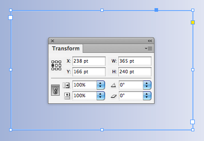
Set the vertical justification to Center.

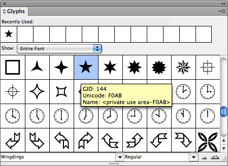
2. Next, we’ll add the star. Open the Glyphs panel by going to Window > Type & Tables > Glyphs. I used “Wingdings” for my star, and made it 108 pt.

3. Next let’s make the blue field. Select the star character and underline it using the Underline button in the Control Panel.


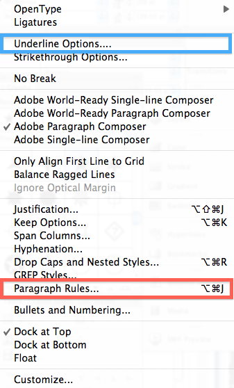
Since we’ll be using the underline to create the blue field, we need to edit the settings in the Underline Options dialog box. Go to Control Panel Flyout Menu > Underline Options? (Notice that both Underline Options and Paragraph Rules are available in the Control Panel flyout menu.)
The default underline settings will look like this:

Since our flag is 240 points high, that’s the size we’ll use for the stroke weight in the Underline Options dialog box. Also change the underline offset to -42 pt, and the color to blue.

4. Now let’s add the red field. Go to the Control Panel flyout menu > Paragraph Rules?
If you haven’t used this dialog box before, there are a couple of things you should know in advance:
- BOTH Rule Above and Rule Below are handled in the same dialog box.
- A drop down at the top of the dialog box let’s you choose which rule you are editing. (It seems like an odd UI, since usually a drop down menu would indicate an either/or choice, but not so in this instance. A better layout of this dialog box would be like the Table and Cell Options dialog box, with a tabbed interface. But I digress.)
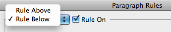
So to edit the rule below, first choose “Rule Below” in the dropdown menu and then check “Rule On.” Also, be sure to check “Preview” in the lower left hand corner of the dialog box.
Since the red field is one half the height of the flag (which is 240 pt), we’ll need to make the height of the red field 120 pt. We’ll do this by adding a paragraph Rule Below. We’ll use the same offset as we used for the blue field, which was -42 pt. Next, in order to make the red field span the entire width of the text frame, choose “Column” from the width field. (If you leave it at “Text,” the red field will be completely hidden by the Blue field.)

Red Rule Below settings

5. Add the white field. Because our text frame is 240 points high, make the white paragraph rule 240 points high as well.
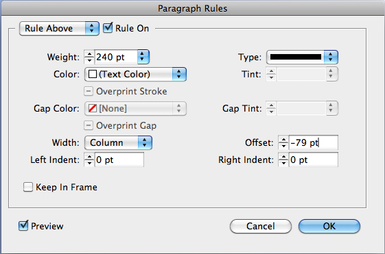
White Rule Above Settings
Considerations
So, the white field doesn’t look that impressive on it’s own, but something interesting to note about paragraph rules is the stacking order.
- The character underline (blue field) site above both paragraph rules.
- And contrary to what you might think, Rule Below (red field) sits next in the stacking order,
- Rule Above (white field) sits at the bottom of the stacking order. (By expanding the white Rule Above, you can see that it actually sits behind the red Rule Below.)

What you need to keep in mind about the terms “Rule Above” and “Rule Below” is that they refer to the location of the rule in relation to a paragraph. Like so:

So paragraph rules can be used not just for simple lines above and below text, but also to create striped designs. If you were so inclined, you could embed the entire design for Texas state flag into a paragraph style! By understanding all the different options available with paragraph rules and underlines, it would be very easy to apply these concepts to create a variety of other state flags.
Right… I see a simple table, two columns, two rows, left column merged cells.
But if you want to go complicated, here is your change ;-)
That’s a pretty wild use of rules! Wow…
It’s a good academic use of the Paragraph Rules and Underline Options, another option wold be the Strikethrough, for a 4 stripe flag :D Or you could use custom strokes to add a myriad of stripes.
Then start adding in Overprint Stroke, to combine colours, and you could get lots of stripes!
The only thing that bugs me about the Paragraph Rules is that the Above and Below panels are in separate panes. They could easily combine these panels into one, so you don’t have to switch between both to make adjustments. Another thing would be a nice little switch to swap the values between Above and Below.
I’d definitely use Paragraph Rules a lot more if the panels were more functional.
Good job, Kelly! This is a good exercise for people to learn the ins and outs of using paragraph rules.
Eugene, you are so right about the paragraph rules panel. Why aren’t rule above and rule below displayed simultaneously so we can make adjustments to both without switching.
Kelly, I love the way your brain works! This is another awesome example of how the titles of features in InDesign are just suggestions for what to do with them. :)
great demo! :-)
This is why I prefer low level and flexible design building blocks instead of gimmicky one trick ponies.
Then again paragraph rules (and, remotely related, character over, under, whateverstrike) are not very flexible and one will hit the ceiling fairly quickly.
Missig (and kind of expected) features:
? rule per paragraph / rule per line
? vertical rules
? end caps (well, there’s workaround with stroke styles)
? left/right offset for character equivalents
? absolute/relative sizes for character equivalents (points / multiple of typesize)
I don’t mind “ergonomic” issues with the rules dialog very much, after all, they’re meant to be used predominantly in styles definitions, which is one-off task
20??,??????????? ???????????????,?????????????????,????????????????????”?????????????,??????????”?????????????? ??????????????????,???????????????,???????????????????,???????40%???????,??????,?????????????????????????,????????????,?????????????????????,?????????????????????????????????,?????????????,?,???????????,???????????????????,???????????????,???????,?????????????????