

Chartwell Typeface: Update

In 2011, Mike Rankin featured the story of the Chartwell typeface. It is a collection of fonts that can display various graphs in one of seven ways thanks to clever use of ligatures:
- Pie charts
- Line graphs (with fills)
- Vertical bars
- Horizontal bars
- Rose charts
- Ring charts
- Radar charts
Since then, the Chartwell typeface has been updated and features new ways to display charts:
Bubbles

This turns the numbers between 1-100 into circles that have a size that reflects their value. Just like regular type, the circles can be given fills, strokes or gradients.
Scatter
 Scatter is similar to bubbles, but it allows the bubble to be positioned on X-Y coordinates of 0-100. More importantly, it doesn’t matter what order the statistics are entered, so long as the coordinates are entered as X coordinate, Y coordinate, value. If a value isn’t given, a default size is given instead. The stacking order of the figures is based on where they are entered in the text. One of five grids can be added as part of the font by adding a letter a-e to the start of the sequence. If a grid from the font isn’t sufficient, one can be drawn using the usual tools in InDesign.
One constraint is that the grid being referenced is always square in shape. It can be scaled using the horizontal and vertical scales of the character tools, but the results look unusual.
Line graphs
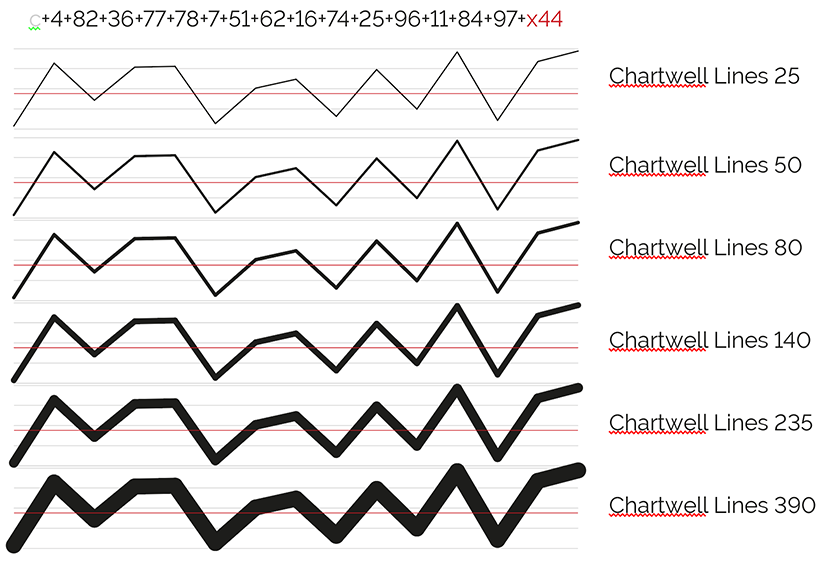
This replaces the previously named Chartwell lines that has now become Chartwell areas. The line graph can also be given one of six thicknesses. Just like scatter, the letters a-e at the start of the figures can add a grid, but unlike scatter, adding the letter x followed by a value 0-100 will add a specific gridline through the chart.
Floating bars, areas, and rings
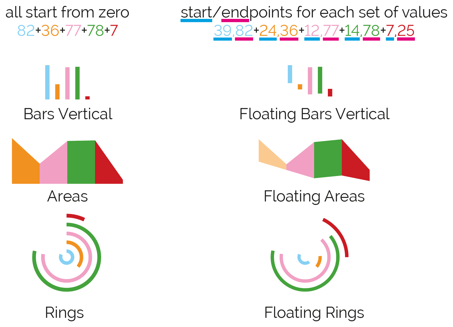 These behave similar to the regular bars, areas or rings with the exception that they no longer start from 0, but instead start from a given value. To work properly, the end value of each record must be greater than the start value.
More information
For full instructions and further details about the Chartwell typeface, visit the Vectro Font websiteFontfont website.
Other Chartwell tricks
One consideration with the fonts is that the majority of them will only work with whole numbers between 0-100. Chartwell bars is slightly different in that it will work with whole numbers between 0-1000. The idea of only working with whole numbers between 0-100 may make some users consider other options instead of using the Chartwell typeface as a solution. However, there’s a potentially viable fix: In Excel, convert the values to percentages and round them, then import them into InDesign. It’s true that some precision is lost by doing this, but if the purpose is for an infographic or a chart that is tiny in size, the differences will usually be imperceptible.
The new inclusions to the typeface certainly expand the use of Chartwell. Chartwell bars is still my favorite as it has other uses:
- It can represent more values than the vertical bars (900 more values);
- Its appearance can be changed by giving it a fill/stroke of none and using the underline feature to control its appearance; and

- When combined with anchored objects, it can move an object to a desired location; or hide an item that is underneath the text frame by a clever use of a multiply trick and the Knockout Group feature.
That last bullet point is a very valuable tip to transform Chartwell bars into a powerful tool for Data Merge. I’ve prepared videos elsewhere where I use these techniques to either move a graphic on X-Y coordinates; or use it to show/hide an image to represent it as an infographic. Check out this video to see Chartwell move a graphic on X-Y coordinates, and this video to see Chartwell make friendlier infographics.
How do you go about upgrading?
That’s a question best answered by fontshop. Look for the link in the article under the heading of “More Information”.
Since writing this story, there are now more fonts that serve a similar purpose: https://www.zetafonts.com/amazing-infographica
Similarly, if bar graphs are being created, there’s a way to do this using a fixed width font and GREP styles: https://creativepro.com/turning-numbers-into-bar-graphs-using-grep-improved-technique.php
hello, thanks for a great way to make charts. My problem is that I need to scale a vector in different percentages. I can’t figure out how to do this. Either the objects are in 3 different sized, as all with a one digit value for the % are tiny, the ones with a 2 digit % are bigger, but all of them the same hight, and the ones with 3 digitis are bigger, but no difference if they are 101 or 999%. I don’t know how to code, I use Numbers, inDesign, data merge, Chartwell. Please help, /marie