Convert Portrait to Landscape with Layout Adjustment
One of the most pressing needs in publishing today is converting a document of one size to another — often even going as far as turning a portrait page sideways to landscape orientation. You can see this with a flick of the wrist when viewing most iPad magazines, of course. For example, these two pages both show the same data, and are laid out in InDesign:
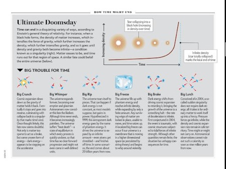
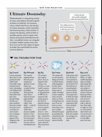
(These images are from the nifty and new Scientific American Beginnings & Endings iPad app and are used here for educational example only. The black line along the right edge is a scroll bar.)
Let me be really clear about something: There is no easy way to redesign a landscape page into portrait, or vice versa. It takes human eyeballs and brains. However, there are some good tricks that can help the process. And one of the best tricks is to make use of the Layout Adjustment feature in InDesign.
Layout Adjustment has come up in previous blog posts, such as this one by Cari Jansen, where she talks about using it with CS5’s Page Tool to change the size of ads. But here I want to explore the most important aspect of Layout Adjustment: Guides.
To make layout adjustment work for you, you need to position your objects next to guides (such as the margin guides), or position your guides next to objects! Layout Adjustment just sort of flails around with your objects unless they’re abutting guides.
You can drag out page guides from your rulers and snap them to the edges of your objects. (In CS3 and earlier, you need to select the object first and snap the guide on one of the side or corner handles.) Then, when the guide moves, the object will move with it.
For example, in the image below, you can see I’ve added two frames to a landscape page (left) and then changed the orientation to portrait (right):


Even though Layout Adjustment is on, the objects are pushed off the page — InDesign can’t “manage” them because they weren’t touching (or very near) a guide. However, if I add a single vertical guide along the left edges of the objects before I change to portrait orientation, I get a much better result:

This is because guides are moved proportionally with the rest of the page. As the page width got smaller, the guide moved with the page, and the objects moved with it.
But, um, why did the space between the objects get larger? I don’t have any good explanation for this besides perhaps InDesign was trying to be helpful. By placing the guide on the left edges, layout adjustment figured you wanted to move the objects around in all kinds of ways. I personally think this is a bug. Of course, if you group the objects first, they’ll stay together.
What if you want to keep the green frame near the top of the page and lock the magenta frame down near the bottom? In that case, add guides along the top and bottom of the (individual, ungrouped) frames:
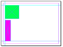

By the way, if the frames appear at slightly different sizes in the images above, it’s because I’ve scaled them… they remain the same size in the actual document. They just get moved around differently.
But what if you do want the shapes to change size as well as move? You can do that by adding guides on two or more sides of the frame. For example, here I’ve added frames on all four sides of the frames:
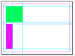
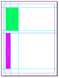
You can see that the frames move and scale. If there were text inside the frames, it would not get scaled, but images do get scaled along with the frames. Here’s a very simple example with text and graphics:
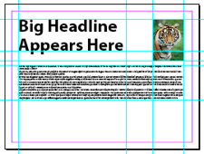
Now here are two versions of the same layout, one with layout adjustment turned off and then again with it turned on:

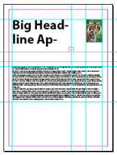
Which is better? There is no “better”! It’s just a matter of which suits your needs more. Nothing is going to save you from having to do additional work to make the new page size look right, but one might save you more time than the other, depending on what your final design. In the example above, it might have saved me a bit more time if I had left the guides off the headine frame, for example.
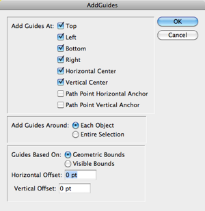
By the way, if you find yourself adding frames to all four sides of a lot of frames, do yourself a favor and use the AddGuides.jsx script instead. It comes with InDesign (look in the Scripts panel, inside Applications/Samples/Javascript). Just select all the objects you want to apply guides to and double-click on the script:
There are some other great layout adjustment tricks, including setting up page column guides, but I’ll have to cover that in a future post.


David, you bring up a key point here about the importance of grids and guides in graphic design.
As you’ve demonstrated, not only are guides extremely helpful when invoking InDesign’s Layout Adjustment feature for converting portrait layouts to landscape, but, more importantly, the disciplined use of guides insures consistency, repeatability, and absolute accuracy as well.
Knowing that a centered headline is indeed mathematically, no-chance-of-being-off, centered, affords the designer the option to freely experiment with other design choices because his/her layout’s infrastructure provides a clear framework or foundation.
Here’s a simple example. Imagine you’re designing a letter-sized flier. Margins are .5 inch on all four sides. Your headline, set in 72 pt Helvetica is aligned centered. When drawing out your text frame for the headline, do you a) make your frame just large enough to hold your text? Or do you b) draw a frame from the inside of the left margin to the inside of the right margin?
Although both a) and b) can give you the result you need, version a) requires additional work to insure that centering is accurate (i.e., measuring, drawing ruler guides, using Smart Guides, etc.).
With version b) no additional work is needed. Provided your text is centered within its frame (Shift-Cmd/Ctrl+C), snapping the frame sides to the margin guides takes all guesswork (and potential inaccuracy) from the task.
Do I sound like your aunt Prudence, the family fuss-budget? That’s because I am a fuss-budget! But not without reason. Over more than thirty years as a designer I’ve learned (often the hard way) that the time spent fussing over the little stuff is rarely wasted. Moreover, I’ve never regretted doing a job right.
If design were only about making a buck I would’ve gone to law school years ago. But for me, I’m proud to be a designer. Design is art, and art comes from craft. There are no shortcuts to craft. Craft takes time and discipline but its rewards are honesty and integrity.
Fuss-budgets unite! Oh, and happy new year.
Great points, Scott! But you’re not only a designer, you’re also a good trainer and author of the new Adobe Creative Suite 5 Design Premium How-Tos: 100 Essential Techniques
Thanks for the mention of my new book, co-written with the wonderful Michael Murphy.
David:
In preparing content for the iPad (Using Adobe’s Digital Magazine Publishing tools), do you prefer to starting with a horizontal layout, and then convert to vertical, or vice versa? For layouts that will be intended for both horizontal and vertical, is there a starting point you prefer?
Also I am wondering if there are statistics available for the preferred orientation when reading iPad magazines. I guess it may make sense to do the initial design using the preferred orientation.
And lastly, a challenge facing us all is to redesign content for 16:9 aspect ratios, for example the Android’s 7 inch Gaslaxy tab. Are there any resources or best practices to follow when targeting multi-platform, multi-aspect ration tablet devices?
PS Scott: Nice book! (I’ve placed a request for kindle download on Amazon)
“Although both a) and b) can give you the result you need, version a) requires additional work to insure that centering is accurate”
Not really. I almost always have the align selection thingamajig set to “Align to Page” or “Align to Margins” to get an object dead-centered (or aligned to the top/bottom/left/right of the page or margins).
In fact, I rarely have it set to “Align to Selection” as even setting a frame to the full width of a page or margins isn’t fool-proof considering snapping isn’t always 100% accurate.
@JuergenB: I agree with you that the changing aspect ratio problem will be a major issue as time goes on. But I don’t think either portrait-first or landscape-first is better. I do think that designers need to practice their skills in thinking in both designs at the same time.
Hi,
I am trying to accomplish the following in Indesign CS4.
I use a simple Indesign format that contains only a single rectangular frame on each page. This frame covers the whole page – so the contents of the frame (say, an image) will be displayed full page. I would like to be able to resize the document, so that the frame also resizes.
It seems simple. However, so far, it doesn’t work. I made guides on all sides and used automated layout adjustment, but so far the frame does not scale, it sticks to its position.
Could anybody help us out? A simple example file would be greatly appreciated.
best,
Sander
@Sander: Interesting… I think you have uncovered both a feature and a bug. If you extend a graphic frame to the page edges, the edges act like guides. So when Layout Adjustment is on, the object will stretch with the page.
However, if the frame has an image in it, then it stops working properly. The frame seems to change its height, but not its width!
If the frame is empty or has text in it, then it seems to work. But not with images.
Thanks for your response!
Empty would do for me, but even that doesn’t work. Could you send me an example of a working file? I think some setting might be off..
best,
Sander
Sander, I just made an empty graphic frame that reaches all the way to the edges of the page in CS5. Then I turned on layout > layout adjustment. Then I used File > Document Setup to change from portrait to landscape (or back). The size of the frame changes. Not for you?
Yep, it does if I start from scratch. Thanks!
I couldn’t do it with an existing file. Maybe some of the settings were wrong somehow.
Thanks for helping out – even with the it-doesn’t-work-wit-an-image bug – I am a happy camper.
Best,
Sander
I was having a strange issue with InDesign CS5 in re-sizing files. I had set it up with columns & rows so that my gridded layout fell within guidelines, the purpose being that when I did his, and resized the page horizontally, the image boxes & text boxes within the guide areas would automatically resize with the document, without changing alignment. This works just fine as long as none of the image boxes have images in them. When I place an image into a box, it seems to insist on scaling the frame proportionally for some reason. This ONLY happens when an image is in the box. I have tested all the settings I could find and so has my colleague, all we can seem to figure is some sort of bug or glitch in the Layout Adjustment palate (we are guessing the ?Snap? setting panel) has anyone come across this? More importantly, does anyone have a FIX for this? PLEASE???
I have a different sort of page rotation question. I laid my pages out 8.5×11 in landscape for a children’s book. Createspace needs my pdf pages to be sent so the left side margins face upward because they can’t do a side binding that large (I know right?). But they can do it if the PDF pages are sent with the gutter facing up (since they can do a top binding this size). So what I need to do is turn all of my pages to accommodate them. I don’t want to change anything in the layout, just turn each page 90 degrees keeping the content the same. Is there a simple way to do this?
Thanks
Frustrating
Robert: I would rotate the pages in Acrobat. Don’t worry about getting it right in ID.
Hi there,
I’m new to InDesign and am trying to import text (and tables) from a Word document (circa 60 pages long) that uses section breaks to enable both portrait and landscape pages in the same document. The landscape pages are important because they accommodate large tables and the document switches between the two orientations throughout.
I’ve set up both a portrait and a landscape master in InDesign.
When I try to autoflow the text from Word into my InDesign document, it doesn’t pick up the different page orientations automatically, so everything is imported in the A-Master (portrait) and the landscape pages end up as portrait pages.
Is there a way to have this import issue sorted out automatically? Its would be a time consuming process to manually fix the landscape pages imported as portrait, and I’d like to avoid taking a piecemeal approach if possible (placing landscape pages separately to portrait ones).
Thanks in advance!
Hi Kate! Assuming your text has been styled, I think you could use the script Mastermatics from ID-Extras to do what you want: https://www.id-extras.com/products/mastermatic