

Creating Transparent Table Strokes

Recently, I wanted to make a quick table with transparent strokes around the cells. You may already know that this isn’t a standard feature in InDesign. If you have fill colors applied to table cells and set the strokes to [None], the strokes will disappear, but in their place you’ll see the cell fill colors instead of seeing what’s beneath the table.
Here’s the embarrassing thing: I know a technique to handle this problem, and I’ve used it for literally hundreds of elements in one of the book series I publish, but I completely forgot how to do it and that I ever knew how to do it at all.
So I did the obvious thing, which was to google “indesign transparent table strokes.” That brought me to this InDesignSecrets article, which is followed by some comments explaining techniques for achieving the effect, including one that I myself wrote explaining how I do it.
The moral of the story: document your processes. InDesignSecrets may not be the approved documentation repository at your company, but anywhere is better than nowhere. I often record short videos for myself when working on the first book in a series, to remind myself exactly how I carried out certain complicated tasks in InDesign.
Now, onto making tables with transparent strokes. You may be able to use a single table for simple jobs, but more complicated ones work better as two tables grouped together. You also might want to use the more complicated build process if it offers easier data input down the road.
Simple Table with Transparent Strokes
Just looking at this, you can probably already guess how the strokes are transparent. They aren’t strokes, they’re extra rows and columns. Set the Fill of the “stroke” rows and columns to [None], and you are golden … or whatever color is seeping through from beneath.
That’s the simple solution, but if you’re making a bunch of these, you might find it tedious to copy and paste material into them. If you’re copying tab-delimitited text into it, your second column of text will end up inside the stroke, and so will the entire second row! This will require a manual fix or re-formatting your information before you paste it in.
So this simple table might be good for a one-off, or in a situation where you are bringing data in via Data Merge or another more mechanical method.
Complex and Robust Tables with Transparent Strokes
You can have your cake and eat it too if you make two cakes. That is, you can get the table effect you want if you create two tables, one sitting exactly on top of the other. The top-most one is for the text, with the proper number of columns and rows to easily accept pasted-in, tab-delimited text. The one underneath is for the “transparent strokes” effect, that is, additional empty columns and rows.
Below is an excerpt from one of the games I publish. In one of the chapters, there are many characters listed, and each has a stat block along with some descriptive text. Naturally, I want them to be objects that flow with the text and as you can see, the white background that the text is on is ever-so-slightly transparent. So I need the table to be transparent as well.
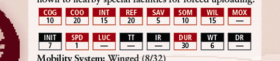
Here’s a close up of two of these completed tables on a transparent background. You can see in the second instance that I’ve ungrouped the object and moved one of the tables slightly lower and to the right – showing that each final table in the book is actually made up of two tables.
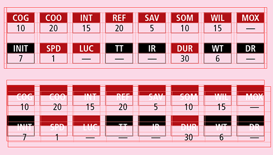
Now let’s focus on those two tables, and what belongs on each one. In this image, you’ll see them distinctly. The first table is the Background Table, and the second table is the Text Table.

I advise you to first build the Text Table: figure out the text and cell sizes you’ll need for your information. Of course, you should test this design with multiple data pieces, as you’ll probably have some tables that vary in content. If you can test with your most complex content, you’ll save time and frustration in the future as you’ll encounter fewer special cases.
Once the Text Table is built to your satisfaction, it’s time to make the Background Table. There is a formula for determining how many columns you’ll need in a standard Background Table to have an invisible stroke between each column: (Number of Columns in Text Table × 2) – 1
In the example above, my Text Table has 8 columns, so the Background Table has 15: (8 × 2) – 1 = 15
The number of rows may vary based on exact formatting – in my example both tables have an identical number of rows, but you can adjust that as necessary depending on how complex you want the background to be. And of course, the number of rows/columns you need to create your visual effect may be entirely different, especially if you’re placing images inside the Background Table.
Once both tables are created to your liking, select them both and Align Horizontal Centers, then Align Vertical Centers. Group the two tables together, copy, and then paste them right into your text flow so the grouped tables become an anchored object. Adjust it so the placement is correct, and create an object style (for the grouped tables, not each individual table) so you can easily place more of them.
I often make a half-dozen or more of these tables at a time, so I “assembly line” them in an InDesign file that contains only the necessary styles, a series of blank tables, and the text that belongs in them. Once I’ve built them all, I copy and paste those tables into the main text flow in the main InDesign document, and since the styles match up 100% between the two documents, everything comes along for the ride, perfectly.
(Not using Anchored Objects yet? Check out Steve Werner’s Wrapping Text Around Anchored Objects, which shows you how to create different types of Anchored Objects and how to wrap text around them, and the subtle complexities!)
Cool, Adam! A great deconstruction of a technique that can be baffling.
Interesting technique Adam! To clarify, I think I’d add here that when you start trying to align tables or drag tables around etc., (as you describe toward the end) that you’re really dragging around the text frame that encloses the table. There’s no way to actually select a table with the Selection tool and move it around on the spread or group it or anything, they’re always anchored within a parent text frame.
So If you want to work with your tables as though they were objects, you first need to put each one into its own text frame, then kiss-fit each frame to the table’s boundaries. You can just double-click the lower right hand corner of the text frame to snap it to fit the table precisely.
When you say “select both the tables and align the horizontal centers and then group them …” etc., users should be doing that to the text frames that enclose the tables. Yes? Or let me know if I’m off base.
AM: You’re totally right; since each text frame contains only the table, I phrased it a little lazily. Good catch!
Hm. So you eliminated empty columns in the table with text contents. Good. But obviously for this example you needed empty rows. Isn’t that a problem? Or do I suspect something wrong?
Uwe
Uwe: There’s an extra row in this one, yes. But that’s easily fixable at the manuscript level, just by leaving an extra line between the two lines of numbers.