Drawing a Good Callout Line for Illustrations
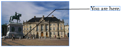
I draw a lot of callouts lines — you know, those lines that point to something in an illustration. It’s the nature of the training biz. But of course, if you draw a black callout line (or pullout line, or pointer line, or whatever you want to call it), and it goes over a dark area, it’s going to disappear, right?

You can still see the line in the image above, but you get the idea: Line over image = hard to see. What we really want is a white “pushback” area, around the line. Here’s the way I’ve been doing it for years: Make a stripe (you can use any of the double-stripes in the Stroke panel, but I usually make my own that is about one-third stripe, one-third gap, and another third stripe). Apply this stripe to your stroke:

Set the stroke color to Paper, and the Gap color to Black (or whatever color you want the line). See what happens? The stripes along the outside go white, and the inner part, which was just a gap between the stripes a moment ago, turns into the line. But out, over the part of the page that is just paper, the white part “disappears”:

If you want a nice sharp corner, then you’re done. But don’t forget you can use Object > Corner Options to smooth out corners into rounded Bezier curves. I certainly couldn’t draw a Bezier curve that nice!


Oops. Ignore that little bit of panel in the lower right. Don’t have time to fire up Photoshop.
The only problem with this technique is that it does not put a band of white at the end of the line… which means you cannot use arrowheads or other endcaps. Well, you can, but they appear white (paper) instead of black. Well, maybe that’s a good thing.
Yes, you could achieve this same effect using two lines — one on top of the other. I did that for years. But I much prefer this one-striped-line approach. The fewer objects I have to worry about the better.


Thanks for the great tip, I plan on using this quite a bit.
By the way, I used the mac application preview all the time for simple photo edits like cropping or resizing.
Cool tip, David!
I’ve had my years in the newspaper business drawing lots of lines on images and illustrations.
My habbit is to make a single black line, and then apply an Outer Glow Effect (somethimes with a bit of blur), and save this as an Object Style. Using that technique I’m able to get a white (or whatever color) band around arrow heads.
Great Application! I usually use this technique for making roads on my maps, I never thought to use it like this.
You can easily extend that technique to get this (https://indesign-faq.de/wp-content/uploads/2008/10/callout-17.jpg)
Don’t forget you can also use the Effects panel on top of the posted tip!
You can change the Stroke and Object effects to get your japanese/neon/whatever effect you want to call it :) to add in at least 2 more stroke options ;P
I suppose you could do a drop shadow with a 0 offset, and an inner shadow and other things too.
But can’t get better than the original. Remember when you use the Effects panel it adds transparency to the page. So you may not want that. The original way posted avoids that.
https://tinyurl.com/d8zpu6
Great tip! I wish I had read it an hour ago…I’m going right back into that job and change the callout lines.
BTW, I had a designer and printshop manager in my office the other day (investigating a platesetter) and the first thing that I showed the designer was this site. I have no doubt that she checked it out as soon as she got back to her office. IDS is wonderful! Thank you one and all!
Not sure if it was mentioned? But you can create and Object Style for this. And in CS3 onwards you can find and replace objects appearances and replace them with an Object Style.
That way you can change all the objects with this style in a few clicks.
I came up with a solution to get the rounded cap to be white as well. It involves reversing the striped Stroke Style, and then adding a capped end. Details can be found here: https://www.documentgeek.com/blog/PointerLinesSolution.pdf
@Kelly: NICE! Basically, the idea is to do a stripe down the middle, with paper-colored gap color… so the gap is on the outside. Then set the stroke to round endcap. The result is just right:

This looks like a great solution to what I am looking for. However, i would like to add arrow heads to the end of the line.
When I do this, the arrow head is not outlined in white.
Is there a way to get this affect applied to the arrow head?
@Bob: I did some experimenting and found a reasonable solution. My solution was a stripe stroke (with the edges knocked out), a stroke color of black, and a gap color of white. But because arrow heads will aways be the same color as the stroke, you’ll have to reverse the concept in order to get white arrowheads. So if you use a the Thick-Thick stroke style, with a stroke color of white, and a gap color of black, with a Butt cap for the end cap. In InDesign, there isn’t a way to get both the arrowheads also outlined in the gap color. But if you’re okay with flat ends, then the Thick-Thick stroke style will do the trick. Maybe you could use two different strokes styles in your documents. One with white arrowheads, and another with black arrowheads.
David Blatner…
THANKS FOR EVERY IDEA ON INDESIGN…