

Exploring OpenType Pro Fonts, Part 2

Last week we started an in depth look at the features of OpenType fonts. Let’s continue now with a review of typographic gems like contextual alternates, all small caps, stylistic sets, and more.
See also: Adobe Drops Fonts, Leaves Users Stranded
Contextual Alternates
These are alternate characters often found in script typefaces to provide a more natural link between two characters resembling handwriting style. They provide better spacing and joins between specific characters. Contextual alternates are also used in some non-Latin scripts, such as Arabic. This feature is selected by default.

All Small Caps
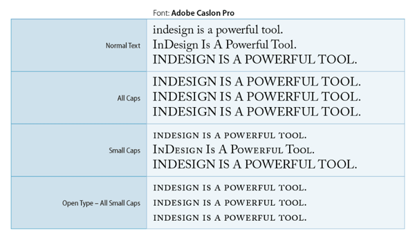
You’re probably familiar with InDesign’s ‘All-Caps’ and ‘Small-Caps’ features. All-Caps make all the text in uppercase. Small-Caps makes all the lowercase letters uppercase in a size equal to the x-height, while capital letters remain as-is.
The ‘All Small Caps’ feature of the Open Type fonts makes all the upper/lower case characters uppercase in a size equal to the x-height of the typeface. These are also referred as Real-Small-Caps.
Slashed Zero
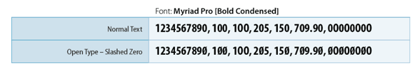
This option displays the number zero ‘0’ with a slash through it. Sometimes (especially in condensed fonts), it becomes very difficult to differentiate between the character ‘O’ and the number zero. In the example below (the text with slashed zero), you can easily identify the zeros and Os. Check carefully the 100 and the last group of zero and Os.
See also: More Font Info for InDesign CC Users
Stylistic sets
Some OpenType fonts include alternate glyph sets designed for aesthetic effects. A stylistic set is a group of glyph alternates that can be applied to one character at a time or to a range of text. If you select a different stylistic set, the glyphs defined in the set are used instead of the font’s default glyphs. If a glyph character in a stylistic set is used in conjunction with another OpenType setting, the glyph from the individual setting overrides the character set glyph. The Stylistic sets available in a font can be seen and used through the Glyphs panel.

Positional Forms
In some cursive scripts and in languages such as Arabic, what a character looks like can depend on its position inside a word. The character may change form when it appears at the start (initial position), middle (medial position), or end (final position) of a word, and it may change form as well when it appears alone (isolated position). Select a character and choose a Positional Forms option to format it correctly. The General Form option inserts the common character; the Automatic Form option inserts a form of the character in which the character is located in the word. The General/Automatic Form controls the behaviour of the character and changes the shape accordingly.

Superior/Inferior vs Numerator/Denominator vs Superscript/Subscript
Whenever you apply Superscript or Subscript, the affected text is scaled to 58.3% and positioned at 33.3% (as per default Preferences > Advanced Type). The downside of this is that you get a squeezed version of the original typeface. Also, in many cases the subscript position is too low and looks stranded. Whereas the Open Type Superior and Inferior are much better in all respects. They neither look squeezed nor stranded.
Similarly Open Type Numerators and Denominators stay within the character height. The Numerator does not go beyond the Cap Height and the Denominator stays on the baseline. If an OpenType font doesn’t support Superior and Inferior glyphs, the application of Numerator and Denominator attributes can be useful. Moreover, if a font also doesn’t support true fractions, then complex fractions can be created using these attributes.

OK, that’s all for now. We’ll finish our look at OpenType features next week, in Part 3. Till then spend some time exploring your fonts and see how you can take advantage of these great OpenType features!
For anyone serious about OpenType fonts, I would suggest following @IxtaTypeUI on Twitter, who’s developing an OpenType Panel for InDesign.
The mention of a quite useful slashed zero font reminded me that some Europeans write their one (1) with a hook that makes it look like a seven (7). To fix that, they also add a line through the seven to create a “crossed’ or ‘barred’ 7.
Do open type fonts have such a beast? Apparently not, judging by this discussion.
https://forums.adobe.com/thread/326253
Including this:
“I personally cross my sevens, but that is not a typographic feature. Crossing sevens is used to differentiate between the handwritten number one which in European countries can be written from the bottom up and then back down mimicking the printed 1 and therefore resembling a 7 and the number seven. There is simply no call for such a thing in type, since type isn’t subject to the sloppyness of handwriting. If it ever was incorporated in a font I would only expect it in a free-flowing hand-lettered style. Otherwise it would just look contrived and silly.”
——-
Some years ago I did the layout for a science book that had numerous formula. I went almost nuts trying to create them using standard InDesign and OS X fonts. Shortly after that I discovered STIX, an open source font set designed specifically for that purpose. If you are in a similar situation, here’s an InDesign Secrets discussion from 2010:
https://creativepro.com/pr-stix-fonts-released-for-scientific-technical-and-medical-publishing.php
Here is the background to STIX from that InDesign Secrets article:
Speaking on behalf of the coalition of publishers who developed the fonts, Tim Ingoldsby of the American Institute of Physics said, “This project, which received funding support as well as the contributions of many staff members from the American Chemical Society, American Institute of Physics, American Mathematical Society, American Physical Society, Institute of Electrical and Electronics Engineers, and Elsevier, represents a significant step forward in the STM publishing process. Now individual researchers can come to a single source to obtain a free set of fonts that they can be assured contains substantially every character or symbol needed for reporting their results.”
—–
If I recall correctly, a few years ago Adobe shipped STIX fonts with a pre-CC InDesign (which I still have), but I just checked and it is not available from TypeKit. Even a search on TypeKit for “scientific” and “technical” drew a blank.
Anyone know of a font in TypeKit that has all the characters needed for scientific, technical and medical publishing? There’s not a category for them in TypeKit’s classification nor is it treated as a language.
——
I suspect this is another illustration that TypeKit has meant less rather than more for many users. Rather than own fonts that Adobe once distributed with their apps, they must rent them with a CC membership. And rather than get the STIX font set, they get nothing, or at least not the scientific publishing industry’s standard STIX set.
https://www.stixfonts.org
It does seem that Adobe should be supporting through TypeKit at least one set of high-quality scientific/technical fonts, particularly STIX.
Thanks Inkling, for sharing such information with us. I am not sure, but have heard that Adobe is not distributing fonts with the recent installation kit to make better use of the TypeKit fonts. Regarding your query for a font suitable for Technical publishing, I’ll search and get back to you.
Interesting about the 1 and 7 in European usage… I’m European and never heard of that. When I started making 1’s and 7’s with head, feet and crossbars I was 13 and doing technical drawing.
This was to distinguish the numbers from being and I or other confusing things like that. With technical drawing you have to clearly write a description at the bottom of the drawing.
I distinctly remember Mr Glynn, the tech drawing teacher, drawing each number and he drew a 0 with a slash through it and said – “and that’s how you draw a 0, isn’t it?” – everyone replied that yes that it was correct. Mr Glynn then threw the chalk at the nearest pupil and yelled
“NOOOO – that’s not a 0 that’s how computers write it!” and he demonstrated a perfectly oval shape for a 0 and a round shape for an O.
The reason I do it is because I taught that way in school, by a Technical Drawing teacher.
I didn’t know about superior/inferior, what a great tip. They definitely look alot better than superscript/subscript. The postitioning of the inferior especially is beautiful in comparison.