

Exploring OpenType Pro Fonts, Part 3

In Part 1 and Part 2 of this series, we looked at many useful features of OpenType fonts. Let’s complete our review of typographic gems by checking out the options for figures.
OpenType Numerals
One of OpenType’s many useful features is the ability to manage different styles of numerals within a single font. When you’re working with typefaces that offer both lining and oldstyle figures, each in both proportional and tabular spacing, this is a huge time-saver!
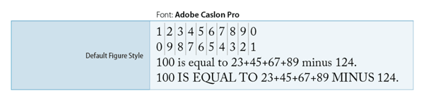
Default Figure Style
This is the default figure/numeric style of the current font. The default figure style in most OpenType fonts is tabular lining figures. You can change the numeral style that best suits your needs using the OpenType palette.
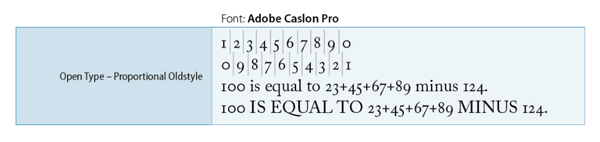
Proportional Oldstyle
This style adds elegance and sophistication to body text. The figures have varying height and widths, mixes well with body text, and doesn’t look stranded or too high with lowercase characters.
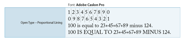
Proportional Lining
This style blends better with all cap settings and makes numeric data stand out from surrounding body text. The figures use full-height with varying widths.
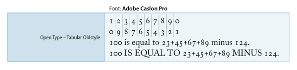
Tabular Oldstyle
This style also adds elegance and sophistication to body text. The figures use varying height with fixed equal widths and mixes well with the lowercase characters. This option is recommended when you want the classic appearance of old-style figures, but you also need them to align in columns, as in an annual report.
Tabular Lining
The figures use fixed equal heights with fixed equal widths. This option is appropriate in situations where numbers need to line up from one line to the next, as in tables. Tabular lining and oldstyle figures are intended for use in tables, price lists, or anywhere that numerals must align vertically.

With so many features in one font, you can see why OpenType came to dominate over other font types. I hope this information is helpful and I encourage you to explore the extended character sets of your fonts. If you think I missed something, please let me know in the comments.
In the Bio of Masood 2 words ‘assist’ & ‘try’ should be kept as ‘assists’ & ‘tries’.