

Fixing Missing Fonts that Don’t Exist


So, here’s an existential conundrum for you: Why would InDesign tell you that you’re missing a font that doesn’t exist?
Exhibit 1: This screen shot of an InDesign alert, telling me I’m missing “Times 85 Heavy” …
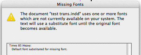
Perhaps the layout was created in an alternate universe where there’s a numbered version of Times? That was my first thought this morning, when I opened the problem child document sent to me by a couple new InDesign users.
But, no such luck – that would’ve made a great post! When I opened the file and looked in the Component Information dialog box (hold down the Command/Control key as you choose About InDesign to see it), the Document History area didn’t report that it was created in the 9th dimension or in the Orion Nebula. Just your usual, prosaic InDesign CS2 on planet Earth.
No, the problem was a Character Style that had been applied by mistake. It’s easy to inadvertently let this happen, no matter how experienced you are with InDesign. Let me briefly explain how it came about, and how we fixed it.
It Could Happen to Anyone
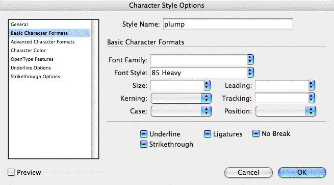
The user had created a Paragraph Style for body text that used the Avenir LT Std typeface with the style “55 Roman.” Then they selected some text in a styled paragraph and changed the style to “85 Heavy” to plump it up.
Since they were going to use this style a lot, they created a Character Style based on it in the usual way – left the text selected and chose New Character Style, which I’ve named “plump” in the screen shot below. The end result is that Character Style’s specs consisted of just the call for “85 Heavy,” since that was the only local formatting difference between the selected text and the underlying Paragraph Style.
So far so good, and that’s one of the strengths of InDesign’s Character Styles. You don’t have to spec a typeface, size, etc. within them, making them much more flexible.
The problem is that at some point, the user inadvertently selected that character style in the palette when there was no active text selection, making it the default character style instead of “None.” Perhaps they were fiddling with it when there was nothing selected in the layout, or had an image selected with the Selection tool. The “plump” character style became the default character style (along with the default paragraph style, “Basic Paragraph”) for any new text they added or imported.
So then they make a new text frame, enter some text, and InDesign thinks they want Times (“Basic Paragraph”) 85 Heavy (“plump”). Even if they apply a different paragraph style, InDesign still thinks it’s supposed to override the font style with 85 Heavy.
Yes, InDesign warns you as you try to do the impossible – format text with a missing font or style – via the “dreaded pinking,” the highlighting of text indicating a substituted font for a missing one. But what if you turned off that option in Preferences? Or what if you’re working in Preview mode, where the highlighting just flashes briefly and then disappears?
The text retains its original typeface and style called for in the paragraph style, so it’s easy to overlook that something’s gone glitchy. Only a sharp-eyed user would see that the Typeface Style field in the Control palette has brackets around it, indicating a missing font.
![]()
And if the Control palette was in Paragraph formatting mode, you wouldn’t get any feedback at all.
What happened with these particular new InDesign users is that they saved the document, closed it, and then opened it later. That’s when they got the dialog box alerting them to Missing Fonts that Don’t Exist – their alert actually listed a whole pile of impossible fonts. Fun times!
Fixing It for Good
Luckily it’s an easy fix: First, deselect everything in the document (Edit > Deselect All is one way) and choose the default “None” in the Character Styles palette. That stops the problem from continuing.
Next, use Type > Find Font to find instances of the “impossible font” in your document. Whenever it finds a range of this sort of text, change the selected text’s Character Style to [None].

Or, use Edit > Find/Change’s “More Options” button to find/change formatting. For the Times 85 Heavy example, in the Find Formats area you’d enter Times as the Typeface and “plump” as the Character Style. In the Change Formats area you’d just choose “None” as the Character Style. That’d remove all mistaken applications of the character style to the font in question.
Finally, you might want to consider editing the character style so that it specifies the actual font in addition to the font style, at least for those character styles where an unusual font style, like 85 Heavy (or UltraCompressed Thin or Engraved OldStyle, etc.) should only be used in combination with a particular font.
In a perfect world InDesign would support ‘soft’ character styles such that I could create a single Apply Italic character style that would work with any font family, regardless of whether ‘Italic’ is ‘Oblique’ or ’56 Italic’ or whatever. InDesign already has the Apply Bold/Italic/Normal keyboard shortcuts, why can’t we have that support in a character style?
Actually, InDesign CS3 already does that in some cases. Define a character style that changes Font Style to “italic”, and does nothing else. Apply that style to some text in Helvetica, and prepare to be amazed…
Anne-Marie wrote: “The problem is that at some point, the user inadvertently selected that character style in the palette when there was no active text selection.” As a matter of fact, there are other — maybe even more likely — circumstances where the situation you describe could easily occur. For instance, supppose all the text was set in Avenir at first, with a character style for all the bold bits of text (85 Heavy). Now, somebody decides the quotes should be in Sabon Italic, and change the paragraph style. Suddenly, all the bold text in the quotes is Sabon 85 Heavy.
Anne-Marie wrote:
“Fixing It for Good
Luckily it?s an easy fix: First, deselect everything in the document (Edit > Deselect All is one way) and choose the default ?None? in the Character Styles palette. That stops the problem from continuing.”
TOM: I’ll try that… and let you know…
“Next, use Type > Find Font to find instances of the ?impossible font? in your document. Whenever it finds a range of this sort of text, change the selected text?s Character Style to [None].”
My response: WRONG. There is no option to select a NONE Character style. All I can choose is FONT FAMILY and FONT STYLE. Neither of these give me the luxury of choosing NONE.
Nice try. Maybe that worked in the BETA CS2 that was never released…
It really doesn’t matter if you use styles or not, you will experience this missing font beauty anyway because ID applies a BASIC PARAGRAPH style that it imposes upon all type before you get a chance to apply your own style to it. This is why you will get those weird fonts.
I have tried changing the BASIC PARA attributes, but then I get some other freak font like Univers Bold Caps Italic. Your results may vary. By the way, the freak font is usually applied to a space or paragraph break that you weren?t psychic enough to change when you changed the rest of the visible type.
The best solution is to simply do a search / replace as part of your final prep. But it still sucks to have to do it.
I also find it rather annoying how the author has chosen to make light of the problem (“Perhaps the layout was created in an alternate universe where there?s a numbered version of Times? That was my first thought this morning, when I opened the problem child document sent to me by a couple new InDesign users.”)
This issue has the potential to cause RIPS to crash or flush a print job, thereby costing me money or causing me to miss print or delivery deadlines. That ain?t funny. Printers love to blame the software (particularly InDesign) but since they can?t send the bill to Adobe, I get shafted. So how eager am I to upgrade to ID3? Hahahahahahahaha?
I switched to ID 3 years ago because Quark was not gonna help me meet a client?s ridiculous deadline. Yes, it saved my butt then and I do see the value and usability in some of the cool image features, but Adobe, please stay on track with producing publishing software that is bullet-proof and avoid the funky new ?unproven? almost useless stuff like the 3D type effects. Anything you can think of adding to ID, I can create using your Illustrator, Flash and PShop. So thanks, but I?m not interested.
Tom — when I said “Whenever it finds a range of this sort of text, change the selected text?s Character Style to [None]” … I’m not seeing any mistake in there.
But it’s clear from your response that my text should have included more explicit details — that you need to do that from elsewhere in the program (Quick Apply, Character Styles palette, Control palete, etc.); as Find Font doesn’t let you change formatting styles. Just fonts.
And as a long time Heinlen fan, I’m always hoping to find evidence of alternate universes …
I find myself using the CreateCharacterStyle script (which ships with ID). This hard-codes all typographic attributes into the character style instead of defining the char style relative to the underlying paragraph style, as we’re discussing here. Obviously, there are advantages to both.
Paragraph vs. Character styles:
I find it a hard habit to break (albeit a rather essential one) to apply paragraph styles to every bit of type I set, since I usually produce pieces of more than a single page of text. I reserve the character styles for special instances, like bolding numbers in a list…
If the client (or I) want to do a wholesale change on the design, it?s pretty easy to simply redefine my paragraph styles.
However, the way ID applies styles is not a concern of mine. It?s the fact that a program intended to be taken seriously by professionals can?t figure out that a font which doesn?t exist is one that probably should be fixed automatically at the point in time when the designer changes the font from the default to whatever choice they make. Why leave a little scrap of poo in the file waiting for the user to clean up later?
I actually thought the phantom font was my fault at first, but after 3 years of this issue, I am pretty sure it ain’t me. I read the article hoping to find a solution, not a quick fix.
We pay how much for this program? And we are told that the phantom font issue is one that occurs ?because that?s what happens when you do that kinda thing? so here?s how to waste more of your precious time by fixing the bug manually? on every one of your files from now on?
Imagine if the ?door ajar? light in your new car came on every time you put your foot on the gas. Now imagine the car manufacturer telling you the door isn?t really ajar, but here?s how to fix the problem ? just open your door and close it every time this happens.
They would probably fix it so it only happened when a real door was ajar, don?t ya think.
Hope the metaphor wasn?t too deep?
I say once again? fix the bugs, deliver better software, then give me flashy new things that I can go ?ooooh wow? about.
Rant done ?
And finally:
The easiest thing I have found to do is this: I proceed to design my piece, ignoring the wacky font warnings until the very end. Then it is just a matter of finding/replacing the goof ups once. If I were to apply the suggestions outlined in this article every time I wanted to print, I would have probably found myself on the top of a building by now.
Some of you may be wondering why I?m not already up there.
Actually, this problem has existed in Indesign since at least version 1.5 as I’ve dealt with it repeatedly over the years (and I’ve seen it posted to the Adobe Forums more than once).
It can occur with a paragraph style as well as character style. I guess my point is that there’s more sources of this frustration than the one detailed in this article.
I meant to add that it’s likely been an InDesign issue since version 1 since I don’t think that style behavior has ever been modified in InDesign since it’s initial release. And when I say
“issue,” I don’t mean that Indesign is working incorrectly so much as I mean that it’s a problem for users.
Whoa, Tom! Don’t forget to take your blood pressure medicine, and back away from the edge of the roof! It’s not that bad. Sure, InDesign has quirks and doesn’t always fix everything that you wish it would fix on the fly, but it’s not that bad. And as for Anne-Marie “making light of the problem,” umm… remember that humor is an excellent salve for the frustration we all feel sometimes. You might look for some in a nearby hardware store.
As others have pointed out, this is a deep problem that has nothing to do with upgrading to CS3, and everything to do with paying a lot of attention to what you do and when you do it. Personally, I think it’s crazy that you can select a character style while no text is selected (so that it is applied to the text in every new text frame you create).
What Caleb pointed out at the beginning of the comments is great: I’d love to be able to set up a table of style mapping. For example, “the ‘bold’ of Myriad should be Semibold, and the ‘bold’ of Stone Serif should be ‘bold’ not ‘semibold’…” and so on.
Tom wrote
I say once again? fix the bugs, deliver better software, then give me flashy new things that I can go ?ooooh wow? about.
I’m inclined to agree with Tom. ID can sometimes be a very irritating program to work with, and I think there should be more focus on fixing its ‘bugs’ before delivering the wiz bang stuff.
I also think that we all sometimes feel like ranting at ID, and that more people should do it in forums like this – that way the message gets across (hopefully to Adobe) that there are things that need to be looked at.
Rob and Tom: you’re right that InDesign can be infuriating sometimes (just like any other program…), and I agree that it’s just as important for software companies to make current features better as it is to add new features. That’s why I was so happy that Adobe had a whole team of people working on nothing but “little improvements” in CS3. It’s far better than CS2 in most ways. But remember that there’s no way to make software perfect, and there will always be room for improvement. There are just so many programmers and everything takes far longer than you’d expect to change.
Most of all, I agree with you that we all need to stand up and say what we want changed. But in the meantime, please don’t yell at us for offering workarounds to the problems that exist. That’s what we’re here for.
To David Blatner: Please accept my apologies if I offened you and Anne Marie in any way. There was never an intent to make you feel like I was yelling at you particularly. My comments were based upon my past and current experience around this missing font issue.
Also, I would appreciate in return that you refrain from personal attacks when responding to any comments that get posted.
I try to avoid doing that because it diverts attention from the real issue and then nothing gets resolved People just get offended and angry.
Humour is good. Workarounds are good. But in the end, I hope the concerns raised here get noticed and addressed by the adobe team.
Thanks, Tom! I’m sorry if you felt personally attacked, too. I certainly didn’t mean to do that. I want all of us to continue to contribute to the conversation in a reasonable way.
By the way, I want to reiterate that the very best way to get concerns noticed by the InDesign team is to go to Adobe.com, click Contact, click Feedback, then choose InDesign from the product list. It may feel like your comments are going into a black hole, but I have been assured by the product management team that they’re not.
Holy Cow! I just want to say that I’m thankful for this post because now I know why sometimes when I type something, it comes out as superscript! But I got all caught up in the melodrama. Thanks for the great read.
This fix works great when there are characters that use that particular font or mis-identified font (like Times 55). I have a problem with documents that show missing fonts, but the character counts of the missing fonts = 0 and I can’t find that font in any of the styles or nested styles. Any help on getting rid of the missing (though unused) fonts? Thanks all
Even with all its issues, ID is utterly and completely superior to working in Quark – which I’m now having to do at a new job. :( One bug for me is the non-existent character at the end of a paragraph that exhibits the characteristics of the “Times 85 Heavy”. That’s a bug I’d like to see addressed.
“My response: WRONG. There is no option to select a NONE Character style. All I can choose is FONT FAMILY and FONT STYLE. Neither of these give me the luxury of choosing NONE.”
Actually, NOT WRONG. Apply [None] by clicking on it in the Character Styles palette, not the Control Bar or the Character palette.
Font Family and Font Style are options in the Control Bar and in the Character palette. Those are completely different than the Character Styles palette, where [None] does appear. The effect of selecting [None] is that any applied Character Styles are cleared, returning the text to the basic Paragraph Style.
“It really doesn?t matter if you use styles or not, you will experience this missing font beauty anyway because ID applies a BASIC PARAGRAPH style that it imposes upon all type before you get a chance to apply your own style to it. This is why you will get those weird fonts.”
This is true as well. Both issues can cause phantom missing fonts. I always warn folks that when selecting text to paste into InDesign to be extremely careful (intentional) about paragraph returns. We sometimes have text pasted from Word onto InDesign’s pasteboard, styled, then cut and pasted somewhere onto the page. The user doesn’t realize that when they styled the text, they omitted a trailing paragraph return. But when they pasted the text into their page, they included that return. When they realize they have the extra paragraph return and try to delete it, they actually delete the properly styled return, leaving the improperly styled one in the paragraph.
I have tried all of these suggestions with no luck. I can’t “find” any instances of the rogue font (Times Light SemiCondenced) being used, so I can’t replace it. Says Character cound is 0. Can anyone help me? I have six large files with this same problem.
Chris, when the Character Count is zero, it often means the font is in automatic bullet or automatic numbering formatting. Those bullet or number characters aren’t counted in the “count.”
Hmmm, so how do I find and replace? Find font and find format come up with nothing.
Chris, choose Type > Find Font. Pick the font and click Find First. InDesign should take you to the paragraph that uses the font. Click Done. Then use the Bullets & Numbering feature to see what formatting has been applied. If it’s a character style, then go change the definition of the character style.
If clicking Find First in the find font dialog box doesn’t bring you anywhere, then there might be some other weirdness in the document and you might have to do an export to INX to clear it out.
Yes, Find First takes me nowhere. I have never heard of this export to INX, can you give me some direction? I am ready for the printer but for this font problem.
(thanks for the help)
Thank you, thank you! I exported and then opened the INX file, and the mystery font was gone.
Should I be concerned that anything happened with this back-and-forth that I didn’t want to happen?
Working with ID CS2 – one computer recognizes Time Roman as such, other says it’s missing, and has Times roman PS MT… how can I get them to recognize them as same font?
I just wanted to say a big THANK YOU!
I had been dogged since CS2 by an errant version of Times on my most-used template. I thought it was a “feature” of InDesign that I was stuck with. When I upgraded to CS5, I was dismayed to see it still, which gave me the motivation to try to track it down again.
With instructions from your column, I was able to find a master page that had the bizarre Times version applied to a couple of text boxes (but not the text contained within). I deleted the boxes, tested every which way, and its Gone. Gone!
Thank you!
I’ve inherited various newsletter files at my new job. All in InDesign CS5. Each one gives me a missing Times font error message. Nothing is highlighted in pink by the Find Font box, though.
Through trial and error, I discovered that deleting a text frame color block made the missing Times font disappear.
Through more trial and error, and mugs of tea, I discovered that if I deleted all the blank but color- filled text blanks in these newsletter files the Times font error would disappear. It would reappear immediately if I drew a blank text frame.
Under Windows>Styles>Object Styles>Text Frames, I found that the Text Frames were set up to pull something called “Basic Paragraph Style.”
Under Windows>Styles>Paragraph Styles, I right-clicked on Basic Paragraphs, and chose Edit from the pull-down. I changed two areas on the basic paragraph style:
1. Under General, I changed “Based On” and “Next Style” both to No Paragraph Style.
2. Under Basic Character Formats, I changed Font Family from “Times” to Adobe Jenson Pro (which is the font we use for body text at my company).
Now when I draw a text frame in these newsletters, it doesn’t create the Times font error. Both steps were needed to effect this change. I also had to make the same changes to the paragraph styles in each of the newsletter files, of course.
I feel rather good about solving this problem myself. Our IT dept doesn’t really support my Adobe Creative Suite products and so I’m on my own when a weirdness happens. I appreciate forums like this InDesignSecrets.com., and one part of it inspired me to go looking at various default settings. Thank you.
I’m in CS5. I received a converted CS5.5 doc and got the message. I deselected all text and selected None for the character. When I did the find font, it went to the first page where all text is already at none character style. I tried to find next and it went nowhere. So maybe it was done! ha! doubtful. I went to print again and got the same message. It prints fine but I don’t like the idea there’s something lurking out there.
All the other person did was add a few paragraphs and when I went in to check, the paragraph style was the same as the one I already had in there, so she just hit return and typed. ugh.
Wow.
I will start by saying that I value the hosting, advice, suggestions and group conversations on this forum. But I am not certain that our comments and complaints about Adobe software behavior “glitches” are being regarded as a “to-do list” by the Adobe team. More like a “nice-to-have” list.
I got involved on this topic 5 years ago, and I just checked in to see how the discussion has progressed (because the Phantom Fonts are STILL NOT SOLVED even with two and a half software versions of InDesign being sold to the professional public).
I value software that can help me shine and earn a better living, today and tomorrow.
Overall, I would say that InDesign is the best desktop pub software out there, but the programmers are under shifting demands by an ever-changing, fast-paced world of media. Five years ago, digital publishing to portable media wasn’t even on the radar… now it’s my #1 concern, and I hope Indesign can be part of my toolkit as I continue evolving as a designer. But that’s just the next “shiny object” for the Developers to go after. Sorry about that boys and girls.
Phantom Fonts are a pain, and do cost me money in wasted time and possible print-proof errors. Will I stop using InDesign because of it? Not until there’s a viable design alternative.
I need to set up an italic font style for several thousand names, but the only option I get in the font style is “regular.” I can see Berkeley Oldstyle Italic in the characters palette but not in the character STYLES palette. Basically I can apply the font manually but not with a style. I tried installing fonts in the InDesign folder without any luck. Ideas?
Here’s a quick fix for instance where a graphic box accidentally got converted to a text box along the way and now is the home to an ‘invisible font’ that can’t be deleted… Convert it to a graphic!
-Select the object note it has text handles around it even though it should not
-Go to the “Object” menu and select “Content” and then “Graphic
No more fonts showing in ‘Find Font’
missing glyph protection has occurred indesign. the new font could not be applied to all selected text. Please use Cmd+option to Override.
I’ve got a problem much like this one – but it’s asking for a font that is not in my document. while exporting it says Bebas Neuve Regular isn’t currently available – but I’m not using it … seriously … I’m not. It’s no where. What do I do?
Amanda: Maybe it’s being used in a graphic? Did you check Type > Find Font?
Yea – I check find font – it’s not in there … isn’t that strange?
Using Indesign CC 2015.4 here… Exported an .idml file, opened it and the dud font issue was resolved!