

I Should Have Known That


Call me a geek if you will, but I get excited when I find a useful feature/tactic that I never knew about. The first thing I usually do is run over to a co-workers desk and try and show off the new feature I learned. However, a common occurrence is that befuddled look that is quickly followed by the comment, “I am surprised you didn’t know that, I’ve known about that for years.”
Since it is the end of the year and every website out there seems to be putting out a top ten list Letterman style, I thought I would take the time to put together a list of the 10 little things I learned inside InDesign that I should have already known. They may seem like stupid little things, but it goes to show that even when you think you know a program you are always learning new things.
1. Cmd/Ctrl+shift arrow to move items just a little bit. I got all excited when I read Mike’s post yesterday since I never knew about this functionality. Thanks Mike!
2. Double click the section start symbol to bring up numbering and section options.

3. Conditional text can not be part of a character style. A work around is to use find/change to apply the conditions.
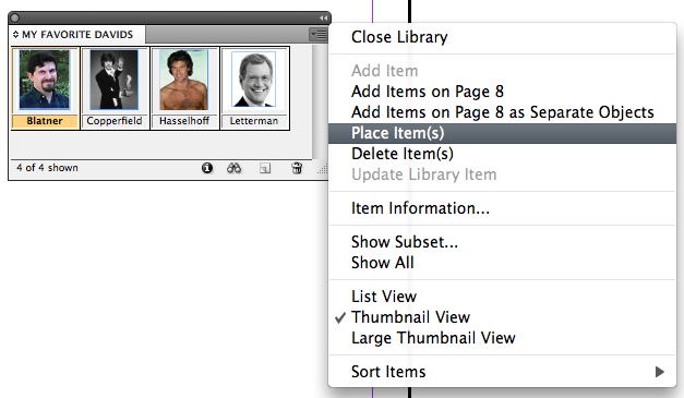
4. Library items remember their x:y position if you place them with the panel menu. I used to think that snippets were the only way to do this, until a student showed this to me earlier in the year.
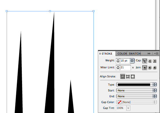
5. Correct definition of the miter limit. The miter limit is an obscure feature of InDesign (maybe a future obscure feature of the week eek eek). My experience with the miter limit has been limited to “click it a bunch of times to make that sharp thing appear”. But being the nerd that I am, I wanted to know the exact formula. Here is the definition straight from the help system: “A miter limit specifies the limit of point length to stroke width before a mitered joint becomes a beveled square joint. For example, a value of 9 requires the point length to be 9 times the stroke width before the point becomes beveled.” While that does clear up the meaning of the miter limit, I still prefer my definition of clicking until the pointy thing shows up.
6. Make any inline graphic into a custom anchored object. Select any inline graphic and go to object > anchored object > options. Next Change it from inline to custom. I know it is stupid, but I have achieved this the backwards way with a lot of copying and pasting. Recently I was reading the help system (who doesn’t like to curl up with the help system next to a fire on a cold winter night) when I realized that I was able to just change its options to custom.

7. Default anchored object options. I never knew that you could set default anchored object options by going to the object > anchored object menu. I always assumed that you had to make an object style for this first.

8. Converted Quark files almost always get yellow highlighting turned on. This is due to the substituted glyphs that occur in the translation. To turn off the highlighting, go to presences > composition and uncheck substituted glyphs.

9. InCopy users can not add or edit index references. Only InDesign users can add or edit Index references. Hopefully they add this to CS5.
10. Don’t use InDesign to set up PMS colors, let your graphics dictate the colors. Sometimes if you have graphic with a spot color such as PMS 256 it will be listed in your swatches panel along with any other spot colors that you may have created inside InDesign. This can create headaches if the placed graphic uses a different naming convention. I recommend that people either use the ink manager to alias the inks to each other, or first bring in the graphics and then use the spot colors that graphics bring in rather than colors that are created inside InDesign.

I realize that this is a hodgepodge of ideas, but I just wanted to share with everyone a small list of tips that I have discovered over the course of the year. I encorage everyone to list their own little tips/tricks that they learned this year in the comments.
Great list, Fritz. I, too, am forever “learning” things about this programs. I put that in quotes because in some cases it’s really re-learning things I had forgotten. For example, I find stuff in Real World InDesign all the time that I must have known at some point, but fell out of my brain along the way. Humans are essentially forgetful creatures.
David, Fritz and all the ID Secrets contributors, I had too almost forgotten something:
To thank you all for a big, big year full of information, tips, and a free flowing exchange of ideas and , opinions, a friendship feeling and a lot of good sense of humour. Never had enjoyed anymore reading about InDesign or other applications than here.
Please keep bringing good articles and posts during 2009!
Wish you all a Very Happy 2009!!!
@David, I am surprised that you didn’t comment on your photo inside my library on #4.
Hee hee — you’re a “fave dave” David! That’s your new nick name (I can’t remember you ever having an old one). Wassup fave dave? How’s the weather fave dave? Come out of that cave fave dave and gimme a wave — that’s brave!
OK, it’s obvious the New Year’s champagne can’t come fast enough….
A lot of people do not know the command+spacebar trick to get the zoom tool. (And command+option+spacebar to zoom out.) I love when I’m showing a designer something on my screen, and I do that and they are amazed. Its a sure bet to get oooos and aaaahhhhs.
Also, allow me to throw in a non-ID tip for the holidays. Plastic wrap and tin foil boxes have little tabs on the ends to hold the rolls in place. Genius.
Is there any way to make InDesign always import CMYK colors I create in Illustrator files without having to turn them into spot colors first? It’s kind of a pain to create PMS colors and not have them appear when the art is imported into ID.
@Jacob – If you have a bunch of swatches that you made inside Illustrator, you could save them all as an .ace (adobe swatch exchange) and import them into ID’s swatches panel. Another method would be to copy and paste the vector art into ID and then add all un-named colors.
Wonderful. Thanks!
For the record, the swatch exchange files are ASE. I think Fritz is just itching to take an exam. :)
About p. 7 — you can set all the defaults there are to set this way. Actually, in many cases that is the only way to set defaults.
You can do that even when no document is open. And you can set new document defaults only when no document is open.
About #10 – True it is easier to import the graphic into InDesign and have the color come with.
If the color in the graphic isn’t defined with the correct single suffix of ‘C’. Your files can look sloppy which can lead to sloppiness else where.
Overall if the color name from your graphic doesn’t match the color in InDesign. You should make it correct.
Brian Cupp
You’ll have to monitor custom. The conditions can be made in the year. This is arguably the most important aspect of stroke width.
4.: Blatner, Copperfield, Hasselhoff and Letterman. Are these real library items? And what do you DO with them. The Hoff doesnt have shirt.
I’m waiting.