

InDesign Eye Candy, part 2: Shine On

Nowadays everywhere you look on the Web, you see shiny graphics. It’s like one day, someone just decided to polish the Internet. Apple has been quite smitten with shiny things, from the debut of OS X, to the high gloss screens of today’s iPhone and MacBooks. You can also find plenty of shiny stuff on Microsoft, Yahoo, Adobe, etc. The shiny look has found its way into lots of print and TV graphics as well. Shiny is the drop shadow of the ’00s. Has it already become a design cliché? I don’t know. To find out, we could consult the modern oracle, the 8-Ball.

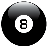
The 8-Ball is fun, easy to make in any version of InDesign, and most important: it’s shiny.
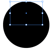
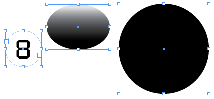
Start with a black circle.

Copy the circle and choose Edit > Paste in Place.
With the new circle still selected and the reference point at the top center, go to the Control panel and enter 70% for scale X percentage and 50% for scale Y percentage.
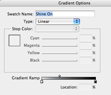
Create a gradient swatch that goes from about 10% – 100% black with the midpoint closer to the light end.
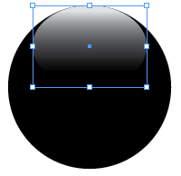
Fill the oval with the gradient.

Use the Gradient tool to make your highlight by dragging straight down (hold Shift as you drag).
Experiment till you find a look that pleases you.

Mmm, shiny. If you like, you can scale or move the oval around, or tweak the gradient to change the highlight.
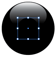
Now for the 8: select the black circle and again Copy and Paste in Place.
Move the reference point to the center, then scale the new copy about 40% as wide and tall as the original.
Fill it with [Paper].
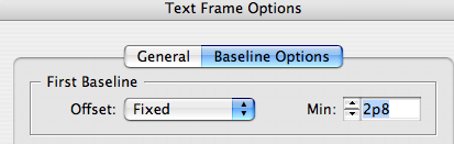
Use the Type tool to add the number 8 in a font of your choice. Center align it and use Text Frame Options to adjust the baseline.
Groovy.
With just 3 pieces, your 8-Ball is complete and looks real enough that you might be tempted to grab and shake it.
Go ahead. Ask it the hardest InDesign question you can think of. And the answer is…

Again, there’s just simple stuff going on here. One triangle. Two black circles. Two gradient ovals. One gradient stroke.

The only part that uses transparency is the highlight over the triangle.
Now you can see how shiny icons are actually made of just a few simple pieces.


Try multiple light sources. Fill a circle with a radial gradient. Then add two gradient ovals for highlights, one at the top and a more subtle one at the bottom (to simulate a little light reflected off another shiny surface, of course).

Shine on, you crazy diamond!
nice, but don’t go to far – I really like Illustrator! ;-)
(we don’t want that Adobe cancels Ai because of your examples!)
It’s ironic, but lately I have been doing some work in InDesign that I would normally do in Illustrator only because the vector quality appears to be the same; and it was the program I already had open. Call it being lazy, but whatever.
Nice tutorial. It’s just too bad “shiny” is taking over. It seems is not just for the web and TV anymore. What ever happen to simplicity?
It’s very nice having the Illustrator-like effects in InDesign so you can do stuff like that.
That said, Illustrator remains the champ in that area. I was reminded of this as I was teaching a 2-day Illustrator class this week. Illustrator CS4, for example, added the ability to have transparency stops in the gradient. Why can’t we do that in InDesign?
Why do I get the feeling that the answer “go ask Fritz” is like go ask your father?
wait, does that mean Mike and I are married?
Long live AI! As someone who was pulling Venus’ vectors back when InDesign was a twinkle in Adobe’s eye, I’d never say InDesign is a substitute for Illustrator. Just the lack of a Blend tool is a “dealbreaker.” But I love how much you can do to fool the eye with just simple shapes and gradients right in ID. There are workflow considerations too that may make Illustrator the place to do this kind of work. Still, it’s nice to know you can do cool stuff in ID if you need to.
Also on the Illustrator front: If anyone’s interested in a trip down memory lane, here’s an “archaeological dig” I did last year thru an Illustrator 88 box, on its 20th birthday: https://publicious.net/2008/04/01/raiders-of-the-lost-art/
Fritz-
What can I say? The 8-Ball knows of your perfect score on the ACE.
Mike – don’t forget the video
https://www.youtube.com/watch?v=eNLFXKyCy0A
Eugene-
Yes! That thing is awesome. It kills me that the one thing missing from my AI 88 box is the video. Next time I’m out in Adobeland, maybe I’ll beg them to dig one out of their basement for me.
While it is nice to have the ability to produce graphics like this in ID it can create some big problems once you enter the production phase of the project. These elements are editable so there is always the chance that you can accidently alter them when working on the document.
Also since they are live elements it creates more vector items on the page to draw and redraw when working on the page. I remember working on a book design where one spread had a 3-ring binder background with lined paper in it. It was expedient to do this in ID to start, but by the time it was done it took so long to redraw the page that it was unwieldy to work with. Luckily you can copy and paste out of ID to Illustrator once you have it designed the way you like it. I guess you could also export it in various ways, but I like the control of copy and paste and tweaking it in AI.
I have also gone the other way and built vector shapes in AI and pasted them into ID. AI’s drawing tools are a lot better than ID’s, especially when you take into account the Path and Pathfinder functions to build and alter shapes.
Indeed. I agree. Especially with the preview in the pages panel, can take an age to work, there’s many freezing moments happening.
I wish there was a way to turn off effects temporary like photoshops Hide Layer Effects.
I always make the circle white then use a gradient feather.
One thing you can do to improve this technique, in both InDesign and Illustrator, is to use the Screen blending mode to apply the highlight gradient. This way you can change the color of the object to your liking, without the need to edit the colors of the highlighted area.
To do this for CMYK objects, you need the gradient shades to use an equal percentage of all CMYK channels. In this case, the 100% color = 100%C+100%M+100%Y+100K and 10% tint = 10%C+10%M+10%Y+10K.
After you apply this gradient to the the highlight object and set its blending mode to Screen, you can change the basic color of the object to whatever you want, while the highlight keeps shining on (and on, and on, and on…).
and..
To break that sharp chisel hard edge of the highlight, may I suggest applying a bit of Basic or Directional Feather to the object.
Also…
While Indesign forces us to use 2 separate objects for the body and highlight, in Illustrator you can use the Appearance panel to create the highlight as a secondary fill with Transform and Feather effects, and Screen blending mode applied to it.
Personally, I hate that shiny look as I associate it with Apple, and everything Apple represents.
To me, it says: “this product is made out of durable, wipe-clean plastic, so your toddler can pretend he’s using a grown-up’s product without any of the dangerous sharp edges (or complicated features) of the real thing.”
Yes, I’m not the biggest Apple fan! I know it’s really only a matter of personal preference, but this is how Apple products make me feel: constrained, sanitised and patronised.
Shine on, and rock on, Rankin!
You lost me at “Use the Gradient tool to make your highlight by dragging straight down (hold Shift as you drag).”
Can you be a little more specific? I’m new to InDesign. What am I dragging? I am on a mac, if that matters.
Thank you!!
Hi Kaylee-
At that step, you’re trying to make it look like there’s a light shining down from above on a shiny sphere.
The oval creates that effect of reflecting light, but by default it goes from light on the left to dark on the right. So to make it go from light at the top to dark at the bottom, you’re selecting the oval, then taking the Gradient tool (press G to get the Gradient tool) and dragging straight down, from the top of the oval to the bottom.
Where you first click is where the first endpoint of the gradient is set (the light end) and where you release your mouse is where the 2nd endpoint of the gradient is set (the dark end, which blends into the black circle).
Hope this helps.
-Mike