Inspirational InDesign Projects on Behance
One of the best inspirational tools I have in my bag-o-tricks these days is Adobe’s Behance. An added bonus of being a Creative Cloud subscriber is access to this font of creativity and inspiration. If you’re a designer, the Behance community is a great place to share not only your finished masterpieces, but to upload works in progress to get feedback from your fellow creatives.
As someone who spends most of her time helping others with the creative software tools—or working to get others’ creations to work perfectly—I don’t actually maintain a portfolio anywhere these days. If I did, Behance would be my go-to portfolio. What I do use it for, however, is to see what’s out there, how people are using the Creative Cloud tools, and to generally get inspired by the creativity we all have to offer. Admittedly, sometimes I look at the amazing creations and I feel so tiny in this vast universe of awesome. All existential crises aside, let’s take a look at some awesome projects that were created using everyone’s favorite page layout tool, InDesign.

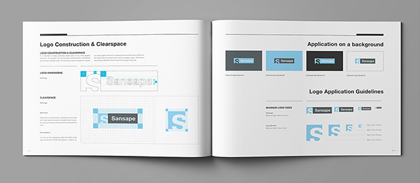
Brand Manual Template
Creating brand manuals for your clients—or even your own business—is an essential part of cultivating a consistent look and message across platforms. We all know this, but often skip this process because creating one can seem daunting. Luckily, Behance user Egotype has created a template to start the ball rolling. The 44-page guide is set up in US and international sizes, includes free fonts and device mockups, and features text styles and layers in the InDesign file. No more excuses, we can all get to creating our brand manuals in style now!
Diverse City Skate Decks
These skateboard decks for a small skate company’s launch into the UK market evoke that freestyle spirit of the late 70s punk scene. Maybe that’s just the British flag and grunge graphics affecting me, but I’m loving the vibe all the same. That initial deck design led to the creation of promotional items like t-shirts and postcards where the sender can check off what sick trick they just pulled and let the recipient know they’re gonna need a new deck from Diverse City soon.
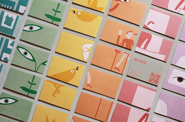
WE BUD Corporate Design
This well-thought out corporate design for a small business consulting firm in Italy uses bright colors and cheerful icons to get their message across. The highlighted pieces include business cards with varying backgrounds and feature only sections of the branding icons. These days we need to think beyond the printed materials to include how a brand will be conveyed in digital publications on mobile devices, as well as websites. WE BUD has the digital realm mapped out to streamline their look across platforms.
British Independent Film Festival
For something so visually rich as a film festival, I love how there is little to no photography in the branding for the British Independent Film Festival. Relying instead on bold black type on a field of bright pink, and playful poking of fun at all things British, Alphabet Design Studios let the words speak louder than pictures. The color scheme and simple “B” logo appeared on outdoor signage, tickets, schedules, wristbands, wayfinding, tablet apps, and credentials and even tied into the awards presented at the festival.
Grain & Forge Woodcraft Co.
Does anything say “rustic Americana” as much as woodworking? The brand identity for Grain & Forge Woodcraft takes that rustic, hand-hewn feeling and runs with it. The simple yet clever logo “G” with an almost hidden “F” that slowly reveals itself from the whitespace has a freshly-chiseled look. The product catalog—both the print and web versions—also take advantage of surrounding whitespace to deliver a clean, uncluttered, modern presentation that contrast oh-so-well with the shots of traditional methods used in creating the company’s furniture.
Oslo X Games 2016 Arena Branding
Maybe it’s just the special place in my heart for Norway, or the fact that I have to wait two more years for the winter Olympics, but I was drawn like the proverbial moth to the X Games branding as I was wandering around Behance. I forget sometimes that some designers’ canvases are huge and some take helicopters to install! For the X Games, over 3500 square meters (nearly 38,000 sq. ft.) of branding featuring the iconic “globe and X” logo appeared on metal signs and starting gates, as well as on scaffolding and fences along ski jumps and race courses.
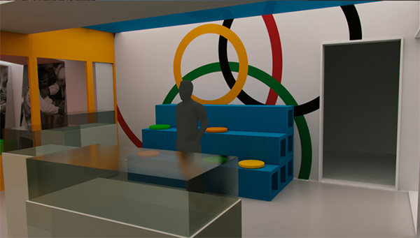
Olympic History Museum
Showcasing a region’s proud Olympic heritage, the Olympic History Museum in Gyor, Hungary is a recent addition to the area. Design firm Zwoelf was tasked with not only bringing the museum’s branding to life, but also the museum’s interior design. Using the Olympic rings as a starting color reference (strict guidelines control how they can and can’t be presented), they developed a dynamic identity that they carried from printed brochures, to museum signage, to 3D and surface branding and wayfinding.
A Designer’s Survival Guide
This project was a university assignment where the student had to create a book geared towards a designer’s psychological survival. I can’t say what the other students’ creations looked like, but this stash book is my favorite. Just look at the thought and construction that went into this project. From the stacked kraftboard, hollowed out and bolted together, to the hidden treasures of coffee, stress ball, and timekeeper inside, I need these to become a real thing. Oh, and can I get a copy of the hand-drawn planning sketches? Yum!
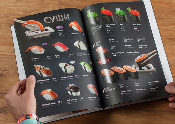
Menu for Sushi Bar
This menu project is part print presentation and part “interactive” device. From the beautiful food photography to the heavy bolt-bound pages and board binding, the menus resemble a coffee table book more than a menu. The interactive part of the experience comes from the partial portraits on the back of the menus. Patrons are encouraged to hold them up to their face, snap a pic, and post it to Instagram, tagging the restaurant. As someone who isn’t a big sushi fan, even I want to go check out this restaurant, based on the menus, alone!
El Sabor Libre
Another student project (ah, to have free-reign with the design and no clients telling you, “Um. No.”), this time for Mexican food company, El Sabor Libre. I love Mexican food and Lucha Libre-covered anything. Throw in the fact this project is from Limerick, Ireland and I was intrigued. The company name is hand-drawn and limes and iconic wrestlers’ masks sprinkle the packaging with whimsical charm. The food wrapping is almost as much fun as gift wrap, and the stars falling from the barcode were just icing on the cake (or would that be flan?).
Smaak Cookbook
This simple cookbook was designed for a food bank in The Netherlands and the people they serve. Looking to create a little order out of the chaos that food bank rations can often create, designer Ferdy Pullens came up with a modular cookbook concept. Wall-mounted bins at the center are printed with information and recipes for the types of food delivered, and volunteers can pull the cards they need to accompany the specific food going out to clients each week. This project is simple, informative, and organized and also helps a segment of the community with specific issues they are facing. I learned that Smaak means taste in Dutch, but I liked the name because it also sounds like “snack!”
Shorts Film Festival 2015
What can I say? I like film festivals. What caught my eye was the use of a classic super-8 film camera and the interesting choice of models holding that camera. The marketing materials did more than advertise the festival, in that by featuring faces of local residents and university students, they hoped to portray the surrounding community as one cohesive unit. The striking pink on everything from posters to schedules to attendees’ credentials contrasts nicely with the featured black and white photography.


