

License Plate FX

Here’s a tutorial that illustrates some key concepts for working with InDesign FX. Behold, the InDesign Secrets FX license plate (click the image for the full size version).
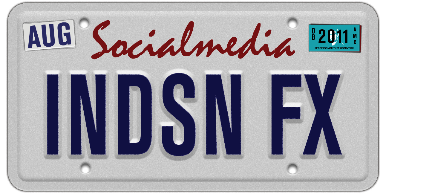
This is made entirely with 100% all natural InDesign ingredients (and a couple fonts of course). I modeled the design after a California license plate I have among the random things in my house. After I got the inspiration, I just grabbed the plate and propped it up next to my screen for reference. And that illustrates key point #1 for making great FX:
Look At Real Stuff
In my opinion, the best way to make something that looks real is to start by looking at real things. If you copy an illustration, I think the best you can end up with is an approximation of it: a copy of a copy. And if the original artist cut corners or made mistakes, you’ll be copying those too. I prefer to make fresh, brand new mistakes, don’t you? ;-)
To make your own license plate, get yourself a reference, whether it’s real or a photo. Then use the following steps as a framework for experimentation, with the real goal of creating something that’s 100% your own.
Begin with a rectangle. Fill it with 10% black. Make it 600 px wide and 300 px tall. Give it a rounded corners with a radius of 15 px. Give it stroke of 15 px, aligned to the outside of the frame, also colored 10% black. So you have something like this:

Now it’s time to start applying some FX to bring this thing to life.
Apply separate bevels to the fill:

and the stroke:

At the object level, apply a small Drop Shadow:
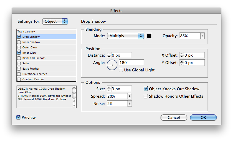
and an Inner Glow with noise (to give the plate some metallic texture).

You may have to experiment with the amount of noise in the Inner Glow. I used 100% noise at low opacity. Often what looks way too noisy in InDesign looks just right in an exported JPEG or PDF. For now, you should have something like this:

Next, to create the screw holes, add four small circles, 15 px in diameter, filled with [Paper].
Apply two effects to the holes, first an Inner Shadow:
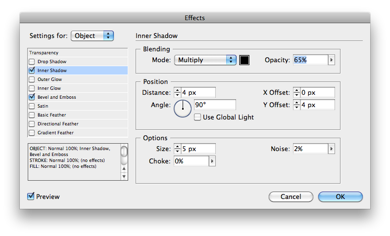
and then a Bevel and Emboss:

So you get something like this:

Which brings me to my 2nd point about making cool FX:
Think About The Shadows
Note how to the shadow settings for the holes differ from those applied to the plate. The hole shadows are lighter and larger. This is because we’re trying to simulate the beveled fill of the plate being lifted up off the surface it’s lying on. The edges of the plate are resting right on that surface, so the shadow there is darker, smaller, and has less variation (thanks to the 20% spread value).
You may well wonder why not just unite the holes with the plate in a compound path. There’s actually a very good reason for that: if I did that, I could only apply one set of Bevel and Emboss and shadow settings to the whole shebang, and that wouldn’t work in this case. It would yield something like this:

which is interesting, but not what I want. Which brings me to my 3rd point:
There’s Always Another Way
I couldn’t get the shadow I wanted on the holes with Drop Shadow settings, so instead I used Inner Shadow. There are nine types of InDesign FX, and many times when one won’t do the job, you can substitute another one with great results.
To continue building the license plate, add some text. You can experiment with colors and fonts of your choice. In this case, I made do with Mistral Regular and Berthold Akzidenz Grotesk Bold Condensed. They’re not perfect matches for the California plate, but they’ll do in a pinch.

Next, add an Outer Bevel to the main text.

And while you’re at it, add an Inner Glow with noise to the edges of the text. This will roughen the edges of the glyphs and make them a little more realistic.


Which brings me to my next point:
Nothing’s Perfeckt
Any time you want something to look a little more realistic, try adding a little imperfection. Nature has no use for perfectly straight edges, perfectly smooth gradations of color, and so on. A little noise added to an effect can help a lot in this way.
Finally, for the coup de grace, add small rectangles in the top corners for the month and year stickers. In my case, I added a small Bevel and Emboss and Drop Shadow (to give the stickers some shine and thickness):


I also rotated them a little to add that bit of happy imperfection. And I added extra rectangles underneath to look like the stickers from past years.


So there you have it, try this project and you’ll be a fully licensed InDesign FXpert.
For lots more tips, tricks, and techniques check out my Lynda.com video series InDesign FX. New blog posts and videos come out every other week.
I probably would make this in InDesign, but it’s really cool!
I probably wouldn’t make this in InDesign, but it?s really cool!
Nice. You could have added a bit of shine with the old Satin, but nonetheless you get an A+ :D
Alexandre-
Thanks. Even if you wanted to do it in Photoshop or Illustrator, those same key concepts still apply.
This is really cool! Apparently we think alike. I did a similar project a few years ago. I did mine with a font called Penitentiary Gothic. I like how you got the graininess of the white plate. Excellent work, as always. I am in awe of your effects knowledge. Thanks for sharing.
rockin’!
Once again Mike, great job! Very realistic, which begs the question… did you ever spend time in jail making license plates? jk
Hey Mike ! Great job, love the effect. On a totally unrelated note, THANK YOU for the ACE prep ebook – I got my certification for InDesign 5.5 today and it’s definitely thanks to your help. :-D
Quentin-
That’s great! Congratulations!
Great job Mike! Very Realistic, it’s always the little touches that make a big difference.
Is that Fritz hiding behind the 2011 sticker? Ha Ha.
This is good shows you how versatile indesign can be
Nice job Mike. I too like the noise applied to the plate.
I’m sorry to tell you but as of today your plates are expired.
Thanks Matt. Don’t want to get pulled over by the FX cops.
Actually, that kinda illustrates one of the cool things about doing FX in InDesign. I could just change 2011 to 2012 right in the document.
I’ve seen a similar tutorial online. It, like yours, used Mistral for the “California” script. I think Rage Italic is actually a closer match.
@APS221-
Thanks! You’re right! That’s definitely the font.
THANK YOU SO MUCH. I MADE A LICENSE PLATE
FOR MY HUSBAND’S BIRTHDAY WITH THIS TUTORIAL.
This was a big help! Really appreciate the step-by-step guidance.