Making a Table with Transparent Strokes
M.A. wrote:
I’m working in InDesign and I have a background image. On top of this image I have placed a table. The table fill I want to be a 100% fill (orange). The table stroke I want to be 100% transparent, so that you can see the image behind.
Unfortunately, tables strokes don’t work that way in InDesign. It seems like you should be able to select the table cells and change their color to None in order to see “through” them. But instead, you “see through” to the table color (the color of each cell).
So instead of using a real table, you should probably fake one with frames on a grid. Any version of InDesign can make a grid of frames easily with Step and Repeat, but InDesign CS5 makes it super easy.
First, drag out a frame (in this case a text frame):

While you’re still holding down the mouse button, press the up and right arrows until you get the number of frames you want in the grid. (This is called the gridify feature.)

If you want a different amount of space between the frames, hold down Command/Ctrl and press the up/down or left/right arrows (again, this is while the mouse button is still held down).

When you let go of the mouse button, InDesign makes the grid for you. When you do this with text frames, InDesign also links the frames together. Here they are with Show Threads turned on:
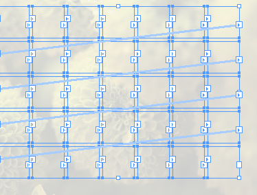
Now you can format the frames and put text into them. Here, I made a sort of calendar by pressing Return/Enter between each number (to break each number into its own paragraph), then selecting all and applying a paragraph style. (The numbers at the end are just selected with the Type tool.)
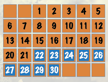
Okay, so this isn’t as flexible as a real table, but it creates the effect pretty well with not a lot of work.


Would this be a good alternative?
– Select the Image; Object/Lock
– Select the table; Edit/Copy; Edit/Paste in Place
– Select the top Table, change it’s cells fill to None, it’s Stroke to Black
– Change the Opacity of the textframe containing the top table to 0% in the Effects Panel
– Select both the text frames containing both tables (that’s why we locked the image layer – to prevent it from being select when we drag select both text frames)(in case you don’t have CS5 with it’s Layers panel :) and group them: Object/Group
– Select the group and put a checkmark in front of Knockout Group in the effects panel.
This way you’ll use the black stroke color of the top table as an opacity mask for the bottom table.
If you want to use this technique it’s recommended to apply it after the table has been ‘finalised’ and at least the cell sizes won’t change anymore.
This did it for me – thanks alot!
This is a genius solution, and works brilliantly. I am responding to this post 10 years after the original post – why hasn’t Adobe sorted this out. It must be a common requirement
This highlights one of the few things Quark got right when copying InDesign. In QuarkExpress, opacity is a color-level option – i.e. whereever you can set a color, you can set opacity. This is something that InDesign needs badly, as the current system is simply too limiting.
Another way to do this is to add an extra column and an extra row between each pair of cells in a real table, Set the Widths/Heights to the size you want for the stroke, and just leave them empty.
@Peter: Great idea! I like that one, and it works in all versions of ID.
@Asbjørn: I’m going to have to agree with you there. I do wish we had that in ID.
I do the same as Peter, with two tables on top of each other, one for the background colors/transparencies, and the second on top for the text. I do it this way to make it easier to select text from tabbed text and paste it into the topmost table, which only has as many rows as there are rows of text.
So for a two-row table, the text table has two rows and as many columns as necessary to accomodate text, and no fills/strokes of any sort, the bottom table has three rows and X number of columns, where X is equal to: Number of Columns in Text Table * 2 – 1.
@Peter and Asbjørn: I also used method with extra rows and columns, but it has one limitation. Height (or width) of empty cells is limited to minimum 3 pt (1,058 mm) . If you want thinner lines between you must use another method.
Beautiful! I was trying to come up of a good example on where to use the gridify text frames feature. This is excellent. Combined with an object style that has a frame fitting option (and the paragraph style as you suggest) it would also be really easy to adjust it.
Also if you decide to change the size relation between the text frames and the gaps in between, or stretch it somewhat, I could just select all of them and drag while holding down the space key, and the frames would spread or contract smoothly. If I do the same without holding the space key, the size of the frames and the gaps would change proportionally. (I find this useful since my brain coordination and fingers have some problems holding the mouse button and the Ctrl-key down while simultaneously using the up/down or left/right arrow keys)
Here is a solution that can set row heights and column widths to values less than the required 3 pt (1.058mm).
Save this line as “ForceRowHeight.jsx”
app.selection[0].properties = {autoGrow:false, height:"0.5mm"};and this one as “ForceColumnWidth.jsx”:
app.selection[0].width = "0.5mm";Both of them need a single cell selected before running; they both set the entire column cq. row size. But they even work with a value as small as 0.1mm! I didn’t dare go any smaller than that …
I tried using the
app.selection[0].width = “0.5mm”;
on cs6, but I keep getting:
JavaScript Error!
Error Number: 30477
Error String: Invalid value for set property ‘width’.
Expected Unit, but received “0.5mm”
help? ;(
Leo, is it possible … Adobe BROKE something in that update? It works in CS4 and it *should* work in newer versions as well. But (as I don’t think Adobe will consider upgrading your “old” — hum hum — version) try this instead:
The notation ‘0.5mm’ is to force InDesign to use millimeters regardless of the current measurement units in use. If you make sure to set “mm” before running the script, then this ought to make it work again:
app.selection[0].width = 0.5;
i.e., *without* specifying the units.
Jong, I tried that. Same error, saying “Expected Unit, but received 0.5.”
:(
The first script works, though. My row heights are being converted to 0.5mm perfectly, and all my settings are to mm.
any other insights? ;)
I’ve grown hopeless of solving this issue. Even tried my luck with a few java programmers, but that was more of a headache then a solution.
Maybe after cs6 row width will be limited to 1.058 mm forever
@Jongware – good idea to stay above 0.1mm. Below that, you start to get into quantum effects: you never know if you have a border or not until someone looks at it.
Sorry, just silliness :)
I like the creative approaches. Hopefully a future patch will free us from these workarounds….