

Making Patterns with Conditional Text

Besides being an full-time InDesign user, I’m also avid knitter. While many people doodle cartoon characters during meetings, I tend to doodle knitting pattern ideas. Quite often in my life, my love for InDesign and pattern-making collide and the result is a blog post. For example:
- How to Make an Argyle Pattern in InDesign (using PatternMaker)
- How to Make Lumberjack Plaid (using tables)
- Making a Checkerboard Pattern With Nested Styles
- Making a Chevron Pattern Within InDesign (using conditional text)
Some of my best ideas come during that half-asleep stage as I am waking up: a magical time when normal thought processes are not bound by fully coherent rationale. In my half-asleep stage this morning, I wondered “What might happen if I take two chevron patterns rotated at 90 degrees, and change the blend mode?” Before I even had my morning coffee, I had to try it. The results amazed me! So here’s how I did it.
1. Make a placeholder frame for your chevrons: Create a text frame, and fill it with some right-indents tabs. My frame is small, only 55 pt wide. (In case you’re wondering how I got that small yellow tag in the top right corner of my frame, that’s the wondrous work of FrameReporter. These little tags are non-printing and auto-generating. This little plug-in is worth gold, my friends! It has nothing to do with making patterns, but will make your life easier.)

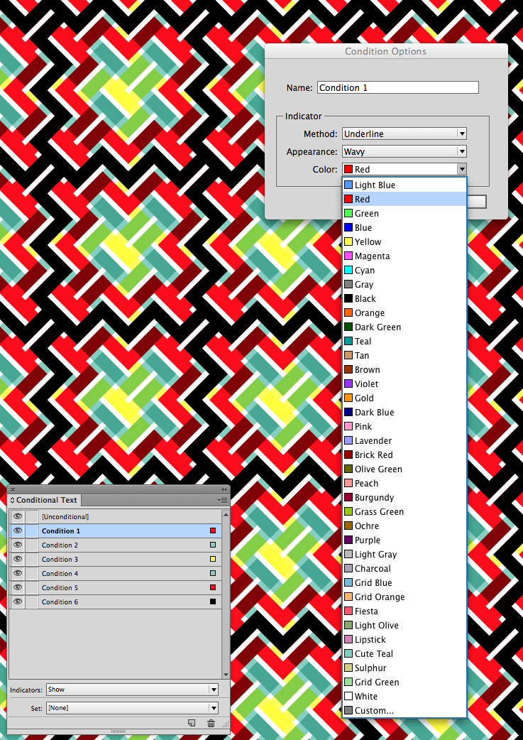
2. Make some conditions: Open the Conditional Text panel (Window > Type & Tables > Conditional Text). Click the New Condition button a half dozen times so you have six new conditions.

3. Apply your conditions: Select all the text and apply every condition to it.
 4. Tighten up the chevrons. My text frame is the default 12 pt Minion Pro, with Auto leading. I found that by adjusting the leading to 6 point, that tightened up the chevrons just perfectly. To make the next part easier, Fit Frame to Content (Opt/Alt + Cmd + C).
Note: I only applied six conditions to my tabs, and so there was some blank space in between the groups of chevrons. The amount that you’ll need to tighten your text will be determined by the number of conditions that you apply to it.
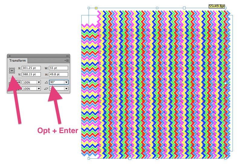
![]() 5. Duplicate and rotate 90 degrees. Select the object, set the reference point to the center, then type 90 into the rotate field in the Control panel or Transform panel.
5. Duplicate and rotate 90 degrees. Select the object, set the reference point to the center, then type 90 into the rotate field in the Control panel or Transform panel.
7. Set a transparency effect to the top frame. This will allow you to see well enough to scoot the top frame into place over the bottom one. It’s a little garish at this point, but it gets better!

8. Adjust your units. InDesign’s default for nudge increment is far too large for scooting something this small. So I changed my increment from 1 pt to .025 pt.
 9. Scoot the top frame into place. You’ll need to zoom in very closely to see the alignment.

10. Adjust your colors. First, try experimenting with the colors of your conditional text. To edit the color of conditional text, double click on the condition name and then choose from the list of colors.
Note: I found that I got better blending effects by switching my transparency blend space to RGB.
 11. Adjust your frame fill colors. In all of the following examples, (in addition to changing condition colors) I have given a fill color to the bottom frame and a transparency effect to the top frame.


 12. You can also create interesting effects by changing the Underline appearance from the default Wavy to either Solid or Dashed.


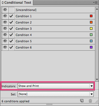
 Now, if during the process of creating patterns you enter Preview mode (W), you may have discovered that your patterns simply disappear! Fear not, for all you need to do is choose to Show and Print the conditional text indicators.
Conditional text can be used for some much more than currencies in a catalog! If you would like to experiment with these conditional text patterns, here are a couple for your amusement.
Wow — insane!
This has to be the most inspired, thinking-outside-the-box use of an InDesign feature I’ve ever seen. Incredible work, Kelly.