

New InDesign Features Revealed at Adobe MAX

Adobe demonstrated the upcoming third version of Adobe InDesign CC 2015 (dubbed 2015.2) at Adobe MAX last week. Along with the requisite handful of bug fixes, the update will include features for finding and selecting special typographic glyphs, enhancements to Publish Online, and a new touch-based workspace for Windows users. Here’s a summary of what has been revealed so far.
New Features for Finding and Selecting Glyphs
Users have been complaining that Adobe hasn’t updated InDesign’s OpenType features for many years. Well, let the changes begin! In this new release, it’s now easier to find and select glyphs, especially from OpenType fonts that can contain thousands of them. The InDesign team has added three new features:
- If you know the font that a particular glyph is in, you can use a new feature in the Glyphs panel (Window > Type & Tables > Glyphs): the New Glyph Search Field, which appears below the Recently Used display. You can search glyphs by their name, glyph ID/character ID, or Unicode value. For example, to find the Greek letter psi, you can just type “psi” into the field. You can even use a search based on any combination of glyph number and name. (Read this article to see where to find the glyphs you need.)
- Contextual Menu for Alternate for Selection. OpenType fonts may have many glyphs for the same character—including swashes, small caps, and so on. Previously, you could look for and view them in the Glyphs panel using the Show menu. Now it’s far easier to see them in context as you’re entering text. As soon as you select a character that has alternates available for it, a contextual menu appears showing up to five of the available alternates. If more than five are available, click the arrow at the right end of the menu to view all of the alternate glyphs.
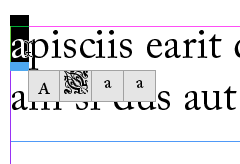
A contextual alternate menu is available for fonts that contain alternate versions of a glyph.
- Contextual Menu for Fractions. In the past, if you have an OpenType font that supports built fractions, you’ve been able to apply the fraction feature to a pair of numbers separated by a slash by choosing OpenType > Fractions from the Character or Control panel menus. Now, when you select the same numbers, you will see a contextual menu for applying the OpenType fraction. To return the fraction to the original numbers, use the contextual menu to select that option. (Note that this menu will only apply to fonts that have built-in fraction support.)
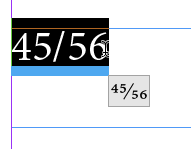
It’s now much easier to create fractions from fonts that support them with a contextual menu.
Publish Online Enhancements
The Publish Online feature is a technology preview that provides a way of publishing your InDesign documents online (as HTML web pages) by storing them on Adobe servers. They can be viewed with a modern web browser on computers, tablets, or smartphones, and they include built-in navigation and support many of the interactive features you can create in InDesign—including buttons, animation, slideshows, video and audio.
Unlike some other export formats from InDesign, this technology doesn’t require special file preparation: All you have to do is click the Publish Online button prominently placed on the Application Bar.
InDesign’s August update (2015.1) made the feature available for all versions of InDesign (the first release was only for English versions). It added support for multiple page spreads and multiple page sizes. Problems with hyperlinks in text were fixed, and there were improvements in support for mobile devices. For example, the tablet view now includes an easy-to-use scrollable thumbnail view.
Now, in this newest release (2015.2), Publish Online offers these new features:
- Update Existing Documents. If you have previously published a document, you now have the option to upload an updated version. You’ll now see this choice in the Publish Online Options dialog.
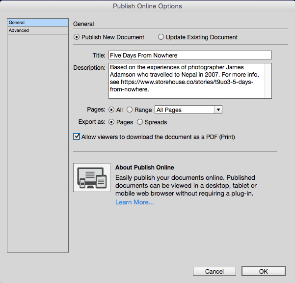 When you click Update Existing Document, you’ll see a list of previously published documents so you can select one. You can also edit the title, description or Advanced options. When you click OK, InDesign uploads the document to replace the previous version.
 - Viewing/Sharing Options. When you preview in a web browser or a mobile device, you are given controls to move from page to page. You are also given viewing and sharing options at the bottom of the screen. You can toggle on page thumbnails, or zoom in and zoom out like you can in a PDF document. You can toggle into and out of Full Screen. Volume can be turned off to shut off the sound, and there is a chance to report abuse. There are also Embed and PDF Download buttons described below.

There are now new options for creating an embed code and downloading a PDF when you view a publication.
- Embed Options. Clicking the Embed button at the bottom of the preview opens the Embed on Your Site window. This provides an embeddable iframe code that can be included in a website. Just copy and paste into your web page code. There are options for the size of the embed link, and the start page. Click the embedded link to view the document full screen, beginning at the selected page, then click from page to page.
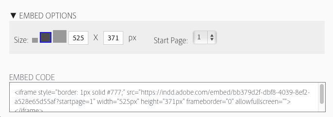
You can create an embeddable iframe code to be included in a website.
- PDF Download. Previously, you had to view the publication online, which meant you had to have an Internet connection. You also couldn’t search for text or copy it. In the new release, when you upload the document, you can enable the Allow viewers to download the document as a PDF (Print) option. If you have done so, your viewers will see a Download PDF button. This will generate a PDF (Print) document in your web browser. The PDF is static, but having it will allow you to view the document pages, to copy or search text, or to print the document, all without an active internet connection.
- Transparency Effects. Previous versions had some limitations on how transparent effects could be included. The newest version allows more transparency interactions, but caution is still advised. You may see unexpected results when using overlapping transparency effects with text frames, groups, buttons, animation objects, or multistate objects.
Windows Touch Workspace
If you’ve seen the “touch workspace” for Adobe Illustrator on a touch-enabled laptop or tablet (such as a the Surface Pro), you’ve probably wondered when InDesign will go down that same path. The answer is now. The Windows version of InDesign CC 2015.2 comes with a new Touch Workspace that is supported on all Microsoft Windows touch-enabled devices, including tablets and touch-enabled desktop or laptop computers.
Note that the touch workspace isn’t designed to replace the fully-functioning normal workspaces. Rather, it is targeted for creating basic layout comps in much the same way that Adobe Comp CC does on an Apple iPad. (See “InStep: Adobe Comp CC” by Conrad Chavez, in InDesign Magazine issue #77)
The new workspace can be invoked by:
- Launching the new version for the first time on a touch-enabled device, and you’ll be prompted to try it out
- Clicking the Touch icon to the right of the Publish Online button on the Applications bar
- Unplugging your keyboard on a touch-enabled device. Plugging in the keyboard switches out of the workspace (this behavior can be switched off in preferences).
The Touch workspace includes a few InDesign tools and panels to help you build comps, but laid out in a way that is more suitable for using with a finger or stylus. Plus, there is a new gesture-based drawing tool, so you can quickly sketch out shapes that are converted to regular objects.
Conclusion
Undoubtedly, there will be more news to report when Adobe officially releases the next version of InDesign. But in the meantime, we have our first glimpse of what’s coming: improvements in Publish Online, a touch workspace, and better ways to insert special characters and make fractions.
Thanks for the round-up, Steve! Some exciting new things there, can’t wait for the full announcement!
Ultimately, I’d love to be able to print and search from the publish online version – I know it’s a WIP but hopefully they include it in newer releases! The PDF download is a good feature. And the ability to update the documents already there is fantastic.
Can’t wait for the update!
Thanks for the information Steve. That part of the Adobe Max presentation was rather hurried, so I didn’t get all the details you give.
The good news are the enhancements to Publish Online, They are so impressive, I’m pondering how I might take advantage of them to promote my books. Being able to update a document published online and keeping the same address after that update is particularly helpful. Among other things, organizations can place their in-house documentation online and easily update them. The same could be done for a lot of fact sheets or manuals for products. Update the ID original, publish online, and the distribution issues are solved.
Unfortunately, the improvements to what ID itself can do weren’t that impressive for anyone not making extensive use of glyphs. Like you, I hope Adobe’s working on improvements that weren’t quite ready to announce.
Years ago, when I took high school trigonometry, at the end of the course my teacher informed us that we’d just accomplished something incredible. Because there is only so much that can be done with the sides and angles of triangles, we’d just learned everything there was to know about trig. There are very few fields of study about which that can be said.
Perhaps someone should explain to the bean-counters who approve enhancement to InDesign that the app is a lot like trig. There are only so many things that can be done with digital and printed texts. The good news is that the feature set that ID needs is limited and nearly complete. The bad news is the seemingly slow rate at which the missing features are coming out. Complete those features over the next year or so, and ID users would have a lot less reason to complain about than those will apps that are in more turmoil. ID users would become happy campers.
In my case, I can think of only few strongly held wishes:
1. Footnotes and endnotes done right. I layout scientific texts with thousands of endnotes hate the kludges I’m forced to use to turn footnotes to endnotes. It’s be great if the feature were robust enough to transform footnotes to end-of-chapter endnotes and end-of-book endnotes on the fly, changing from one to the other on command.
2. Speciality windows for common and repetitive tasks. ID’s panels are designed to do quite a few things but not to do often-repeated tasks such as applying a series of paragraph styles or entering index entries quickly and easily. That’s bad because, more than any other Adobe app, using ID demands a lot of dull, repetitive labor. Those carefully targeted tools need to be built in and to work with with tablet apps. Making index entries on a quickly scrolling tablet screen would be marvelous. Just click in the text where it is to go, and then tap on an easily scrolled list of index entries. No more tiny panel window. No more slow scrolling. No more opening up arrows. Just click, scroll and tap.
3. Link paragraph styles to master pages. Shifting page counts for chapters often create havoc with the special master pages for chapter starts. It’d be great if a specific chapter-heading style could trigger a particular master page. Doing that manually takes a lot of time.
Others might want to add additional suggestions.
Great ideas for future products. But I have to disagree with your comment that InDesign is “nearly complete.” I have pages of wishlist items that I want, and of course other people use InDesign differently than me and they want even more other things. Just look at indesign.uservoice.com and you’ll see the InDesign team has no lack of feature ideas to choose from. :-)
David, we’re talking about different things. I did a quick look through the wish list and came away with the impression that most were about either UI changes or tweaks making certain features work better.
I was discussing what ID can create as digital and printed output not the process for creating that output. It can create footnotes. It can’t create endnotes, That matters a lot, particularly since publishing shifted from footnotes to endnotes far back in the 1950s. Not long ago, ID couldn’t shade paragraphs. Now it can. And note that’s different from some clumsy workaround that fakes a feature.
I was arguing that there’s not much left as output that InDesign can’t do and that Adobe should concentrate on filling in those few remaining gaps. Once users can accomplish everything that they need to accomplish in a straightforward fashion, then Adobe can shift its emphasis to giving ID layers, for instance, with the nicer features of Photoshop layers.
Improving a UI can go on forever. I’ve got my list of own wishes there. But wanting panels to have a larger everything option in addition to their current tiny text and tiny icons is a different kind of problem than not being able to do endnotes. The former costs me a split second when I have to read lists of tiny type or hit a tiny panel icon. The latter consumes hours of my time. I have to warn a publisher I work with that once I convert their Word-generated footnotes to endnotes, adding new faux endnotes will be very messy to change.
Think of a car mechanic and his tool box. His first priority is having all the tools he needs to do his job. Without that, he is in big trouble. Once that’s achieved he can concentrate on improving those tools to make his work go quicker. That’s the distinction I was making. ID, for instance, does full-feature indexing. But dealing with hundreds of index entries using a small panel with tiny clumsily scrolling text is a pain.
Keep in mind that for Adobe’s financial evaluators, because little tweaks cost less to implement they are more appealing than adding a full new feature. When I lived in Seattle, I spent two hours one afternoon with ID’s product development team. I got one of my wishes, backwards searches, because it’s relatively simple and benefits everyone. I didn’t get another, endnotes, because it would be expensive and benefits only scholarly and scientific publishers. I’m arguing that Adobe needs to bit the bullet and give ID those necessary for some features ASAP, that one by one they may not affect many people, but collectively most ID users have something ID simply can’t do that irks them no end.
Hope that explains our differences. They’re about what should be emphasized not that there aren’t hundreds of ways to improve a massive application like ID.
After 10 years, the lack of improvement in footnotes is just incomprehensible. I already read this request so many times, is it at least on the Adobe radar?
Edouard: Yes, I have talked with the Adobe product management team, and I know they are aware that people want improvements on footnotes.
Don’t forget – Adobe move to Cloud version so it can release incremental updates, there’s no dates on these releases. Features are released when they are ready to be released. At the moment, this is what is ready to be released; who knows what else they are working on that is not ready to be released!?
Any dates for the release?
Everyone at Adobe has been very careful to NOT reveal release dates. They suggest it’s not too long, but…
It’s just as well because they manage to shoot themselves in the foot when they pre-announce a date, then release a not-yet-ready product!
Personally, as someone who DOES make extensive use of glyphs, I find this new feature to be something I’ll greatly appreciate when it’s implemented. Similar to what you described for this enhancement, I’d like to see some better methods for identifying what I can only call “weird ass problems” with fonts. For example, if I highlight a character, instead of just showing me the alternative glyphs, give me the option to actually identify the character.
I’m probably not getting my issue across properly, because it sounds like what you can already do by seeing what gets highlighted in the glyphs panel, but I’m taking about more obscure issues. I have a client who routinely sends me manuscripts for conversion into ebooks. Her Word documents usually look just fine. But for whatever reason, a bunch of the characters (usual suspects include quotation marks, em dashes, ellipses, and apostrophes) are not what they are pretending to be. Word displays them fine. SOMETIMES InDesign displays them fine (other times it shows as a pink missing glyph box, and most disturbingly, sometimes ID just decides to not display the character at all, making it look like the glyphs to the right and left of the problem character are actually right next to each other.
The issue doesn’t become apparent until you view the resulting ebook on an ereader or simulated viewer. Then those characters become really odd. Sometimes it causes the words on the line to actually overlap, sometimes it adds a bizarre amount of white space…
Anyway, I’ve never quite been able to figure out what’s going on, as Word and ID both lie to me and tell me the glyph I’ve highlighted is either actually the glyph it looks like (when it’s not) or ID just displays all blank fields in the UID or glyph ID fields.
The only solution I’ve been able to come up with that consistently works is to take her document and do a global search and replace on all the individual problem characters before I do anything else. For example, search for and ellipsis and replace with an ellipsis. Of course when I do this with the quotation marks and apostrophes, I have to review them all to make sure Word didn’t decide to flip the typographers quote the wrong way. Frustrating :)
Still nothing for long documents, then, so why is Adobe surprised that I stick to CS6!
I am glad that the Glyphs panel is getting some love! I use it a lot.