Non-Rectangular Text Wrap Around Drop Caps
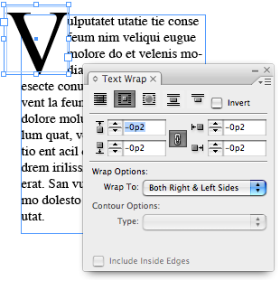
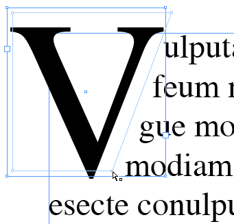
Someone recently asked me about making non-rectangular wraps around drop caps — you know, like a diagonal wrap along the right side of a “V”. InDesign can’t do this automatically; instead, it wraps to the character’s always-vertical right side bearing. You can, however, force the diagonal (or any other shape) pretty easily:
- Place a text frame containing only the drop cap on top of the paragraph in the position you want.
- Select this drop cap frame and turn on Wrap Around Bounding Box in the Text Wrap palette. The paragraph text will wrap around the drop cap’s frame (but not the character itself).
- Set the wrap offset values to -2 pt (or some other small negative or positive value) in the Text Wrap palette.

- Now you can zoom in on the drop cap frame and use the Direct Selection tool to reshape the text wrap boundary. Remember that you can add or remove points from the text wrap boundary with the Pen tool, including Beziér curves.

The only problem with this technique is that the drop cap won’t flow with the text. To do that, you need to paste that frame into the text as an anchored object.
- Select the drop cap frame you just made with the Selection tool and choose Edit > Cut.
- Place the text cursor at the end of the previous paragraph and paste the frame in. Now it’s an inline object, but it’s in the wrong place. (If there is no previous paragraph, then create a blank paragraph at the top of the text frame. Why the previous paragraph? Because InDesign only applies text wrap to the lines after the one in which an object is anchored.)

- Click on the inline drop cap frame with the Selection tool and choose Object > Anchored Object > Options.
- In the Anchored Object Options dialog box, choose Custom from the Position popup menu. Click OK to close the dialog box without any further changes. (Well, you may need to turn off the Keep within Top/Bottom Boundaries checkbox, depending on where you want to place the object on the page.)
- Use the Selection tool to drag the inline object (now technically called an ‘anchored object’) to its original position (where you want it to be sitting).

Since your custom-wrapped drop cap is an anchored frame, it will flow with the paragraph text, but the text after it will wrap around it.
Of course, many designers find non-rectangular drop caps to be anathema and eschew them at all costs. But now that you know how to do it, it’s an aesthetic decision, not a technical one.


Rather than put the drop cap in an anchored frame, I made a small text frame, just large enough to hold the drop cap, then threaded the two frames together… then situated that smaller frame on top of the larger frame. Now the text flows and looks normal in story editor.
That may be true Christopher, but it also means your drop cap won’t move with the rest of your text.
If you wanted it look normal in the text editor, then you can make a large V and baseline shift it down.
Then using Davids method above, insert a blank box (with no fill or stroke) and move the text wrap so the text looks as if it is wrapping around the V.
This can be sped up using Nested Styles and doing Grep Searches to place the Object that you’ve made.
You’d have to anchor that blank box so that it moves with the text.
Boys, boys, boys…let’s not get all worked up! Just kidding…thanks, David… I love these “little” tips that are so easy and so helpful!
There is no need for a separate box. Just put your cursor between the first and second letter and use negative kerning until the type on the line that needs to be the most to the left is set as you like. Then add an n space or spaces for the other lines to get them back away from the drop cap. You may need to put in a shift-return at the end of the top line and second line, too.
Oh dear.
@ mike – if I’m reading you correctly, that only works if no one edits the type. Soft returns in running type make me grit my teeth – people who use a series of tabs and spaces to fake a hanging indent make my left eye twitch.
That said, is there any issue/benefit to simply changing the drop cap into outlines, and setting the text wrap to the shape of the [new] object? Could you anchor that into the text?
Dave, I agree with you: spaces and tabs and soft returns are painful at best. No, there’s nothing wrong with converting it to outline, but I also try to avoid that when possible.
dave,
I can see how soft returns can cause grief in a story, and yes, your method would also work. Our work flow is such that this isn’t an issue for us. This method also is only used in the first graph, and allows for text boxes to easily be moved about the page as needed. Outlining the first letter would also require extra steps if the first word were to be changed. I just don’t see an advantage to it.
???????,????,?????????????,????,??????????,???????,???????????????????????,???????,?????,????????????,??????????????????????????????????????????????????,??????????????????,?????????????????????”??”?????,”??”???????