Setting a Dash Stroke with Exact Gap and Dash Values in InDesign
So you want to use a dashed line, and you want to specify exactly how long the dash should be and how long the gap should be. On the one hand, this is easy, but on the other hand, it can be maddeningly difficult in InDesign.
Here’s a quick rundown of the problem and solutions.
Setting a Fixed Dash
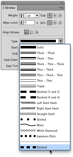
Once you select a frame or path and give it a stroke, you can set its Stroke Type (in the Type pop-up menu, in the Stroke panel) to Dashed — not one of the dashed line stroke styles in the middle of the menu, but Dashed, all the way at the bottom:
When you do that, the Stroke panel expands with some extra options, allowing you to type specific gap and dash values.
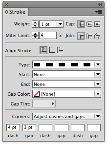
But there are two main problems with setting dashes and gaps like this. First, if you apply the same settings to two different lines, you may get two different dashes. For example, look at these two dashed lines:

See how the lines both start at exactly the same place, but the dashes and gaps don’t match? That’s because the Corners pop-up menu in the Stroke panel is set to Adjust Dashes and Gaps. So if there is any corner on the path, InDesign changes the values so that the corner looks good. (And “any corner” really means “any additional point on the path.”)
However, if you set the Corner pop-up menu to None, you can override that behavior. The corners don’t look as good, but the dashes line up.

The Problem with Object Styles
Unfortunately, as one furry member pointed out, when you use this Dashes feature (the ability to specify your own dash and gap value), you cannot save it in an object style! InDesign just ignores it entirely — perhaps a bug, or an oversight on Adobe’s part.
Fortunately, there’s a solution: Make your own stroke style. It’s easy and fast, and works in object styles. Here’s how.
First, choose Stroke Styles from the Stroke panel menu. Then, click the New button in the Stroke Styles dialog box and set the Type pop-up menu to Dash:
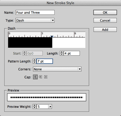
Here’s the trick to the whole thing: Add up all the dashes and strokes you’re going to have, and put that in the Pattern Length field. For example, I want a 4 pt dash and a 3 pt gap, so I set the Pattern Length to 7 pt.
Next, set the Length field to the length of your first dash.
(If you want more than one dash in the pattern — like long dash-gap-short dash-gap — you’ll need to do more work by clicking in the ruler above the pattern and then tweaking the Start fields.)
Finally, if you always want the dashes and gaps to be the same length, even if it means your corners will look a bit odd, set the Corners pop-up menu to None.
Now click OK to leave this dialog box, and then OK again to leave the Stroke Styles dialog box. Your dash is ready to apply! Even better, it’s ready to be added to any object style.
Remember that when you create a dash like this, the effect may surprise you if you make a really thick line:
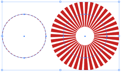
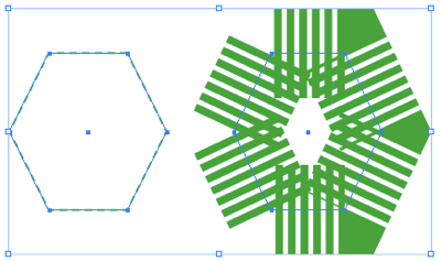
(The four paths above have the same stroke type but different stroke weights and colors. Hey, that green octagon would make a cool logo!)
By the way, here are a couple of other stroke style tricks to chew on:


Great tip – the ‘octagon’ is of course a hexagon – I too thought it looked a great logo as soon as I saw it.
Argh! Thanks, Gavin, you’re right. Was typing too quickly. I always get icosahedron and dodecagon mixed up, too. :)
Thanks. This trick actually helped me create a logo idea I’ve had in my head.
Great tip. Proper use of the stroke feature can really enhance a design-beyond the “click, set and done” that many designers use.
Although you can create all sorts of effects in InDesign, it’s not ideal to create logos in InDesign. It’s probably best to use Illustrator. As that would be able to generate the standard file format used worldwide for use as a logo.
Oh, Eugene, I’m not sure I fully agree with you there. While I like the idea of using the right tool for the job, I also think that you need to use tools that you’re comfortable with. And a PDF of a logo saved out of InDesign is going to work as well as a PDF saved out of AI. And you can, of course, always put the ID artwork into AI if you need to do more with it.
I agree. Some logos are best built in InDesign, and others beg to be from Illustrator. The programs have differences that greatly affect your personal production speed when tackling certain projects. I’m always mad at myself when I picked the wrong program for the logo/graphic project at hand, and it’s a bit late to turn back. The clipboard, once in a while, is a lifesaver.
David, I disagree. I think it’s worth building the logo in the right program, even if it’s a learning curve.
Or design it InDesign and get someone familiar with Illustrator to redraw it.
Problem really is that you can give a PDF of a full colour logo. Then some print company gets the PDF and opens it in Illustrator/Inkscape or whatever they have to make it 1 colour. And it’s not really a good idea if the logo is complex or anything.
There are reasons for and against it.
But I’m on the side of against. Build it in Illustrator and save yourself trouble down the line.
Eugene,
Excellent post and I fully agree with you. As the graphics director for a printing company, and being both a designer and print technician, I could write for hours about the headaches we encounter in having to convert files for 1-color jobs because the customer either doesn’t want to go back to their original designer or has lost contact with them and get the native file.
I can select and change content in a Master page setting on individual pages. Some of the sub-master pages have the text frames in dashes-these cannot be selected and changed on each page. Any suggestions
Jeffrey
Okay, I ran across this old post and wanted to add my 2 cents:
Hmm, what did the world do before the computer? Basically, do not limit yourself to Illustrator; create a logo in ANY software or medium your heart desires. For various reasons, I’ve created logos or portions of logos in IL, PS, 3D software, and logo-like typographics in ID. The more you’re not afraid to experiment and make mistakes and freely play outside of the box, the bigger your solution set will be, thus a greater chance for success.
OF COURSE, there are practical and technical issues to consider in every project, but this is DESIGN–creative and strategic solutions should be the driving point. Insisting that Illustrator is the “standard” is an oversimplified answer and a perfect case of “if all you have is a hammer, everything looks like a nail.”
Learn the rules, then break them with style. Your clients (and wallet) will thank you. And a “good” prepress provider will teach you (or up-charge you until you learn). Everybody wins.
TIP: ID exports vector EPS and PDF.
Hello,
Can you add a gap color within Stroke Styles?
Hi Joshua,
No, gap color is independent of stroke styles. Here is an article that explains how to set up a stroke style, and then apply a gap color. https://creativepro.com/american-flag-stroke-style.php
Anyone help How to apply dash & gap equal to edges
It give link below
https://drive.google.com/file/d/1gAWi1rCwbPm3Xbcn9wa7ursNi_2EKIT-/view?usp=sharing
nice post