

Setting Vertical Text in InDesign

Renee wrote:
As our crossword magazines are moving from QuarkXPress to InDesign, I found out that you can’t write the crossword solutions the same way in InDesign as we did in XPress. We used to use a textbox with narrow columns, where each column holds only one character. The solution is then written vertically. But InDesign will not break the words as XPress does.
Yes, InDesign really doesn’t like breaking up words into individual characters. But there are three ways to achieve vertical text in InDesign. First, you can get the effect you want by placing a space character between every character in the text. If that sounds annoying to you, I agree. Nevertheless, it does work. Remember that if you can’t see the text in your narrow, vertical text frame, you can always select the frame and choose Edit > Edit in Story Editor (Command/Ctrl-Y) to view the text.
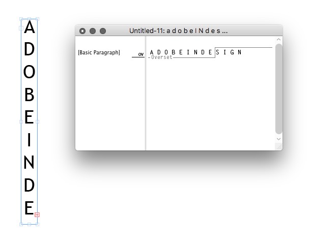
The trick to getting good spacing between all the letters here is to open Object > Text Frame Options (Command/Ctrl-B) and choose Justify from the Align popup menu. That way, the text automatically stretches the entire height of the frame.
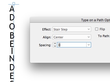
Option two saves you from adding all those extra space characters: Use text on a path:
- Draw a vertical path with the Line tool (or Pen tool). Remember that holding down Shift will help keep it vertical as you drag or click.
- Choose the Text on a Path tool (press Shift-T), click anywhere on the path, and type or Paste your text.
- In your case — because you’re doing crossword puzzles — choose the Justify All Lines paragraph alignment (or press Command/Ctrl-Shift-F). This forces the word to spread out across the entire path.
- Set the stroke width to zero (or set the color to None) so you can’t see the stroke anymore.
- Double-click on the Text on a Path tool (or choose Type > Type on a Path > Options) to open the text on a path options dialog box.
- Set the Effect popup menu to Stair Step and click OK.
Note that in my experience, this works best with a monospaced font because each character is the same width, so they align properly on the line.
I know this sounds like a lot of work, but the good news is that once you set up one of these, you can largely automate it duplicating the line and just changing the text for each one.
I think you are using a space after each character even in your Quark workflow. You’d end up with hyphen at the end of every line if you woudln’t, which, I assume, is not the look you want for your crossword.
I would recommend to use tables for crosswords: each tab moves you to the next cell, and you can easily fill the black cases.
Weller, actually, QuarkXPress behaves just as Renee described. It doesn’t insert hyphens arbitrarily (if the word isn’t in its hyphenation dictionary). When the text box is narrower than the word, it just breaks the word up, wrapping its letters into new line(s).
I agree with JM here — Tables are the best way to go when it comes to crosswords. I do several children’s magazines that have entire spreads of games like crossword puzzles, word searches, etc. Tables work wonderfully each time.
I started using tables about half a year ago, and i love ’em, once you get to know how to use them properly they’re amazing. I’d go with JM as well
Yes, I agree that tables are a great way to go, especially for things that are meant to go on a grid (such as crossword puzzles). However, my intention was to take her request — which was for a non-table solution, after all — and generalize to more broad topic of simply setting any text vertically.
Thanks for this “instructable”. It’s just what I needed to complete a job.
Thanks a lot for all suggestions. I will try them out to find the most convenient way. I love tables myself, but I’m not the one that is going to do the crosswords.
Hi.
It is highly annoying and expensive, but you can buy the Japanese version of InDesign CS3 from Amazon Japan and they will happily ship it to you.
I agree with the tables people, it’s much easier than pissing around with the pen or line tools.
Tables are great, as good as sliced bread – make sure you learn all the short cuts, then you have butter on your bread.
Pablo says no!
[…] For some alternate approaches you can also refer to David Blatner’s post on the InDesign Secrets blog. A very nice article outlining another couple of InDesign vertical type methods. […]
Hey i just found out that you can easily create a textbox that conains the verticle text using the rotate spread view option… This might be helpful as it might not be the same but still is woth it….
the easiest way to make vertical character in indesign English version:
1. create vertical text in illustrator by using vertical tool.
2. copy the whole vertical text from illustrator
3. paste the vertical text to indesign.
DONE!
The REAL easiest way to create vertical text with InDesign is to highlight the text you want to change, right-click on it, select transform, rotate, 90 degrees.
Done!
@Ken: Huh? What program are you in?
I’m with David here… i’m a bit stumped as to Ken’s suggestion. Simply clicking a text box and rotating 90 degrees will turn the type to the left or right, it won’t make text
R
E
A
D
L
I
K
E
T
H
I
S
which is the aim of this thread.
I have downloaded the inDesign CC (Tutorials)two days ago, but I can’t set the vertical layout in text box, usually I need to put the Chinese words in vertical layout. How can I download Indesign CC (tutorials) in Chinese Version?
I can open a old version file(in Chinese) in InDesign C2,anything is OK except the page No.
Sarah: We talked about this a little here: https://creativepro.com/getting-asian-features-in-indesign-with-an-english-ui.php
Also, check out World Tools: https://creativepro.com/typesetting-hebrew-and-other-languages-in-english-indesign.php
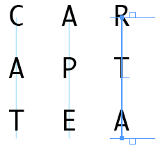
Followed the instructions for text on a path. Found that after setting ‘stair step’ the last letter didn’t align properly so had to add another letter and make it white (so you can’t see it).
Other than that great and thanks.
I would like to learn how to number pages vertically starting from 001, 002 up infinety
The easiest way to accomplish adjustable vertical text is to follow each individual letter (except the last) with an End Paragraph. Set each of these “paragraphs” to Center. Make your Text Frame narrow and tall, and set its Vertical Justification to Align: Top.
You can use option-up/down keys to adjust spacing between letters. You can add words in smallest type sizes that can remain horizontal. Following each horizontal word with an End Paragraph will make its leading individually adjustable. Or, use a Line Break to adjust multiple words/lines all the same. Mix and match!
Just be careful: very short words will read reasonably well if vertical. Very long words really need the rotated text box treatment. Thanks!
hello, I was wondering if you can space page numbers vertically in a master this way. I tried with no success. Is there a method to do this? thank you
Not if you use automatic page numbers. You would have to create the numbers manually, and then probably put discretionary line breaks between each number.