The Burns Effect: Using Anchored Objects in Nonintuitive Ways
At a recent InDesign seminar, Diane Burns (of TechArt San Francisco) came up on stage with me and showed a great tip. I’ve seen her do it before, and she even wrote about it in InDesign Magazine a while back, so I think of this effect as The Burns Effect. She gave me permission to write it up here for you.
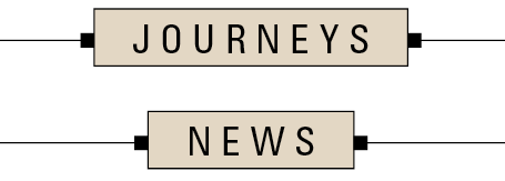
The Burns Effect solves a problem having to do with a “box” that automatically expands for text to fit in — not expanding by height, but by width. For example, here’s a field that we want to make wider or narrower, depending on the text placed in it:

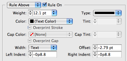
The Burns Effect actually mixes two different techniques. First, the box around the text is created by a combination of a really thick Rule Above and a just-slightly-less-thick Rule Below. By adjusting the color, offsets, and indents, you can make a “box” that surrounds the text quite nicely.


Diane admitted that this multi-rule technique is as old as the hills (I think I recall writing it up in a book on QX around 1990 or so). But the really cool part is how she handles those little knobby things on the left and right side! Those are anchored objects, anchored just before and just after the text in the box.

Each anchored object has its own settings, of course. Here’s what the one on the left side of the text looks like:

In other words, the right edge of that little black square frame is placed almost 8 pt away from the left edge of the left edge of the text in the “box” (where it’s anchored).
The only major caveat to this tip is that you should not click inside the frame and press Command/Ctrl-A to select all the text before typing the new word. Why? Because anchored objects are invisible characters and selecting all the text in the frame would select (and the subsequently delete) them. Oops. You could probably find a clever way around this via building a text variable that grabs the text and copies it into a different frame which would also contain the anchored objects. But that’s a lesson for another day.
Thanks, Diane!


“Burns Effect”, Very cute! Does it pan as you move around the page? :D
Very nice technique!
Very Cool Trick!
The Burns effect… I can’t say anything except “Excellent” *rubs hands* ;)
Very cool effect. Now, where can I use it first???
Cool! Long time looking for something like this for a caption. Wanted a sign like hanging down a picture. Guess this is what gets the work done the easy way!
If I want the anchored objects to appear everytime I have a heading in a box, can it be done automatically, without copy and pasting everytime?
Thanks!
Wonderful! Captions are now much easier for me and my colleagues!