

Three Previews in the Print Dialog Box


A little tip, but interesting.
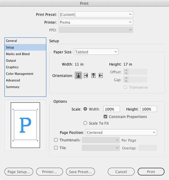
When you choose Print… from the File menu, you’ll see a little Preview window of your page in the lower left-hand corner of the Print dialog box. It doesn’t show page content, it just shows the effects of your Print settings on the document.
There are actually three different Preview types that can appear here. The one we’re all used to is called the Standard View. Click on it once to switch to Text View, once more to switch to Custom Page/Cut Sheet View, and one more time to go back to Standard View. Here’s a rundown of all three:

The Preview options, from L. to R.: Standard View, Text View, Custom Page/Cut Sheet View
- Standard View shows how your document Page size (what you chose for width and height when you created the document, aka the trim size) relates to your Paper size (the size of the print media – Letter, A4, Tabloid) listed in the Setup panel of the dialog box. It also shows the effects of tiling, thumbnails, page scaling, slugs and bleeds.
- Text View is a few lines of text that report the current measures and settings for Media size, Page size, scaling, thumbnails and tiles. The main thing I find useful about Text View is when I know the document’s page size is non-standard but I can’t remember the exact measure – 10″ by 9.75″? 8.75″ by 11.25″? Sometimes you need to know this to figure out the best way to print the page. Before I discovered Text View here, I used to cancel out of the Print dialog box, check File > Document Setup, write down the measurements, then start all over with File > Print. No more.
- Custom Page/Cut Sheet View varies depending on what you’re printing to. If you’ve chosen a custom page size (like you’re printing to an imagesetter), this view shows how the media fits on the output device and the settings for offset, gap and transverse. Otherwise, if you’re printing to a “normal” printer with defined media sizes (letter, A4, tabloid), it shows the imageable areas of the media size chosen – how close to the edge of the paper your printer can put ink on. In either case, this view also has a little icon indicating the Output mode currently in place for the document: Separations, Composite CMYK, Composite Gray or Composite RGB.
https://www.wsu.edu/~brians/errors/affect.html
;-)
oy, I can tell this blog is going to be tons of fun, with readers who proof text for a living. ;-)
Thanks for keeping me on my toes Dave! Hope I got ’em all.
Looks like you used some kind of change tracking software to make the correction because using Firefox, I can still see the crossed out “a”.
Dave
That’s done on purpose. It’s a blog convention to show edits to posts after someone has pointed out a correction in comments (otherwise their comments don’t make sense to new readers). Also sometimes used when a post is updated by the author, to alert people who’ve already read the post that there’s updated info in it. Added text is usually shown in a contrasting color but I was too lazy to do that in this case.
Good job I’ve not done much editing of my blog then isn’t it! I didn’t know about that convention.
Thanks,
Dave
Back on topic, just wanted to let you know that these scripts are GREAT! I spent part of this weekend creating a calendar template in ID CS2 for a client. The table scripts made it a lot easier to get the numerous tables (background grid, date entry table, etc.) I created for this thing perfectly sized and their columns perfectly “widthed” as I tweaked it.
[…] for seminar and conference info & registration links > Another post that’s related to tiling in InDesign, sort […]
[…] Site Original: Indesign Secrets […]