

Tip of the Week: Get the Gray Out of Your Gradients

This tip was sent to Tip of the Week email subscribers on July 10, 2014.

Sign up now and every week you’ll get a new InDesign Tip of the Week and Keyboard Shortcut of the Week, along with roundups of new articles at InDesignSecrets and CreativePro, plus exclusive deals sent right to your Inbox!
Just scroll all the way down to the bottom of this page, enter your email address, and click Go! We’ll take care of the rest. Now, on with the tip!
If you’ve ever made a gradient that went from a color to black in a print document, you might have been less than excited about the results. Take the example below, see how it gets drained of saturation as it goes from red to black?

That’s because the black end of the gradient was created with the black swatch, which yields just pure black ink. So for half the gradient you get a warm charcoal gray effect.
Instead, you can get a much “richer” effect by adding black to the red. In other words, use rich black for the black end of the gradient.
To do this, start by making both ends of the gradient the same color (in this case, red).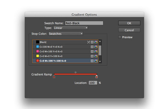
Then with the second gradient stop selected, switch the Stop Color from Swatches to CMYK, and drag the black ink slider all the way to 100% and click OK.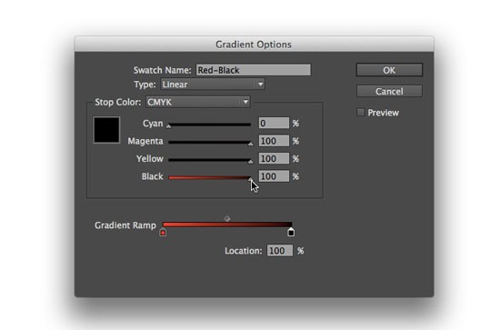
Now your gradient won’t be so gray!
Also, to stay on your printer’s good side, make sure the total ink amount in the rich black gradient stop doesn’t go over the limit for your intended output. Not sure what your total ink limit is? Ask your printer! They’ll be glad to tell you.
I rarely go to black, but this is well worth keeping in my pocket! Thanks.
It’s really good practice to use rich black where black is appearing as a block colour, or in headline type where it’s about 36pt or above.
Always apply to everything, gradient, block colours, large blocks of text etc. that’s appearing in black.
Always have a rich black ready in your swatches for these kind of things.
=================
As always – it’s best to consult your printers on what the “best build” for the rich black will be.
As with this build it’s using 3 colours – and reversing out type (putting white text) over this could be problematic depending on the print method (screen, flexo, litho, etc)
============
Nonetheless – sweet tip!
Brilliant – love all the tips.
Sweet Louise
This is one of those things I’ve just never figured out.
As soon as you said the end swatch was created with black, even before you’d given the answer, I’d figured it out… but I’d never figured it out on my own. After years of disgruntledly looking at my gradients.
Nice. Thanks
Would this also work in Illustrator. My gradients always look muddy.
This was a great tip, can’t wait to try it.
I knew this, but thanks for reminding.
Open the pdf, check your ink % there while talking to your printer (the guy/gal in the shop, my desktop printer never replies to me!)
Very interesting tip!
Interesting tip thanks!
A rich tip. Thanks.
This was a long time problem for me, so I used Photoshop to make my gradients.
THANK YOU VERY MUCH!
Technically more correct would bet to add over transparent-to-black gradient in Multiply mode. That will work more tech-savvy even if you don’t know what printer want’s from you.
That’s an alternative, but I wouldn’t say more correct. I’ve used it with a radial gradient to make a spotlight effect. You still have to be aware of the ink limit and you’d have keep the two objects aligned.
A situation where this is helpful, is when working with spot colors – if you are stictly using PMS colors in a document, you wont be able to adjust the black levels without converting the color to CMYK first.
Thus, more accurate.
Please i really need help where the * is that “gradient options” table ? I dont have anything like that in my ai on right side i only have table with name “gradient” and inside is only type, stroke, gradient line and gradient color nothing like you got here: stop color option… Thank you.
Double click on a gradient swatch in the Swatches panel to open Gradient Options. Or you can select the gradient swatch in the panel and choose Swatch Options from the panel menu.
Thank you for this! Just made my print a ton better.
One of the best tips I’ve had in a LONG time. And so bloody obvious the second you take a moment to think about it. Thank you very much.
Will this also work in large scale printing? I think it will give me a red tint to my black…
Because the printing is so big slight tints are really noticeable. We are sublimating onto garments and signs.
Thanks :)
But what if you’re going to a different color than black? You can’t apply this method. Its driving me crazy.