

Keeping our (Vertical) Balance…

InDesign CS5 really helps us keep our balance (and sanity). Working with vertically justified column text in the past (InDesign CS4 and earlier) has been a painful balancing act.

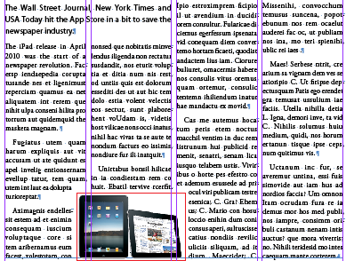
Balancing madness in InDesign CS4 (and earlier).
The following are some of the issues that affected our balancing sanity PRE Adobe’s Creative Suite 5:
- Text frame interaction with objects containing text wrap set to Wrap around bounding box or Wrap around object shape would set the vertical justification alignment option to inactive (Object > Text Frame Options), which meant the text frame setting could not be altered once interacting with the object(s).
- Depending on where the object with text wrap interacted with the text frame, the vertical justification alignment setting might be ignored, instead applying a top alignment. Enabling corner options on the text frame (Object > Corner Options) would do the same thing.
- Text across columns that had vertical justification alignment set to be ‘justified’ would justify nicely in all BUT the last text column. The last text column would display a wonderful (NOT!) accordion paragraph lines effect (well, that’s the name I’ve given it in the past? ;) ).
We’d be fiddling with leading, kerning, tracking, space before/after settings to try and get our columns nicely balanced? and after each document review phase (read: editors making changes to text), we’d have to repeat that balancing act… I am convinced this previous behavior has been the cause of stress for many!
If you are still experiencing this stress today, then please, please, please… upgrade to InDesign CS5 and you’re life will be back in the balance… Not only that, you can use a single column text frame (using split/span columns feature) to set the example below!

InDesign CS5, automatic column balancing justified text.
So what balancing changes do we see in InDesign CS5?
- Interaction with an object containing text wrap no longer affects the vertical justification alignment setting.
- Applying corner options to a text frame no longer affects the vertical justification alignment setting.
- Enabling the ‘justified’ vertical alignment setting, automatically balances all columns, the accordion effect in the last column is a thing of the past.
Yes, you don’t even need to enable the Balance Columns option (Object > Text Frame Options) when you set Vertical Justification to Align: Justified. InDesign just knows that it should NOT create a accordion last-column! How cool is that! You’d enable the Balance Columns option to set automatic column balancing for other vertical justification alignments.
Vertical balance and text wrap in InDesign CS5
What can I say! Thank you Adobe for helping all of us retain our sanity :) and bringing happiness and smiles into the workplace :)
The thing that pokes my eye with a sharp stick is the way the text doesn’t line up across the columns… horrible horrible :/
So… don’t use vertical alignment with more than one column and turn on align to baseline :p
@Christa
:-) I can’t argue against that :-)
In all honesty, the file I used to demo the justification/balancing changes in this post, normally has text aligned to baseline grid ;-) I disabled it for the screenshots :-)
Balancing columns, along with a few spanned paragraphs, in a document with more than a few pages of text is so slow (at least for me) as to be unusable.
Nice in theory, though.
Hi Ariel,
Aaahh, that’s no good.
Have you tried changing some of your preferences
E.g. Interface | Live Screen Redrawing and Hand Tool, Display Performance etc. to see if changing some of these makes a difference? (Also compare document in Normal and Preview modes and with overprint preview enabled etc.).
Otherwise I’d definitely report this ‘slowness’ to Adobe, esp if you have similar documents without spanning/balanced columns that perform faster. Give them your workstation details (System Mac/PC, OS-version, Ram, hardware processor etc.) and describe how many pages your document has, no of spanning columns etc. What display performance settings you are using and preferences settings, etc.
https://www.adobe.com/cfusion/mmform/index.cfm?name=wishform
Cheers,
Cari
Perfect, thank you!! I work on a small monthly magazine with a very short production schedule this is exactly the problem I’ve been having. And it’s exactly as frustrating as you describe. I just switched to CS5 and had no idea my problem was solved! Can’t wait to begin my next issue and not spend precious design time on workarounds to balance the columns.
Can we get back to good old fashioned layout where typographers laid out text and understood items such as leading and vertical space.
I do love loads of the features now available but can’t understand how the current crop of graphic designers have no understanding of the origins of type and how to make it work correctly.
Also, Adobe need to alter their vertical spacing to allow vertical space to be expanded or reduced around headings and sub-headings instead of feathering the leading which leaves text not lining up across columns.
@Niall – I totally agree with you!
I can definitely see some feature enhancements for the baseline grid that would help with alignment in future releases of InDesign:
* Align Last Line of Paragraph to grid. (currently we have ‘first line’ option).
* Ability to set Baseline Grid Increment AND subdivisions.
* In the Indents/Spacing section of Paragraph Style option we could then have:
** Align to Grid: None | All Lines | Last Line Only | First Line Only
** An option that can be selected that becomes active when Align to Grid is NOT None: Allow alignment to Grid Subdivision. This would give us more control over subheading/heading placement.
Totally agree! “Last Line Only”!
Niall,
have you had a look at TypeFitter Pro? This plug-in for InDesign adds advanced typefitting but also balancing controls to InDesign. I’ve worked with it in the past and was quite impressed with it. Not sure how it integrates with baseline grids, but might be worth a try?
still having issues with CS5.5, columns and text wrap, the column at the left side-bottom of the image seems to add one more line brake than the right side bottom. why? what am I missing?
hi, i’m going nuts here trying to unset some sort of preset text balancing that must be on. I have a simple 3-column set of type and the last column insists on forcing a space on the top, presumably because the last column is shorter than the preceding two. When I try to delete the ‘return’ it just runs the type into the previous sentence, REALLY messing it up!
i’m an old Q pro trying to make the switch and this is making me crazy. Any ideas? (thanks in advance!)
@jana: Hard to say, but maybe the Vertical Justification setting in Object > Text Frame Options is set to Bottom?