

What’s New with InDesign CC 2017

Small tweaks and fixes—along with a new file format—mark the 12th major version of InDesign.

Adobe seems to have some confusion about dates. Throughout 2016, the most up-to-date versions of InDesign CC have been called InDesign CC 2015. Now, just before the end of 2016, a new version arrives called InDesign CC 2017 (Figure 1). I think we can attribute this to the strange quirks of Adobe Marketing.
This new version is significant because it’s a major update that requires a new file format version. This means that if someone using InDesign CC 2017 creates a new file, and you open it using an earlier version of InDesign CC, the Creative Cloud will convert the file to your older version. (There were five versions of InDesign CC 2015. No conversion was necessary between those versions.) If you’re unfamiliar with the process, I’ll explain how it works at the end of the article.

Figure 1: Do not adjust your calendars; “2017” is arriving a little early.
That said, even though this is considered a major update, longtime users will be disappointed to hear that there are very few new features in this release. Instead, this update concentrates on bringing enhancements to existing features—including footnotes, OpenType features, arrowheads applied to strokes, and the appearance of the user interface.
Support for Spanning Footnotes
Ever since InDesign’s footnote feature was introduced, footnotes inserted into multi-column text frames were always placed in the same column where the footnote reference appeared. For many years, users have been asking for the option to span footnotes across all the columns of the text frame.
Now, in InDesign CC 2017, you can choose either column-wide footnotes or footnotes that span the full width of the text frame. You can also mix the two styles of footnotes in the same document (Figure 2).
Figure 2: You can now create both traditional single-column footnotes or footnotes that span the width of a frame.
In the Layout panel of the Document Footnote Options dialog box, there is a new option: Span Footnotes Across Columns. Choosing this option establishes a document default for all footnotes to span the width of the frame.
If you open an existing document, footnotes will behave as they have in the past, unless you select the new option to span columns. For a new document, the Span Footnotes option is selected by default, but you can match the old behavior by deselecting the option with no documents open.
You can override the document default in the new Object > Text Frame Options > Footnotes panel for the current text frame. To override the document default, select Enable Overrides, and check or uncheck Span Footnotes Across Columns. This same panel also includes the choices for Minimum Space Before First Footnote and Space Between Footnotes (Figure 3).

Figure 3: You can override the document footnotes setting in the new Footnotes tab of the Text Frame Options dialog box.
To support this new feature, there is also a new object style option: Text Frame Footnote Options. In addition, this same option is found in the Find/Change Object properties.
Applying OpenType Features Contextually
OpenType fonts can include a wide variety of typographic features, but until now, it was a bit of a hassle to find out which OpenType features were available in a particular font. You had to go to the Control panel or Character panel menu, choose OpenType, and then check a list of possible OpenType features (sometimes in a submenu) to see which ones were available for the current font. In particular, stylistic sets (discussed below) were very difficult to use (Figure 4).

Figure 4: The traditional way to view and turn on OpenType options requires navigating though lots of menus.
InDesign CC 2017 builds on earlier OpenType enhancements, and it’s now possible to see contextually which features can be applied, and to apply them directly.
Adding an OpenType “Adornment” on Text Frames
The little widgets attached to objects in the InDesign interface (such as the in and out ports of text frames) are technically called adornments. They let you choose options “in context” instead of going to a menu or dialog box. Adornments we use already include the little blue box (Anchored Object Control) and yellow box (Live Corners) already on our frames. InDesign CC 2017 adds another adornment at the bottom right of a text frame to allow you to view and apply OpenType features (Figure 5). It uses the slanted “O” icon, already found in font menus, which indicates an OpenType font.

Figure 5: A new OpenType adornment gives you “in context” control of OpenType features.
If you select a single unlinked text frame, InDesign will try to determine which OpenType properties are applicable within that frame and provide options for you to apply them. (If your frame doesn’t contain an OpenType font, you’ll get the message, “OpenType properties are not applicable.”)
Clicking on the OpenType adornment opens a contextual menu showing a list of applicable attributes. You can choose to turn on attributes within the frame from the menu. The display will also attempt to highlight which characters will be affected by a particular attribute. In Figure 6, discretionary ligatures and OpenType fractions have already been checked, and a preview of those features shows in the display.
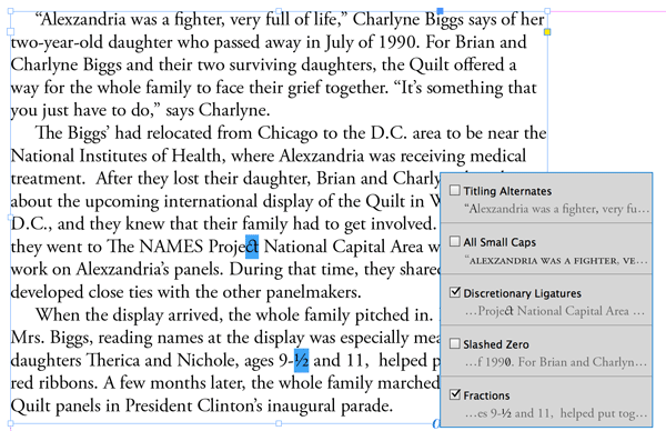
Figure 6: When you click the adornment, you can preview and turn on available choices.
In fact, the adornment is also available when you make a selection with the Type tool, and it appears at the bottom right corner of your selection.
Notice in Figure 6 that you may still have to tweak the type. Selecting Fractions in the contextual menu could convert every combination of “number-slash-number” to a fraction—even dates such as 9/11.
Contextual Menu for Ordinals and Ligatures
The InDesign CC 2015.2 update brought a contextual menu for alternate glyphs and for OpenType fractions. InDesign CC 2017 adds similar contextual menus for ordinals and discretionary or standard ligatures.
For example, if you select a letter pair like st in the word start, and a discretionary ligature is available in the current font, it will be suggested and can be selected (Figure 7).
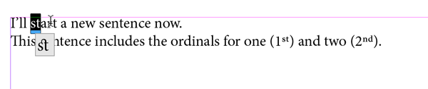
Figure 7: Contextual menus are now available for ordinals and ligatures.
Similarly, if you select a number such as 1st, 2nd, 3rd, etc., the menu suggests the ordinal versions if they are available in the current font. Currently, this feature is only available for the English language.
Using the Mysterious OpenType Stylistic Sets
Some OpenType fonts with many alternate characters have them grouped into stylistic sets. This rather mysterious feature is finally made accessible and understandable in this InDesign release.
Stylistic sets are preselected groupings which allow for the global insertion of anywhere from one to twenty sets of alternates. This eliminates the task of selecting each alternate character individually, which is time consuming in large amounts of text.
Unlike with character styles, you can apply more than one stylistic set to a single block of text. Turning on each additional set adds new alternates.
Some earlier OpenType fonts (such as the richly styled Gabriola font from Microsoft) may simply number the sets: Set 1, Set 2, Set 3, and so on. That makes them particularly mysterious, because you have to experiment to discover what the set actually does.
Other more recent fonts give meaningful names that make them easier and more efficient to work with. For example, Hypatia Sans Pro has 14 stylistic sets with names such as “Stylistic set: sans serif forms,” “Stylistic set: simple lowercase forms,” and so on.
In previous InDesign versions, if a font had named stylistic sets, only their numbers were displayed, and the names were ignored. Now they are named wherever they are referenced in InDesign. You’ll see them in the Glyphs panel Show menu (which displays glyphs by their attributes), in the Character and Control panel menus (OpenType > Stylistic Sets), and in the Character Styles and Paragraph Styles OpenType Features entries.
Even better, when combined with the OpenType contextual menu for a text frame or selection, you can see where the alternate forms will be applied, and turn them on and off easily. Figure 8 shows an example of two alternate glyphs for the letter a, one of the many sets included in Hypatia Sans Pro.

Figure 8: It’s now easy to see which stylistic sets are available in a font and to preview their effect. Above (top), you see the default lowercase a in Hypatia Sans Pro. Underneath, you see a preview of the alternate glyph “simple a” in Hypatia Sans Pro.
Turning Off Contextual Controls
Of course, not everyone wants to see the various adornments that InDesign turns on by default. Fortunately, you can turn off the Live Corners and Anchored Object Control adornments in the View > Extras submenu. Strangely, the new OpenType adornment is not listed there.
Instead, there are two new controls in Preferences > Advanced Type that let you turn off the contextual OpenType displays. The first one turns off contextual controls for character alternates, fractions, ordinals, and ligatures. The second one turns off the OpenType adornment on text frames (Figure 9).
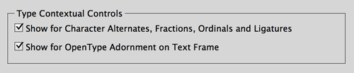
Figure 9: Advanced Type preferences include controls to turn off OpenType contextual displays.
Arrowhead Scaling Control
Adobe Illustrator’s Stroke panel options were similar to those found in InDesign, but Illustrator has always offered more control over arrowhead scaling. Specifically, InDesign lacked the ability to do the following four things:
- Scale beginning and ending arrowheads independently
- Link the beginning and ending arrowheads so they could be kept in proportion as they are scaled
- Swap the start and end arrowheads
- Control how the arrowhead tips are placed in relation to the path ends
All these features are found in InDesign CC 2017 (Figure 10).
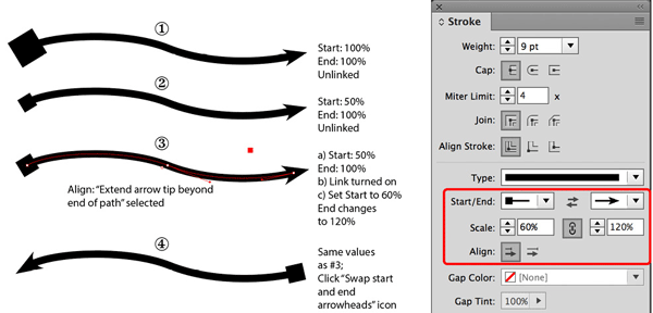
Figure 10: New arrowhead scaling controls in the Stroke panel now match those in Adobe Illustrator. #1, Start and End values both set to 100%; the Start value appears out of scale for the stroke weight. #2, with the Link option deselected, when the Start value is changed to 50% to produce a better result, the End value is not changed. #3, to scale both Start and End in proportion, click the Lock option. When the Start value is set to 60%, the End value is automatically changed to 120%. #4 has the same values as in #3, but the “Swap start and end arrowheads” icon is clicked.
Now, both the beginning and ending arrowheads have an option to set the percentage of scaling, found underneath the appropriate Start/End menu of arrowhead choices in the Stroke panel. As in other places in the InDesign interface, a “link” icon can be turned on or off. This time, the link is called “Link start and end arrowhead scales.” When the link is clicked on, if you enter a new value for the start arrowhead, the end arrowhead scaling will change in proportion.
Arrowhead alignment options
In addition, there are two new Align options: arrowheads can be aligned so the arrowhead extends beyond the path end, or aligns just to the end of the path. This setting applies both to the beginning and ending arrowheads. In example 3 in Figure 10, I selected the former option (and selected the Direct Selection tool to show the path ends).
Conveniently, this feature is also found in three other areas of the InDesign interface:
- Object Styles Stroke & Corner Options
- Find Object Format Options in the Object tab of the Find/Change dialog box
- Eyedropper Options (double-click the Eyedropper tool); three new choices here are arrowhead tip alignment, scale factor for start arrowhead, and scale factor for end arrowhead
Reducing Eyestrain Redux
In the most recent release of InDesign CC 2015 (2015.4), various controls were increased in size and spaced farther apart. Making the controls larger worked well for users of HiDPI or Retina displays, but it caused havoc with others on older (and smaller) displays.
Because users can now see fewer controls on the Control panel, the Customize control (already available) has been made more discoverable. The control is now visible as a “gear” icon on the right end of the Control panel above the panel menu. Clicking it reveals the appropriate tool widget choices immediately, so less useful ones can be turned off.
Many users also complained that the height of window tabs (where the filename appears) had become too large. So there is a new preference: Preferences > Interface > Panels > Large Tabs, which can be turned off to make them smaller.
Hyperlink Performance Improvement
If a document has hyperlinks with destinations in other documents, InDesign must open those documents in the background to check them. Unfortunately, in long documents with many hyperlinks, this makes basic operations, like opening the Hyperlinks panel, scrolling through it, or editing hyperlinks, very slow.
The engineers have refined the algorithm for this process, and it has become much more efficient, giving a much improved performance over previous InDesign versions.
Opening InDesign CC 2017 Files in an Earlier Version
In the InDesign CC 2014.2 update (January 2014), a new feature made opening files from newer versions possible if you have a Creative Cloud subscription. If you are using the subscription version of CS6, or InDesign CC, CC 2014, or CC 2015 when you attempt to open an InDesign CC 2017 file, you’ll see a dialog box telling you that the file needs to be converted to your application version. It also warns that features in the newer version may be modified or omitted. All you have to do is click the Convert button, and the Creative Cloud will convert it.
InDesign CC 2017: Small Steps Forward
While this new release offers only incremental improvements, many of them are in response to long-standing feature requests. Try them out, and I think you’ll be pleased, especially if your documents include footnotes, hyperlinks, OpenType fonts, or arrows.
״ especially if your documents include footnotes, hyperlinks, OpenType fonts, or arrows.״ – That leaves me out, and indeed I’m not pleased… :(
I agree with you, I can live without the footnotes, improving hyperlinks, OpenType fonts, or arrows … I know that “we can’t please everyone”, but i thought they were going to bring deeper improvements we asking for years as export and import layers between documents, improve the Data Merge panel, and above all advance interactive digital documents as it is doing QuarkXPress that exports to HTML5 format without additional plugins.
I Expected more advances in digital format publications such as mentioned HTML5 or expand the interactive features of the Overlays panel and especially better interactivity with Adobe PhoneGap as does into Dreamweaver.
I’m relieved — and honestly, a little surprised — that Adobe has corrected their mis-step regarding the interface preferences. When that rolled out it was immediately obvious that it need to be an option (binary, if not incremental controls). Glad they sorted this out in such short order.
As for the 2017 naming, it makes sense because they’ve now aligned themselves more with magazines or cars, which always pre-empt the actual year or month (almost to a silly amount). It’ll take a lot of studios a few weeks to get caught up, so maybe 2017 is the most accurate way to sort it.
Unfortunately, the “fix” does nothing to resolve the problem. They took a few pixels out of the palette tab height, but even that size is still larger than it used to be. Nothing else was fixed, so most of the UI elements still take up 15-20% more space than they did in CC2015.3 and earlier.
Even if I had a HiDPI display, I would still want the UI as unobtrusive as possible. Get rid of every extra pixel and give me more room for my work, please.
Thanks for the recap, Steve.
I haven’t downloaded it yet – do we need to remind people to set prefs not to remove earlier versions?
Also, do you know if it supports footnotes in table cells?
The installer says pretty clearly that just clicking Install will remove the earlier version. As before, clicking Advanced Options lets you turn that off. Thanks for the reminder though.
Footnotes in table cells didn’t make this release. Hopefully, that will be in the next one.
When I and the ID design team were both in Seattle, they invited me in to offer suggestions. I was delighted to see that most were incorporated, particularly bi-directional searching.
Apparently, no one in a similar situation to mine was in a position to push the new ID-2017 team for features that many of us would like, including endnotes and an indexing interface that’s not hideously clumsy. There’s nothing in this annual upgrade that I’ll even use, much less need. As the article noted, this is just “small tweaks and fixes.” Disappointed again. Given that major upgrades often have bugs, I going to wait for the next incremental update. No use taking a risk for nothing.
Those who’ve had trouble with sluggish performance in the 2015 version might want to weigh in on whether this fixes that. I’ve got my own fix on order, a 440GB SSD from Other World Computing that set me back only $200. I seem to recall an SSD that large costing around $1000 not long ago.
I also told Seattle’s ID team the fix I’d like most, a tablet-based UI that’s task-centric not just panels moved to an iPad. One would solve that index entry problem because it would be specifically designed for entering index entries. Another would make assigning paragraph styles faster. It’d list the most recent styles assigned. Tapping a style in an easily scrolling list on an iPad would assign that style and jump to the next paragraph. That’d be a lot better than dancing all over the screen with a mouse, clicking here and there endlessly. I spend hours doing that.
Apple is partly to blame for that iOS-to-macOS UI deficiency. The time and money it wastes on creating new emoticons would be better spent adding the ability to use iPads as a powerful user inferface to Mac apps. They’d sell more Macs and iPads as a result. The sales of both are down because increasingly innovation at Apple means something that seems intended for what storybook writers call, “children of all ages.”
Adobe needs to make a choice. If ID development is going to continue to be this underfunded and slow, then it needs to charge $10/month for a single-user license. The list of enhancements above simply isn’t worth the over $240 we’ve paid Adobe since ID 2015. For me, it’s worth exactly nothing.
I just got an email from Adobe. Their Adobe Max keynote is about to stream live from Youtube:
https://www.youtube.com/watch?v=TtBVg4kxViM&feature=em-lss
–Mchael W. Perry, author of the just-out Embarrass Less: A Practical Guide for Doctors, Nurses, Students and Hosptials (and perhaps easily embarrassed patients)
For those of us who still do book design and typesetting, the improved footnotes (with more improvements on the way, apparently) is great news and well overdue.
Footnote functionality has stayed the same since CS2 (!!). It’s finally getting some love, and that’s great.
I like it!
Love? Not very much love! No footnotes in tables, no endnotes, no run-on footnotes. Extremely disappointed in this release.
And no ability to easily accomplish non-consecutive footnote numbers for excerpted material in casebooks. Still having to do an extremely hacky and cumbersome workaround. NOT HAPPY.
Absolutely agreed. How many YEARS now have we been asking for dynamic endnotes? It’s absolutely ridiculous. Endnotes have been a mainstay in books for decades now, and we still can’t do them without a lot of work in this software.
They’re working on it, and have promised footnotes in tables soon. Things are moving.
That’s a long article for such poor release again.
I’ll add one additional suggestion. If Adobe, for whatever reason, doesn’t want to fund faster InDesign development, then it might consider another option as an alternative to a price change to $10/month. That’d be a $20/month plan that includes InDesign and one other major app, either of the user’s choice or perhaps Photoshop only.
The latter change would not be that great. CC already offers Photoshop at $10/month with a year’s contract. ID users would be getting that same deal but without that mandatory year contract.
The best solution might be two plans:
1. A $10/month plan that’s ID only. As with the $10 Photoshop plan for photographer, that would draw in writers who find $20 a month to much, but like Adobe’s power and multi-platform export capabilities. InDesign Secrets might find itself in a lively market providing templates and training for those authors.
2. A $20/month plan with ID and either any other major app or Photoshop only. That plan would be more attractive to those like me who do book layout professionally. The other CC app I find myself wanting most often is the marvelous Photoshop. I’ve got a CS3 version I can use, but it’s showing its age and is a bit buggy.
—
I agree with Ariel that it is good to see Adobe finally giving ID’s footnoting features some attention and, having exposed its innards, perhaps they will do more tinkering. But I layout science books that aren’t multicolumn, and scholarly books are a grind. I must wrestle with ones that have several thousand endnotes. I need an ID with powerful endnoting features. I have to freeze a book’s notes on submission because, once finalized, changing the numbering is a pain.
Michael,
Re: the endnotes, please see this discussion:
https://creativepro.com/topic/convert-endnotes-to-cross-references#post-89503
Peter Kahrel has a great script for creating dynamic endnotes that auto update if you add or remove one. I just used it on a book with 500 pages and thousands of endnotes in addition to hundreds of footnotes. Feel free to contact me if you’d like to know more about it.
Thanks Matt. That may be the script I’ve used in the past. If I recall correctly, it did have limitations.
And in the end, this is getting old. I’d like to see Adobe give ID an yearly update that’s not mere tweaks to existing features. The CC process is not working with ID. Development went much faster when they had to convince us to buy. Now Adobe takes about the same amount of money, at least $240/year, but delivers far less.
Apple’s upper management seems afflicted with artsy minimalism. Adobe’s seems obsessed with flashy new products rather than meat and potatoes ones like ID.
I’ve had Adobe keynote playing in the background without sound, and I’ve not noticed the ID portion. It can’t have taken up more than a couple of minutes.
Long ago, people used the expression “red-headed stepchild” to refer to the neglected kid in a family. ID is starting to look like Creative Cloud’s red-headed stepchild.
Michael – believe me I have argued for years that Adobe has neglected InDesign users. They started out as a type company but lost their identity and their soul many years ago – not to mention that they are now practically a 100% Indian company.
I have argued for serious, bread-and-butter production improvements, such as better control of line breaks, hyphenation, orphan control, etc. and for them to do something about the godawful Charts feature in Illustrator. But they only care about sexy features that increase their stock price. They don’t give a crap about endnotes. They consider InDesign a “baked” product and see no need to really improve it, but they keep “upgrading” to keep us paying the monthly fee.
The switch to monthly subscription was a TERRIBLE thing for users and a GREAT thing for Adobe’s cash flow. Now they are no longer required to actually give us anything; they’ve got us trapped. Used to be if the new version wasn’t significantly improved, nobody would bother buying it.
Matt wrote: ‘… the godawful Charts feature in Illustrator’: Using this — and I do every day — is like walking at dusk across an overgrown vacant lot full of discarded refrigerators, rusting cars and rotting mattresses.
Year after year, I don’t hope that the InDesign new update finally allows it to make delicious “cappuccini” instead of the barely drinkable beverages systematically fulminated by some! On the contrary !!
… Thank you M. Adobe to allow me to play with this amazing software! I love you!
(^/)
>That’s a long article for such poor release again.
The things I love the most are the new OpenType features (worth the time to explain them!) and the Arrowhead options which I already liked in Illustrator.
But these new Opentype features are really piddly compared to giving us serious typographical improvements. Where is orphan control? What about fixing the hyphenation dictionary? What about learning how to break URLs correctly? What about endnotes? What about refinements to how it does line breaks?
Choosing alternate glyphs strikes me as something they did only because it was easy to do, not because anyone needed it. They figured it would satisfy those of us wanting type improvements but it just shows that they don’t really even know anything about how people use the product.
It’s not against your article but about the Indesign features lack releases since the CC while there are so much room for improvement. It’s not a dot release, seriously it’s like if Indesign is actually maintained by just one or two developers. Disappointing, I am looking forward to Affinity Publisher.
I watched the keynote and all the “exciting’ improvements for Lightroom, XD (Beta); Spark, Premiere Pro etc., and whereas they are really great improvements, no doubt whatsoever, it left me feeling as though InDesign is just a poor relation.
It’s all very well to introduce these new apps accompanied by the mandatory bells and whistles. However, Adobe has completely ignored the fiasco QuarkXPress experienced and is just riding for a fall. They should remember that no company is too big to fail…
Delighted to see footnote get some love. I have campaigned a long time and pointed out earlier this feature had not been updated since CS2!
Arrowhead improvements is great.
Finally Adobe are giving some features not updated in a very long time some attention!
I’m nearly at the point of moving away from indesign. Cost over performance is a major factor.
Just curious: You say you’re nearly at the point of moving away from ID, what would you move to? QuarkXPress?
I’ve been exploring Affinity lately. It’s not mainstream but on forums I frequent it’s piqued my interest and I’ve dabbled in it.
Affinity has been hinting at an InDesign competitor for well over a year. If it’s anything like Photos and Designer, Adobe should be nervous.
I have been watching Affinity as well. Apparently ‘Publisher’ is to be in beta in 2017.
But, if we move to another app, what we will going to do with all our indd files? Will Quark ou Affinity import inDesign files? After all these years, I have, maybe, thousands… I think I’m chained up to Adobe… forever.
What about endnotes?
And thats all ? again? maybe its time to leave indesign if they dont want to develop it more.
I feel so sorry for anyone who wasted thousands of dollars going to Adobe MAX Disappointment.
This was my first AdobeMAX and I thought it was fantastic. I didn’t get anything out of the Indesign sessions (other than the thought that I should be teaching) but the other labs and sessions were very useful. The 2nd day keynote was great.
Having all sorts of grief assigning Space After to highlighted text in a text box.
Previous releases it was highlight text and enter Space After amount inControl.
For some reason the dialogue box in Control is greyed and it deletes the text in the text box.
I can’t always enter a second digit i.e. the zero in ’10’.
Seems to happen in the Paragraph pane too.
You might want to post this issue in our forums, Matt, where more people will see it and could help you out.
I’m glad it’s not just me. I posted in the Adobe/InDesign forums with that exact same issue and have yet to resolve it, even after rebuilding preferences. Here’s my Adobe Forum thread: https://forums.adobe.com/thread/2231628
Thanks guys, me too! Sorry for my latest post about it down the thread… there’s so much discussion here!
They’ve found a solution: Preferences > Advanced Type, UNCHECK the ‘Show Adornment on Text Selection/Text Frame for more Type controls’.
Photoshop: new UI, Illustrator: new UI, InDesign…
Yet again a crappy release. I really don’t get it. I suppose that currently there is no serious competition and yes, we are now all paying every month/year so who cares.
Fortunately there are some very talented scripters out there, and I have bought a number of Ariel Walden’s commercial script and often use Peter Kahrel’s endnotes scripts. But seriuosly? Even DavkaWriter handles footnotes better than InDesign.
Really disappointed with what I’ve read about this update. For the amount one pays for subscription, html + css + Prince is becoming more an more attractive. I do quite a bit of epub and html based work and working in html often feels more productive than ID for many book. If only publishing clients were not so fixated by ID for all books.
In French!
Mot d’humeur :(
“Quand on veut le beurre, l’argent du beurre et la crémière en sus, on devient crémier !”
InDesign est un soft fantastique ! Avec, comme tous les softs, des manques et des défauts !
… Mais avec surtout une très grande pléiade de scripteurs et d’experts passionnés qui le secondent en permanence avec talent, des sites et des forums remarquables, comme indesignsecrets.com ou encore ceux d’Adobe !…
La réaction d’Ariel Walden, auteur brillant de scripts et notamment de “Footwork” [https://www.id-extras.com/products/footwork], est typique de l’état d’esprit ambiant : il y a ceux qui piétinent, devant la crèmerie, à attendre les mises à jour et à râler, et il y a ceux qui, par leur travail, leurs connaissances, leur savoir-faire et leur imagination, aspirent à devenir crémiers !
J’ai choisi cette seconde voie ! … et j’adore les gâteaux à la crème !!!
(^/)
with respect, scripts can be amazing, but things like footnotes and endnotes are best when they are built in to the program.
Raphael, maybe but, imho, the real question is: What do we need to basically find in inDesign?
Some people would like to have layout features as Word can do as this:
https://www.youtube.com/watch?v=_SZCMRIqHeA
ID can’t really easily do it! … and if the users wait for it, RIP! ;-)
What lacks to many, it is imagination!
Thanks Obi-wan! May the force be with you…
I agree also with Raphael that footnote features are best built into the software itself.
Nevertheless, if you’re doing a book with hundreds of pages that has multi-column, or run-on, footnotes, Footwork is definitely the way to go — even for CC 2017 users!
Aha! Yeap! 2 positive guys lost in a depressed world! =D
When the floppy-disk disappeared computers! …
When Adobe has stopped to update FrameMaker OSX! …
When VHS has disappeared! …
…
When I look at my main computer, a mini Mac with 4GB Ram, I smile with tenderness!
I have never been so powerful!
MTFRWM!
(May The Force Remain With Me!)
(^/)
I think InDesign as typesetting software should be able to handle basic text functions and even some sophisticated text functions!
No endnotes? Seriously? Still after all these years?
Most technical documents have tables with footnotes. Again no support?
How about the ability to have italics in a running head? Does nobody need this?
So yes, Harbs has a script to do italics withing running heads, this but it takes several minutes to run and you have to run this multiple times. If it was built into InDesign then it would be instant.
It’s been how long since InDesign came out? I would have thought that by paying for an annual subscription we can do better than, er arrow heads.
Even Word has endnotes!
hahahaha … I remember when people said, “even Word lets you put shading behind paragraphs!”
Ha, ha, ha!!
Even if sometimes I’m a little annoyed as you, this doesn’t prevent me from sleeping!
I would say even more: life is more funny with these issues! =D
E.g.
https://forums.adobe.com/thread/2217618
https://forums.adobe.com/thread/2193484
https://forums.adobe.com/thread/2191815
…
(^/)
An interesting feature of the new footnote feature is that you can now set the space between text and footnotes on a page-by-page basis. (This was possible earlier by fiddling with the keep options of the last paragraph in a frame, but that was always problematic if the text changed.)
Peter
okay, to be fair that is useful :-)
It is very helpful to see that they addressed footnotes. That is a useful improvement.
It’s too bad this thread has turned into such an Adobe gripefest, but the fact is that just this same week we professional Mac users found out that Apple seems to be ignoring our needs (new iMac? MacPro? I need 2 new computers and don’t want to be stuck buying anything they currently offer!) And now Adobe releases a “major” upgrade with footnotes and arrowheads.
They should call this one InDesign head & foot. It just makes me suspect that nobody at Adobe actually uses InDesign for print production. They don’t seem to know (or care) what we need.
For 20 years I’ve been asking for better graphs. I can imagine a scenario where Adobe made it so easy to create attractive graphs in InDesign that corporate administrative people all over the world stopped making those ugly PowerPoint and Excel graphs and became CC subscribers. It seems to me like Adobe has missed a HUGE business opportunity by ignoring that obvious market. Instead they focused on iPad apps, and what a total waste of time that was!
I can only call it very poor leadership, focused on glitzy features that sound buzz-worthy to investors who know nothing about working with the products.
Quark moved all its operations from the Western USA to India, expressed complete disdain for the customer, and soon became obsolete. Sound familiar? Adobe has been the new Quark ever since they went to monthly pricing.
I hear people talking about Affinity . . . I’m still waiting to see their publishing app, but if anyone can make something that works decently, and free us from paying monthly tributes to the emperor Adobe, I can easily imagine millions of people jumping at the first chance they get.
>For 20 years I’ve been asking for better graphs. I can imagine a scenario where Adobe made it so easy to create attractive graphs in InDesign that corporate administrative people all over the world stopped making those ugly PowerPoint and Excel graphs and became CC subscribers. It seems to me like Adobe has missed a HUGE business opportunity by ignoring that obvious market.
I just evangelized at Max to anybody from Adobe who would listen about my product request: Adobe Dog and Pony. Use the underlying tech from INDD–animations, transitions, drawing, tools, etc. Wrap it in a new, presentations-oriented UI, export to PDF, and purchase or develop a killer charting tool (a seriously good one, please) than can also be used with AI and PS, and you can kill PowerPoint. Aside from the UI and the charting, they already have everything else!
With the greatest of respect, InDesign is allegedly the industry standard, so how is it that Microsoft’s Word and QuarkXPress 2016 both have endnotes but InDesign…? Hello! Is anyone listening at Adobe? I very much doubt it!
So far this year, I’ve dumped Photoshop, Illustrator and Acrobat and replaced them with Affinity Photo, Designer and PDFExpert. And I haven’t missed Adobe’s apps one iota! Now I’m just waiting to see how Affinity Publisher shapes up before I make a decision as to whether I go for QuarkXPress 2016 or Publisher.
As InDesign is a bread and butter app, why is Adobe so disinterested in developing this app further? Is the company going to phase it out as they did with DPS Single Edition? It makes one wonder…
It’s highly unlikely that Adobe will phase out InDesign. They know it is a cash cow, generating ample income from a host of seats at any company that needs to created printed material, including business far removed from publishing. The real danger is that what’s happening now will continue, that Adobe will go on using ID to fund their executives’ pet projects, including:
1. Subscriber services. Yeah, they’re all plunging into this. For Adobe that’s fonts and stock photos.
2. Flashy stuff to brag about to an inner circle. Think thin phones and laptops (Apple). Think glitzy new visual manipulation tools (Adobe). At times these corporate exceutives remind me of small children in their obsession with flashy and new.
If you want a parallel, imagine a world where carpenters can no longer purchase useful tools. They’re forced to sign up for on-line wood and nail suppliers at $X a month. Even worse, when a hammer wears out, they find that the only replacements they can buy are inadequate in weight and length from framing work or that come without a nail puller because the hammer maker has a designer who wants to achieve what he calls the “simplicity and purity of expression that is the essence of hammerness.”
Look on the bright side. At least your ID CC subscription isn’t funding the development of self-driving electric cars or drone delivery.
Anita, are you creating print pieces with Affinity? How much vendor support is there for it?
Karen: Affinity Publisher hasn’t been launched yet, so I can’t comment on that. However, it’s rumoured that it will go to beta in 2017. But I must say the support from the Affinity team is excellent, as they actually answer emails!
This week they sent a link for a new set of tools for Designer and also the chance to purchase their manual at 20% discount, and they keep people posted as to improvements, etc.,
and just to rub salt on the wounds, I have just found out that one of my custom extensions will no longer work with 2017 because they don’t support Flash any more!
Which extension is it?
Another reason a major upgrade is a PITA for those of us who use a lot of plugins – it forces the plugin makers to upgrade all of their software, and often we have to pay for upgrades, and all for what? two minor features?
The sales pitch was that with the monthly pricing, Adobe would roll out new features as they became available, rather than waiting for major upgrades. They’re on the old software cycle, but we’re stuck paying for the monthly bill. BAIT AND SWITCH!
it was a custom script that was made by In-Tools and they even demoed it to Adobe at some Flex conference some years ago (I’m sure I have those details wrong). So with all respect to Obi-wan, custom scripts and extensions have their limitations. And yes the poor developer have to spend serious time and money to update.
I’ll add some remarks based on my contacts with Adobe’s ID team when I lived in Seattle up until August of 2012. I was impressed with how committed they were to improving ID and how eager they were to listen to my suggestions. The hitch, as they repeated told me, was getting the funding from Adobe to make those improvements. The problem does not lie with those tasked with maintaining and improving ID. Even with the move of ID development to India, I suspect that people who work on a app still care about it.
No, what’s happening in the tech world is much like what’s been happening in cultural and politics in the more developed countries at least since the 1990s. In area after area, a self-aware elite regards itself as superior to the great mass of people, looking down on them and sneering at their desires to have a say in their lives. The fuss in Europe over mass immigration from areas of the world whose cultures are most un-European is one illustration. Whether the laws of Europe should be determined by a bureaucracy in Brussels or by a country’s citizens is another (hence Briexit) is another. Here, a good illustration is the dislike most Americans have for Obamacare. Indeed, the conflict explains much of the popularity of The Hunger Games. That’s the ultimate outcome of these trends. A few live in luxury in a central city. Most struggle at dismal jobs in the hinderlands, their feelings deadened by entertainment.
What we’re seeing might be called The Cologne Effect, after the horrors that were inflicted on young women in Colgne Square last New Years Eve. The uniform response of the city’s officials and the local news media was to cover up sexual attacks on over six hundred women. The story only came out thanks to independent, Internet-based media outlets. To admit those attacks occurred was, for this elite, to admit that they were wrong to bring in a huge number of mostly poorly educated, single young males from a part of the world where women are treated badly. This is an elite that does not admit error.
In technology, it’s most visible at Apple, where new products come with useful features removed to fit some goal that the company’s upper-management attaches great value. For the iPhone, the headphone jack had to go to maintain thinness. For the latest MacBooks, ordinary USB ports had to go to drive the adoption of USB-C.
Note too how Apple’s upper-management dismisses, in clumsy fashion, the protests of users burdened by these changes. There is a reason. While users regard their devices as tools, Apple’s upper-management regards their customer base as tools, objects to be used to drive their “vision” of what the future should be like. That is why it matters not that their “vision” imposes costs on others. It’s even highly likely that Apple’s “vision” is molded to benefit Apple’s profitability. Both the changes I mentioned mean more lucrative peripherial sales by Apple. There’s a clue in another area. If Apple is really interested in driving the adoption of BT headsets and USB-C forward, why isn’t it highly discounting those products or offering them free with the sale of these now-castrated products?
In short, these elite visions, while stated in grand terms, benefit the elite. EU policies hurt blue-collar and unskilled workers in the UK by bringing in cheaper laborers from elsewhere. (The elite gets cheap plumbers, housekeepers and nannies from Eastern Europe.) At the same time an elite who earned large salaries in a London that is a “world city.” Also, keep in mind that while they feign loyalty to the world, what they’re really doing is going where the labor is cheapest. Indeed, I suspect that the chief driving force behind self-driving vehicles and drone delivery is to remove one of the few remaining areas where blue-collar workere can earn good salaries. Long-distant trucking and your local UPS driver have jobs that can’t be outsourced to China. This elite wants to move up by pushing others down. Indeed, it assumes an inalienable right to do so.
Adobe is playing much the same game. For a time, I thought that maybe InDesign use wasn’t sufficient to drive much development. That seemed unlikely, although I did shift to an ID-only CC plan to drive home where my money should be gping. But this 2017 release is so pitiful, I can’t believe that anymore. Adobe’s income from ID has to be substantial. Publishing of all sorts depends on it. Yet this release is so pitiful it looks like all that Adobe has accomplished in ID enhancement over almost 18 months was what a couple of developers might do working 8 to 5. It’s nothing like the ID team in Seattle I knew, where one developer emailed me from work on a Saturday morning.
As I watched the Adobe Max keynote run in the background, I realized where ID users money is going. It’s going to fund a host of flashy new schemes that undoubtely look good displayed on screen and that stroke the egos of Adobe executives. But those features aren’t earning an income now and, given how specialized many of them are, may never earn back their development costs. It’s not just the ID users are funding the initial development of those products. Years from now, ID users will still be subsidizing them.
We’re not the only losers in this unpleasant game. My other hat is as a writer and I’m continually trying to wake writers up to an unpleasant reality. For all but a narrow price range, Amazon pays Kindle authors about half the market rate (35% rather than 70%). Amazon is using fat profits earned by underpaying authors to sell its Kindle and Fire devices below cost, much like income from ID funds these flashy new Adobe products.
If your response to these moves in the job market (EU), in hardware (Apple), software (Adobe), or the creative arts (Amazon) is to ask “but where else can I go,” then you’ve captured the essence of this problem. You’re not to have options or choices. And it is precisely that attitude of boxing people in and depriving them of choices that is what unifies this elite across countries and across a wide spectrum of fields.
It’s not merely that they don’t listen to your complaints nor even that they feel they should not have to listen to those complaints. It’s that they envision a future when your ability to effectively complain is rendered almost impossible. That is the central message of The Hunger Games. Each year, people must send children as young as twelve to fight to the death in meaningless games because the capital city says so.
And yes, in comparison to that an InDesign virtually unimproved after a year and a half of waiting is small matter. We’re not being forced to kill one another until only one is left standing.
I totally understand the frustration some folks are feeling, but I also believe in the power of competition to bring out the best in companies. So maybe a strong debut from Affinity Publisher and a resurgent QuarkXPress will spur Adobe to fix long-standing issues, and give us the kind of new features that got many of us so excited about InDesign in the first place. Till then, I’ll be using the new arrowheads and footnotes stuff, and encouraging everyone to contact Adobe with your thoughts about CC 2017. Places like the community forums are very important to Adobe and sadly, the one for InDesign feature requests is virtually dormant. https://forums.adobe.com/community/indesign/indesign_feature_requests
This feels semi-worthy of a .X release, not a major version release.
I just heard from both Martino de Gloria, of Automatication, who makes Multi-Find Change, and Jan Macuch of DTP Tools, that Adobe didn’t release the SDK for CC2017 to them until this morning – a full day AFTER they released the software!
So, neither of these two plugins will be compatible for quite some time.
A high percentage of what I do requires plugins. So, I won’t really be able to use this new “upgrade” until these developers have had time to rewrite their software. Way to go Adobe!
@Matt,
The problem of the InDesign SDK appears to be related to the fact that all the prerelease programs in Adobe have been migrating from an old platform to a new platform the past few months. The InDesign CC 2017 SDK was actually published in the new InDesign Developer Forum some weeks ago, but was not posted in the OLD developer forum. It wasn’t that it wasn’t ready. Not all the developers had applied to become part of the new forum. (There were other problems in the transition, like moving bug reports from the old system to the new system.)
It’s one of the things that happens because Adobe is large organization with multiple divisions and applications, and which is geographically dispersed throughout the world, and whose developers are similarly dispersed.
Well, I don’t know which developers get preferential treatment re: SDK – but I use a lot of plugins and so far all of the developers were uninformed. I just heard from Typefi – not exactly a tiny mom & pop shop – that they did not have prior warning and it will be several weeks before I can use their Typefitter plugin.
Plugins add many features that Adobe has not bothered to include, but I rely on them heavily and literally cannot work without them. I cannot use CC2017 until MultiFindChange, Typefitter, and DTP Tools, to name just 3 of several, are fully functional. Meanwhile at least one client has already updated their apps and now I’m going to have to “convert” their files. Until now, I’ve always been the one with the later versions than my clients; now it’s the other way around. (I have to keep all versions installed; still have CS6 clunking along).
If Adobe isn’t going to provide features, and we need to spend hundreds of dollars on plugins, they could at least let the developers in on what they’re doing so we can work right away when they release the software.
I hoped that in this new version of inDesign we could export in HTML5 format without any plug-in external as do QuarkXPress users. I also believe that there are many improvements more important than those that have been added in this release such as enhance the Data Merge, import / export of layers between documents, improve and expand the panel overlays with new interactive applications … InDesign is being stuck in the career of interactive documents and QuarkXpress has made great strides in that direction.
Do you think is it worth go into QuarkXpress instead InDesign ?
Not at the moment, but I started with Adobe Page Maker then I moved to QuarkXPress and when Quark stopped evolving (10 years ago), i came back to Adobe with inDesign … if history repeats itself I have no problem in giving another chance to QuarkXPress.
I have inadvertently deleted InDesign 2015CC when installing 2017CC, is there any way I can get the 2015 version back?
Yes, you can can download it from the Creative Cloud desktop app.
Just go to Previous Versions in the CC app. Click on the Install button and you should see versions going back to CS6 that you can install.
My problem here is very fundamental. If they come out with a dot release which is the same file format (and thus all my extensions work etc) and all I get is paragraph shading then, well I’m happy because I just got a new feature.
What is happening here is that now we all get to spend lots of $$$ on updating scripts and extensions because features have been deprecated and all we get is a slight improvement to footnotes and arrow heads?
I still use Acrobat XI because I want the ability to undock comments (I get corrections in PDF format and if I leave the comments on the side of my vertical monitor I can’t read the text – if I undock, then I can put the comments on another screen and then read everything perfectly).
Steve, you mention a new file format version. Can you tell us more about that? Can you still down save as .idml?
If you read the top of my posting, you’ll see that CC 2017 is a new file format, which happens with major releases:
“This new version is significant because it’s a major update that requires a new file format version. This means that if someone using InDesign CC 2017 creates a new file, and you open it using an earlier version of InDesign CC, the Creative Cloud will convert the file to your older version. (There were five versions of InDesign CC 2015. No conversion was necessary between those versions.) If you’re unfamiliar with the process, I’ll explain how it works at the end of the article”
Then read the end of the article where I explain how to open a CC 2017 file in an earlier CC version.
I did read the article but wondered if there was any reason for having a new format. As you point out, it seems to be standard procedure for new versions. But, as stated, I also was curious if downsaving is still a possibility. Have they done away with the .idml option since you can now open files through CC?
Karen,
There are certain changes in the program that demand a new file format. Probably for this one, it’s the changes to how footnotes are handled. InDesign files are like a database. You can’t add some items that don’t fit into the old database format.
Yes saving as IDML is still there: File > Save As > InDesign CS4 and later (IDML)
A heads up to everyone that I have started a forum topic to discuss Adobe and CC 2017. That’s where you should put your thoughts about the direction of Adobe/InDesign, etc. That way we can focus comments here on the new release (how features work, installation issues, bugs, etc). Also, regardless of whether you use the forums or post comments on our articles, keep it civil. Anything with profanity or rudeness will be deleted. Thanks.
My system automatically updated to ID 2017 release. Trying to package a file but get dialogue “Printing instructions name is invalid. Please enter a valid name”. Have never had this occur in prior versions. What is considered a ‘valid’ name?
I’ve sent many hundreds of files to print over the years, and don’t know anyone who ever used those instructions. I name mine “delete me” and then do so after packaging.
What did you try to use?
Maybe you just can’t leave it blank? I haven’t tried it yet since I can’t use 2017 until the plugins are updated. W
I simply paste the file name into the Name field, like I’ve been doing for he past few years. Tried the blank approach, but still the same result.
Steve, thanks for the explanation re: the file format change. Very interesting!
Seems odd to have a new file format when the only changes that might require it are those multi-column footnotes and arrows. Is more lurking beneath the surface, waiting for ID coding to catch up sometime next year? An increasing cynical me thinks not. Indeed, I’ve begun to regard this entire episode as the equivalent of a penny tip. Adobe added just enough to say, “we know you’re there, but we care not for your needs.”
Affinity is here: https://affinity.serif.com/en-us/
And a search on Youtube will turn up some demos.
Other options include Scribus: https://www.scribus.net
Youtube also has some Scribus videos.
Adobe seems to be forgetting that the chief reason commercial software can exist in an open source world is that many of us are will to pay more to get more. When that “get more” disappears, as it seems to be doing with ID, any rationale for paying more goes away.
Am i wrong or it’s buggy? Two days using it and i had to shut it down twice. No freezing, just some strange behavior I can’t get out.
Eduardo,
Make sure you have restored your InDesign preferences. That helps for some people:
https://forums.adobe.com/thread/526990
I received an up-date from Justin Putney of Ajar Productions in which he writes about ID CC2017: ‘…it does take away some significant features under the hood.’ Does anyone know what these are?
Hi Lindsey,
All uses of the Flash Player within InDesign have been removed. This includes Flash Panels (which even the DPS tools were built on), Flash Player objects inside ScriptUI windows, the SWF Preview…and possibly the internal browser which was built with Adobe AIR (which is Flash under the hood).
Those are the instances that I can think of off the top of my head. There may be more.
I hope that helps to clarify.
Thanks. I was worried that they had choked export of HTML.
Thanks, Justin, that was helpful. I had forgotten about that change.
Footnotes: What about the legibility crime and visual disturbance when using footnotes extended to the width of text area (the spanning column gadget)?
In the quoted example (above) the number of characters are upon 20, when legibility decency asks for no more than 12-14 per line! Not to mention the wasting of (white) space with shortest footnotes! Or what about “13. Ibid”, for example?
Obviously, one perfect solution mayor be to have the real footnote placed in their correspondent column, as in lead times,those that beautifully controlled the manuscript. These old examples are a must.
Note: If ID 2017 indeed has this feature I missed the adequate information supplied by Adobe.
Correcction to my last post: 12-14 words per line!
Sorry, the election was ruining my senses:
New correction for the third line:
wrong: «the number of characters are upon 20»
good: «the number of words are upon 20»
Is anyone else having a bear of a time with hyper-sensitivity of their Intuos3 or Magic Mouse in Adobe programs, specifically InDesign 2017? Here are some of the terrible UI problems:
-When letters are highlighted in a word and I try to set the paragraph before or after space, it both deletes/affects the highlighted text and takes many many attempts to enter a number in the paragraph spacing panel… sometimes the panel number will be highlighted gray, sometimes highlighted blue, but the only way to change it is to position the cursor in the field without highlighting the number, then using delete keys and typing the number in, then clicking into a different text field to make the change take effect (hitting return adds a return in the text box, even though the active cursor is in the panel)
-It’s extremely hard to pinpoint cursor control with my Intuos3 pen… I’m on the latest driver and have the settings set to default. Sometimes it takes multiple clicks, sometimes I have to mash the spacebar on the keyboard to get the pen to respond… I know this is partly Mac OS Sierra’s fault, but the UI has been worst in Adobe products. Currently I’m switching between my laptop’s trackpad, mashing the keyboard spacebar to get the pen to work, and then multiple-clicking the pen to get it to register.
-Going back to the old driver didn’t really work to fix these issues either.
Yep. It’s nothing to do with the mouse and everything to do with the function of those boxes in the Control Panel. Here’s a thread on the Adobe Forums:
https://forums.adobe.com/thread/2231628
There seemed to be a host of issues with Bluetooth devices in recent versions of the macOS. You can find an extensive discussion of them here:
https://michaelkummer.com/2015/10/08/troubleshooting-os-x-bluetooth-issues/
Search for my name (Perry) and you’ll find a fix that involved turning off Apple’s Handoff feature that works with some people, although certainly not all. In my case, it fixed problems with BT keyboard disconnects and the BT mouse making the cursor jump all over. Those drove me nuts.
—-
My suspicion is that Apple’s obsession with Bluetooth and its efforts to make wireless the standard I/O method has made that code a nightmare and created this erratic behavior. There are now too many ways to have Bluetooth I/O for stability. Apple executives seem to lack the expertise to understand that going to wireless introduces a host of issues with noise and interference between devices. For them, wireless is simply “magic,” hence that name given to products.
My current frustrations lie in a different area, one that even affects USB mouse clicks. Sometimes a single-click does one thing. Sometimes it does another. For example, clicking on a jpeg file sometimes selects it in the finder window and sometimes opens it. I used to be able to change file names with a particular click combination. Now that works so poorly, I just do the change with the Information window. I suspect Apple has changed the rules for clicks in some obscure way but not bothered to tell us.
—-
More and more, Apple seems to think its customers are airheads who do little more than eagerly await the next set of emoticons or a new color of iPhone. Thin matters greatly, while stability and usability do not. Useful I/O ports disappear, and even the headphone jack is gone on the latest iPhone. The hard work of weeding out bugs counts less than it once did.
When users complain, some Apple executive will deliver a lecture on why they have no right to do so. The Greeks called that hubris, defined as:
Excessive pride or self-confidence. In Greek tragedy: excessive pride toward or defiance of the gods, leading to nemesis.
Synonyms: arrogance, conceit, haughtiness, hauteur, pride, self-importance, egotism, pomposity, superciliousness, superiority.
how to enable right to left Direction in indesign cc 2017
U3F: You can get those features into the English version with scripts or with a plug-in:
https://creativepro.com/typesetting-hebrew-and-other-languages-in-english-indesign.php
Here’s I did for years, without installing any scripts or plug-ins, it has worked perfectly for me.
E.g. if you need to set a lot of Arabic or other ME characters, exclusively OR mixed with Roman characters, simply:
– Go to your CC app
– Click the gear icon
– Go to Preferences
– Click ‘Creative Cloud’
– Select ‘English بدعم العربية ‘
– Now install InDesign, and it will have all the ME options standard in your menu.
Any improvement to the speed of documents that include page references which are in other documents? In the past, documents with page references to other documents have been very slow to open.
It’s a bit disheartening to see yet another minimal release.
While of course there are many serious features that expert users would like to see, I’d love to see some solid design features added to InDesign. There’s almost nothing we can design today that we couldn’t have designed (with a little more effort) in InDesign v2.0. Even features like alternate rounded corners were possible with scripts before they were built in.
Why can’t we apply a blur or other Photoshop filter in the same way we apply a blend mode? Or use fancier lines like Illustrator does? Or treat a shaded background as an object, with a border and rounded corners? Or have transparency as a component of a swatch? Or even use Emoji in an InDesign layout? Designers have pretty thoroughly explored what can be done with InDesign alone, and the innovative stuff now has to be done in other apps. Photoshop and Illustrator have had some decent upgrades — why not InDesign?
I cannot get the Open Type contextual controls to show up no matter what. Turning preferences on or off does not help either. (Using 12.0.0.81 Build) Any idea what I could try to enable it?
I’ve the same issu but only with older indd files. Once I create a new document, I can use the open type contextual controls. I still don’t know how to enable it for older file. I already try to save the older documents as IDML format and open it as new indd format but it doesn’t work.
You’re lucky. I can’t get it to work with brand new or older files, yet my co-workers don’t have the same problem.
It’s about Apple rather than Adobe, but ID users might find this look at Apple’s unusual organizational structure interesting:
https://www.vox.com/new-money/2016/11/27/13706776/apple-functional-divisional
As I understand it, Adobe has the more traditional divisional structure, although organized around products rather than broader markets such as publishing, A/V, and the like. Correct me if that’s wrong—and I may be. Here’s a partial org chart of Adobe that only leaves me more confused. Is ID under “Design, Creative Cloud” along with all Adobe’s other apps? I can’t tell, but if that is so then it is in low-level one box in that chart with no less that five boxes further up that have marketing in their name. I gripe that Apple is increasingly being driven by its marketing department. That may be more true of Adobe.
https://www.theofficialboard.com/org-chart/adobe
In the end and from the perspective of users, Adobe and Apple have similar problems. Users feel that certain products important to them are being slighted. With Apple, it’s professional users who need powerful desktops and laptops rather than pretty toys (iMacs) and obsessively thin laptops. The new Macbook Pros are hardly worth four years of waiting—hence the current howls of protest. And it is absurd to suggest that a Apple’s high-end desktop, now three years old, is state of the art in anything but its inflated price.
InDesign 2017 is similarly frustrating to the point of being insulting. Creating a new document format merely to add multi-column footnotes? That’s a bit like a major automaker announcing a new model car with a “bold new design in armrests” as its primary selling point. I’m sure that’s a feature some need but its hardly something to get excited about.
—–
I’ve written a book on administrative follies in another context. Senior Nurse Mentor builds on my experience working at a top-ten children’s hospital where the nurses were so badly treated, some 20% quit in a matter of weeks and finding replacements became almost impossible. To the extent that there was a single cause, it lay in promoting people too stupid to make it as nurses into the lowest level of nursing administration. There they hated nurses with talent and made life difficult for them. When I asked a nursing professor why any hospital would do that, she replied in a flash that hospital administrators want head nurses stupid enough to do as they’re told without protest. It’s apparently a common problem in hospitals. It’s why I placed my suggested senior nurse mentor completely outside the hospital’s administrative structure.
When I lived in Seattle, I knew people on InDesign’s development team and they were talented people who were fighting those over them to get adequate funding for ID improvements. My hunch, depressing as it is, is that the move to India was intended to create a development team that will passively endure being underfunded. If I were on such a team I’d do what the nurses I was working with did and quit in disgust.
As boring as organization charts and promotion policies are, they establish the incentitives that then drive how a business or hospital functions. If you don’t have someone—my suggestion for a senior nurse mentor—looking out for nursing morale, it will go bad. If you don’t have people whose career centers on the success of certain products—such as the success of Apple’s desktops and laptops—then those products don’t improve in ways that users like and buy. Put the design of products under artists (Jonathan Ive) and you get products that are artsy. Add an industrial engineer to the mix (Tim Cook) and you get stripped down, cheap-to-make products. Dominate your org chart with marketing people (Adobe) and you get a product line driven by more by glitz that than solid improvements to products like InDesign that lack pizazz. Companies live or die by how they are organized and the incentitives they establish for executives.
And for the record, my resignation from that hospital, only a few weeks before that mass exodus, was a letter addressed to the head of nursing that described three serious problems on the adolescent unit where I was working. I didn’t openly state “and these problems exist because our head nurse is harshly critical and incompetent,” but I was well aware that was implied by my remarks. I did not go quietly but, given what soon happened, I sometimes wonder if I should have departed with a bit more noise. When a general hospital in a major city goes into a crisis, there are numerous other hospitals in the city where patients can go. The one where I worked was the top-tier children’s hospital for one quarter the land area of the U.S. Going elsewhere was exceedinging difficult.
And ‘going elsewhere’ is what I’ve done with Apple. I’ve maxed out my 2012 Mac mini because I suspect I may never see a good desktop from Apple again. And I’ve removed laptops from my workflow, substituting an iPad for my writing, because I feel the same about Apple’s laptops. In the smartphone and tablet markets, Apple has to compete. Elsewhere, it doesn’t seem to care what savvy buyers think. I can only assume it wants stupid customers because the also do what they’re told.
Adobe’s InDesign is now in my doubtful category. I got burned once when Adobe quit making Framemaker for Macs. I’m taking care not to get burned again if InDesign development continues underfunded and stalled. Adobe has failed to deliver on what it promised when it went to a Creative Cloud business model. It’s failing to deliver a constant stream of updates to ID sufficient to justify the $240 a year I pay them. Just look at the current situation. For over $360 in my money, I’ve been offered a ID-2017 so useless, I’ve not even bothered to download it.
Nor is that all I am doing. Up to a few months ago, I encouraged writers to publish using InDesign, although I stressed that it should be $10 a month like Photoshop not $20. Now I’m discouraging that. I don’t want to condemn them to Adobe’s dreadful InDesign development limbo.
One of my business policies might be called “deliver or die.” With ID, Adobe is not delivering.
–Mike Perry, Inkling Books, Auburn, AL (where Tim Cook studied industrial engineering)
Mike – great post.
My frustration with the move to India is that it further silos the engineering team into a much narrower cultural mindset. If most of the users are non-Indian, how can they understand our needs? They really ought to have a broad mix of people in various parts of the world. Diversity is critically important in a global industry.
I can only hope & pray that Affinity Publisher will come out soon and be good enough to use. It doesn’t have to be better; just good enough to stop paying Adobe. I expect to try it in parallel with InDesign, use it for smaller projects, and hope that within a few versions it will be good enough to start cutting into Adobe’s subscription base. At that point, Adobe will either sue them, buy them, or invest some money in InDesign. Or maybe they just won’t care. Time will tell.
Meanwhile, I really think we need to put pressure on Adobe. I’ve thought about things like the following: if you don’t renew your subscription, you can go 30 days before paying again. So, if once a year, a large number Adobe users suspended their accounts, waited 30 days, and then re-purchased, it would cut into Adobe’s revenue. But it’s just a fantasy; I can’t imagine enough people getting together to do that. I do think we need to get louder and in Adobe’s face. If I were near Adobe MAX I would go there with a protest sign. But it’s not worth paying to travel for that. But anytime anyone attends an Adobe sponsored event, or a speech by an Adobe rep, they should make their views heard.
I have what seems to be a strange bug with this new version. It will not let me select more than one paragragh to change the space-after or the indentation. I have to do it one at a time. Is this actually a bug? Or is the program trying to force people to use paragragph styles?
Jerri: I haven’t seen that. It literally won’t let you choose more than one paragraph with the Type tool?
I can choose more than one paragraph, but when I try to make a formatting change the section to type in the amount of space, or the font size, etc is grayed out.
When you select more than one paragraph and a field is blank, it usually indicates that the paragraphs currently have different settings. But you should still be able to place your cursor in there, type a value, and hit Enter. That will apply the new setting to all the selected paragraphs.
Folks, as Mike (our editor in chief) requested a couple weeks ago in an earlier comment, please post your comments on Adobe’s management, decisions, and where InDesign is going in general to the topic he created in our forum:
https://creativepro.com/topic/indesign-cc-2017
Thanks! I’m closing comments to this thread.