

What’s the use for Horizontal and Vertical Scale on text

I used to wonder why anyone would want to use the Horizontal and Vertical Scale for text. I figured if I wanted text to be smaller or larger I would just specify a point size that is larger or smaller. 24 point could become 20. 12 point could become 17.
But a year ago I discovered a very legitimate reason for using Horizontal and Vertical Scale.
Consider the treatment of the word “TIP” in this text.

Notice how the first instance looks too big. So I need a way to reduce the size of the word. Obviously I will use a character style to apply the new font and reduce the text. But how?
Now look at the second instance. A character style has been applied to the word TIP so that it changes the font as well as reduces it in size. The word looks less cumbersome.
But this character style doesn’t apply a specific point size to reduce the text. Instead the character style reduces the text by a percentage, in this case 70% for both the Horizontal and Vertical Scale.
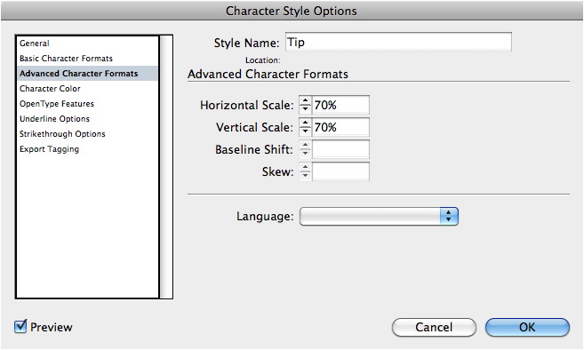
The Horizontal and Vertical Scale controls are found under the Advanced Character Formats area.
So what’s the benefit of using the Horizontal and Vertical Scale? By setting the size of the character style to a percentage, I give myself the freedom to change the point size of the main text without needing to also change the point size of the character style. It also means that the word TIP will always be 70%?not an actual point size?of the main text. I don’t have to jump through hoops to figure out what 70% of 14 point is and then, later on, figure out what 70% of 12 point is.
Before you go changing points in character styles, remember that Horizontal and Vertical Scale can also modify text.
Awesome tip, Sandee! It’s like relative sizing instead of absolute sizing.
Normally, I will never use just a horizontal or vertical scale on text (I’ll always use a condensed or extended version of a font), but the exception is when using picture fonts (i.e. Zapf Dingbats), so I can turn bullets into ovals, squares into rectangles, or create longer triangles or arrows.
But you present a great reason to “scale” fonts instead of using absolute values (especially useful perhaps when you have multiple paragraph styles that are based on a master style).
:) Mordy
Oh, nice.
Great post Sandee!
It is similar to a post I did a few years ago about creating percentage based styles in InDesign.
https://creativepro.com/creating-percentage-based-styles.php
James,
I’ve fooled around with percentages for paragraph styles, but the problem that you mentioned regarding leading left me feeling it wasn’t worth the effort. (Leading doesn’t scale correctly. So this only works for paragraphs that are 1 line long.)
Thanks for the comment.
Nice trick! I think this one will save me a lot of work in the future. I?m using character style every day and my boss are always willing to make the text bigger or smaller.
@Sandee — leading can also be set to use a percentage value, can’t it?
Mordy,
It’s complicated.
The “Auto” setting for Leading does, indeed, come from a percentage.
But in the case of using the Horizontal and Vertical percentages to change the size of the type, the Auto leading doesn’t look at what that percentage-based text is.
Instead, the Auto leading looks at the original point size of the text and bases its leading on that.
(I suspect that InDesign’s internal database has no idea?just as I don’t?of what the actual point size of the percentage-based type is. You can tell if you click inside the text that has the H/V scale applied. It still reads as the original point size.)
So the end result is that the smaller text sits on a much larger or smaller leading?one that is not appropriate for the percentage-based text.
It would be nice if the H/V scale could be applied to leading. Probably would be a checkbox in the H/V scale area.
But considering this is a trick applied for a very unique set of circumstances, I don’t expect Adobe to put any engineering resources into it.
Hi Sandee, love this principle… I couldn’t agree more.
Another area where a similar approach works well is the use of Auto Leading, as it also is based on a percentage. ‘Auto’ works especially well for headlines in newspaper/magazine situations, where people often change the size of the font to make a heading fit.
ha… should’ve read all the comments before posting that one
;)
I use this for instances of EDT and EST. I find the time zone abbreviations overpower my dates: March 1, 2011 EDT. I use horizontal and vertical scaling rather than choosing a point size or using small caps because I have more control over the proportion. I also use the H&V scaling along with baseline shift to adjust bullet sizes when they are too big or small, but don’t want a style for every point size of bulleted list in my document.
That’s a nice tip, I always forget that one. I’m going to try start using it more often :)
Some time ago, Anne-Marie came on a great idea to have Ems as font size unit for character styles. That way you could have proper leading all along with scaled text.
So are you working on a revised character panel then ;)
Those can be very useful for catalog prices – our main client uses a formating in which the eurocents come in a smaller size than the euros, with the “euro” symbol in pseudo-superscript. Trouble is, they use several size of prices for special offers and deals, and in any case the basic formatting is not quite reproducible through subscript and superscript – using scaling lets us format the text dynamically.
Now what I wish one could also set as a percentage is baseline shift, because that ‘s the only part of the style we need to manually tweak each time with a separate character style. Grmbl.
I sometimes use this when I use a dingbat like a triangle so it’s not squat and fat – using only the horizontal scaling to “slim” it up, so it looks more like an arrow and less like a triangle. This also works with bullets and things like that that you want to remain in constant proportion to your main text. It’s a good tip though – and unless you know about using it that way it might not ever occur to you.
Great idea! I never thought of using it besides setting the size and position of Superscript/Superior & Subscript/Inferior characters (which is what it controls).
Great article! I don’t think it would ever have occurred to me to use scaling in that way, and it will definitely be useful!
I keep thinking of this magazine ad which I have to keep resizing. The bullet points are always a problem when I resize. Now I know how to fix that. :-)
We use this often with PostScript fonts that don’t have a small caps complement. There is a bug (either in InDesign–and it seems to be every version–or in a lot of PostScript fonts) where using the small caps attribute leads to the attribute simply disappearing at some point. One day the small caps look fine in the file and the next they’ve all reverted to lower case (even though small caps is still highlighted). So when using PS fonts, we always create a character style called “sc” that changes to all caps at 70% height, 70% width. (We never have this problem with OpenType fonts.)
There is a great script I learned about from IDSecrets for making fractions. When I looked it up just now, turns out that you, Sandee, wrote the post about it a few years ago.
https://creativepro.com/the-best-way-to-make-fractionsever.php
Anyway, the free download comes with 2 scripts, one of which makes the fractions by H/V scaling, which is great if I need to change the point size.
Thank you, Sandee and thanks to Dan Rodney for writing that script!
wonderful tip! :D I’ll remember this!
Gerhard Schrder Gerhard Schr d zhongweixing er – I Express My Shame Upon the 60th anniversary of the liberation of the Nazi death camp at Auschwitz by Russian soldiers, a commemoration was held in a Berlin theater. Organized by the International Auschwitz Committee, attendees included Holocaust survivors and var
I have not found a concrete method yet to auto adjust the horzontal text scale accurately in an onine platform. Lets say I wanted the point size and number of lines to remain the same but the physical width to have a confined space. The variable is the content and while short words are ok at 100%; longer words need horzontally scaled?