

When Character Styles Collide

Someone asked me the other day if it was possible to have more than one character style applied to a range of text in InDesign. The goal was to get the font from one character style and the color from another character style. I said the answer depends on how you apply those styles. You can’t manually apply more than one character style to a range of text. (Well, you can, but when you apply the second style any leftover formatting from the first one becomes local formatting. Same goes for object styles.) However, with some effort you can apply formatting from different character styles to the same range of text as part of a paragraph style.
In CS3 you can blend formatting from drop caps and nested styles with the paragraph style’s character formatting. In CS4, things really get interesting. I count four places in the Paragraph Styles dialog box where you can specify different character styles to be applied under certain conditions: nested styles, nested line styles, GREP styles, and drop caps. Actually, you can also spec a character style in Bullets and Numbering, but it won’t blend with the others.
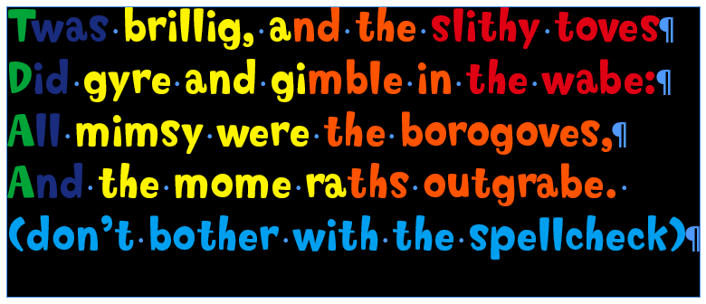
To illustrate, here’s a piece of nonsense, courtesy of Lewis Carroll (with my editorial comment):

It’s all styled with a single paragraph style, with five layers of formatting that converge on the first character of each paragraph. Let’s poke around in the Paragraph Style Options dialog box to see how we got here.
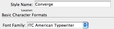
The paragraph style specifies a font.
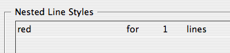
A nested line style makes the first line of each paragraph bold.

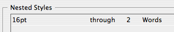
A nested style increases point size of the first two words of each paragraph to 16 pt.
Now we have a pair of GREP styles.

The top style makes the first word of each paragraph purple. The bottom style underlines the first word character of each paragraph.
So that first word character receives formatting from five sources within the paragraph style. To your two-car garage, three-bean salad, and four-star general, you can add a five-formatted glyph.
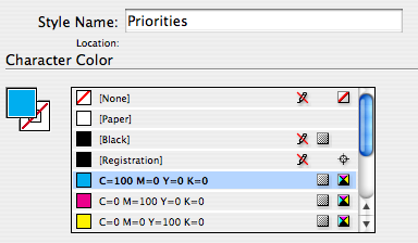
One thing I glossed over so far was a conflict that had to be resolved. The paragraph style specifies cyan text color, and that cyan is being overridden by the purple GREP style. OK, so a character style overrides paragraph formatting. That’s pretty much the raison d’être of a character style. I conveniently made all the character styles apply separate attributes. But what happens when overlapping character styles specify conflicting attributes? What if one style says make the text green and another style says make the text red? What happens when we pit a nested style versus a nested line style? Who wins the battle between a GREP style and a drop cap style? Or even the heartbreaking scenario of GREP v. GREP?
Here’s the deal in a nutshell:
Nested line styles are overridden by nested styles.
Nested styles are overridden by drop cap styles.
Drop cap styles are overridden by GREP styles.
When it’s GREP style against GREP style, the lower the style in the dialog box, the higher the priority.
FYI: I wrote this post blissfully unaware that Tim Cole had already written a tidy summary of style priorites on his InDesign Backchannel blog a couple months back. It’s definitely worth checking out for as long as Adobe leaves it up. The comments add some valuable ideas as well. OK, back to the show.
Here’s another illustration with our same nonsense.
Everything is styled with one paragraph style. In addition to its own character formatting, the paragraph style applies five character styles. The character styles all only apply color to the text, so there are plenty of conflicts to resolve.
The cyan is basic paragraph formatting.
It gets overridden by a nested line style, red.
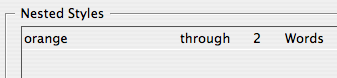
The nested line style gets overridden by a nested style, orange.
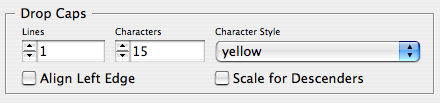
The nested style gets overridden by a drop cap style, yellow.
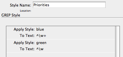
The drop cap style gets overridden by a GREP style, blue. And the blue GREP style gets overridden by the green GREP style, because green is lower on the list (i.e. the green is applied after the blue). Whew!
Of course, a manually applied character style overrides any automatically applied styles, and manually applied formatting trumps everything else.
Just goes to show there’s more than one way to skin a glyph. By understanding style priorities you can design layers of automatic formatting, and save time and trouble by not manually applying character styles to ranges of text, or whole paragraphs.
Great article!
If you want to go even further you could have this paragraph inside a cell style which would be inside a table style.
If you grab that table and then cut it and paste it in as an anchored object it could have an object style to control its location.
Then, my friend, you will have used every sort of style you can use until CS17 comes out with punctuation and nano-particle styles.
Mike and Fritz, I like your style(s). A head-swimming read. And I’ve known about the preference in using which over what for a while, but I never really got it down like that, more a trial and error of using the different styles.
The really fun part is using the nested character style and a “normally made” character style on the same piece of text you can create 2 variables that use both character styles from the same piece of text.
Very cool, Mike. I talked about this and showed a cheat sheet (“what beats what”) in one of my InDesign CS4 New Features videos on lynda.com.
Two things to add to your stack of what beats what:
1: Local character formatting (applied from the Character panel, Swatches panel, etc. or with a shortcut) always wins. It overrides anything applied by a paragraph style, nested style, or manually-applied character style.
2: Manually-applied character styles beat anything applied by a paragraph style or one of its nested thingies. The only formatting that overrides manually-applied character styles is manually-applied character formatting (“hard” formatting) … #1 above.
Finally, it’s important to note that the End Nested Style special character only recognizes and affects the “normal” Nested Styles; it has no effect on nested line styles or GREP styles.
by the way I LOVE your samples! What is that typeface?
Hey thanks folks.
Fritz-That sounds like a dare. ; ) I think if it works, my laptop should start spewing coins like a slot machine.
Eugene-Cool variable trick. I’m going to try it out.
AM- The post was another one inspired by your session with Eric M. at Adobe. It was one of those things that he mentioned in passing, and I quickly scribbled, “must post this.”
The font is Softie Regular. I love it too. Great for kid stuff, or the occasional verse o’ jibberish.
https://new.myfonts.com/fonts/tailspinstudio/softie/
One last thing that I could’ve made clearer: the drop cap style not only overrides the nested style, it pushes the nested style over. If you keep adding characters to the drop cap, eventually the nested style will get kicked down to the next line (and the line style will vanish).
DTP implementation of styles (Quark, PageMaker and yes even InDesign) is limiting.
Time to implement them the CSS way
I would also appreciate Javascript styles (and swatches or text variables for that matter)
They might consist of JS code that would evaluate to valid style defnition on the run, depending on the context.
By DTP I mean the way traditional layout apps do.
Beware the Jabberwock, my son!
The jaws that bite, the claws that catch!
Beware the Jubjub bird, and shun
the frumious Bandersnatch!
What if this is further complicated by not being able to edit what style is applied? I have a document that is an InCopy file, and without checking it out, I want to alter character styles when they are part of certain paragraph styles:
In a finished book, italics serve two possible purposes. One, to emphasize a phrase, like a book or movie title. These are editorial italics. The second is as a design element, like italicizing all A Heads.
-The issue I am having is that all editorial italics are defined by the character style i, and if in an A Head, then everything is italic anyway.
This issue is further complicated by several other styling concerns.
-If that same A Head is bold (as the paragraph style), then we need the editorially-emphasized content to be Bold Italic, not just Italic.
-If the paragraph style is in a font with “55 Roman” and “56 Italic,” then we need the character style i to be “56 Italic” instead of “Italic.”
Is there a way to fix this without checking out the InCopy files? I was looking for a GREP that said “find character style i in paragraph style A Head” and “change anything in the i to Roman,” but I couldn’t figure out how to find a character style in the GREP that is in the paragraph style settings. Ideally, I am hoping to add this code into each of the paragraph styles I have that are Italic, in an odd font, and bold, etc.