

Why “No Break” is better than a line break

I was working on the following paragraph today:

I wanted to keep my email address (highlighted in black above) together on one line. There are two common ways to accomplish this. Most people would just put a line break character (shift-return) before the email address, forcing it to the next line, like so:
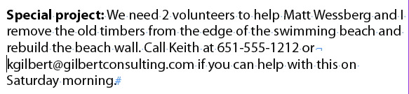
The trouble is, this results in a really ugly rag on the right side of the paragraph, which I would need to fix by inserting more line breaks. But there’s a better way.
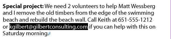
If I select the email address and choose No Break from the Control panel menu, the Paragraph Composer recalculates every possible combination of line endings, taking the No Break attribute into consideration, and comes up with the most even rag possible. Much better!
A couple of related items:
One problem with using the No Break attribute is that there is no easy way to see where it has been applied. This free script by Peter Kahrel solves the problem.
If you want to keep a multiple words together, instead of selecting the words and applying the No Break attribute, another method is to replace the spaces between the words with non-breaking spaces (command-option-x [Mac], ctrl-alt-x [Windows]). The advantage to this method is that the non-breaking spaces are visible as something other than a regular space when you choose Type > Show Hidden Characters. The trouble is, the Paragraph Composer treats words containing non-breaking spaces differently than multiple words with No Break applied. So you will often get two different results, depending on which method you use. You’ll need to determine which method gives you the best results with the Paragraph Composer.
To repair a problem with bad formatting in this example just insert “right indent tab” before forced line break. Obviously using “no break” is better solution because it’s not disrupting the work of paragraph composer.
And mow GREP it: make a character No Break style and make a paragraph with GREP
[\S]+[@][\S]+‘mow’? ‘now’!
Keith-
I’m curious of you have “Balanced Ragged Lines” applied to the paragraph? Would that influence the outcome?
Much better than a line break, anyway, if the paragraph were to be resized or edited! I didn’t realize that “No Break” would balance out the ragged lines, though. Nifty trick! :)
I really like the grep method mentioned. If I were to create some serious templates, that’s what I would put in my styles (a no break character style, and a grep style in the paragraph style).
If you want to see where “no break” is applied, use it as a character style. Then you can just add a color to the character style (temporarily) to see where it applies.
—
Personally, and I’m surprised it isn’t mentioned, when fixing stuff like this I use cmd+shift+- to insert a discretionary hyphen in front of the word i don’t want to break. This will cause the word to not break at all, and unlike “no break” it does show up when you view hidden characters.
The downside to this is that with things like e-mail addresses you’d have to put one in front of every word in the address (or it will break after a symbol like @ or period).
I use the No Break especially for words that appear in a Running Head.
For some reason the Running Head paragraph styles, when you insert a line break you get two spaces on the running head on the first page, and no spaces on the subsequent pages thereafter.
All my new documents automatically have a “no break” character style.
When I press CTRL Return (for quick apply) I type in No Break, and that character style is Quickly Applied to any text that I’ve selected.
If I do need to know where it is withing the document, I can edit the character style and apply an Underline or Strikethrough or make it orange, or whatever sticks out.
Definitely, if your text must appear in a running head – the a “No Break” is waaaay better than a “line break”.
Plus if you need to use that Heading in the TOC when the TOC is generated it does not have a Line Break in the middle of it, so makes it a lot easier when generating TOC’s and other things, like an index, for example.
A great way to find Web Addresses – and it’s pretty neat and I don’t think I’ve seen this method posted anywhere before. The easiest way to get a GREP expression is:
Type>Hyperlinks&Cross References and Convert all URLS to a hyperlink. Big deal you can use the hyperlink panel to remove them if you don’t want them.
The fun part is – go the Find/Change and the GREP tab, and you’ll find a lengthy GREP inserted there.
Why this isn’t part of the pre-loaded GREPS is a mystery?
@Jamie: adding Balance Ragged Lines does change how the line endings are calculated, and results in a different wrap. But the problem remains that a line break results in an ugly rag and applying No Break gives superior results.
I don’t recommend applying balance ragged lines except for short 2-3 line headlines and subheads, which is it’s intended purpose.
I want to clarify one thing. It’s the adobe paragraph composer (Control panel menu > Paragraph Composer) that is doing the work here. The point of my post is that the paragraph composer “composes” differently depending on if a line break is inserted or the No Break attribute is used.
That GREP expression is quite neat and will become part of my paragraph styles from now on I think. Adding a version of it to stop web addresses being broken also makes sense.
It works beautifully, but I like to know why things work, so can you explain what exactly [\S]+[@][\S]+ is looking for? Obviously something either side of an ‘@’ symbol, but on looking up a GREP reference ‘\S’ seems to be ‘Any White Space’? Isn’t it searching for one or more ‘characters’?
I try to catch everything before the@ (can be underscores, dots etc. but never a whitespace!) and everything behind the @ (same thing).
Then it stands apart form the rest being any whitespace or a dot, comma etc.
Oh, and there has to be a dot in it (for .com, .nl etc.)
This is a great solution. The alternative I used before were non-breaking spaces and hyphens, but this is better. Reason being is that many digital formats don’t seem to support non-breaking characters, so this is great if you are utilizing a layout for multiple outputs.
For instances when a Character Style cannot be used (ie, a Style is already used for other purposes) and this needs to be applied manually, a keyboard shortcut can be created in Edit/Keyboard Shortcuts…Panel Menu/Character: No Break.
You can also include it in a GREP style. GREP styles can be independent from character styles, so essentially you can have two character styles applied to the same piece of text.
Or is that nested styles I’m thinking of? I think a Nested Style will apply a character style, that can be picked up by running heads.
I don’t think GREP Styles where it applies a character style is picked up by a running head.
@Steve: capital S matches the opposite: anything but whitespace. The same goes for \U, \L, and \D.
A single flaw (well, other than that I’ve encountered @’s that were not an e-mail address!) is that it will also tack on a final period or comma or closing parenthesis.
Fortunately it doesn’t matter for a No Break solution; but it does when you try to use the same GREP string to convert these to live e-mail links.
Thanks Jongware. That’s very useful to know!
I recently completed a large blog-to-book project (>650 pages). Grep styles applying no-break to email addresses and URLs saved many, many hours of work.
Once in a while, even the Paragraph Composer can’t come up with a decent result (especially with justified text), so it’s still necessary to get in there and tweak by hand once in a while, but grep styles handle 99 percent of the work.
The only “No Break” option I see is in the floating Character palette. Is this the one being referred to here? Hopefully I am not missing something obvious.
@ TX Limestone: “No Break” is visible in both the Character panel menu and in the Control panel menu at the top right of the screen. They are both the same thing.
@Frans @Steve: there’s no need to to create classes if you place just one wildcard or literal in them. In this case, \S+@\S+ works fine. It may even be quicker, which is important if you use many GREP styles, because eventually those GREP styles will grind InDesign down to a crawl.
Peter
@Peter Of course, you are right, a leftover from a replace action with $1 etc ;-)
Now a look at it again, it wasn’t even that, I indeed made classes, have no clue as why I did that some 2 years ago…