

Working With Text in Adobe Comp CC

Using Adobe’s Comp CC mobile app can be a valuable first step in your InDesign workflow. Comp lets you rough out your design on your iPad, then further refine and complete your design in InDesign (or Illustrator or Photoshop) on the desktop. There seem to be a lot of requests for Comp to deliver more in regards to its text capabilities, but for a comping app it really packs a punch. If you’re a seasoned InDesign user, some of the text controls can seem awkward at first, but like many mobile apps, it just takes a slight shift in thinking to get things working for you. Comp lets you work with text, vector shapes, and imported graphics. Here, we’ll be focusing on Comp’s text controls.
Creating a Text Frame in Comp CC
Like InDesign, Comp needs a frame to put text into. Unlike InDesign, however, when you create a text frame in Comp, it automatically pre-fills that frame with placeholder text. And in true Adobe fashion, there are a few ways to accomplish the task of creating a frame.

Comp CC’s Toolbar.
To create a text frame quickly, tap the Type (T) icon in the top toolbar. Choose the App Styles option and you will see three text styles: Headline, Sub Headline, and Paragraph. Tapping on any of these creates a Lorem Ipsum-filled text frame with appropriately sized text. The other option in that panel gives you the ability to style the text with styles you have saved to a Creative Cloud library. Tap on My Libraries to see your library list, then choose the desired library. You may have to tap the cloud icon if the font used in the style isn’t on the device (see more in the “Style Text” section below). Tap a style to create the text frame.

Quickly create a type frame using Comp’s App Styles text frames.
The final option is more fun and involves learning a couple simple gestures. If you want a one line text frame filled with paragraph (body) text, draw a horizontal line with a dot at the end. Draw two lines followed by a dot to create two lines of text, three for three. You get the idea. Making a frame with 20 lines of text is going to take way too long with that method, so you can use a secret drawing gesture, which involves drawing a rectangle to the desired size with a couple of horizontal lines inside. If you want a headline frame, draw a rectangle and put a dot outside the lower right-hand corner. To see all available gestures, tap the Settings (gear) icon in the toolbar and choose Drawing Gesture Help.

Comp’s drawing gestures include a few for creating different frames for type.
Entering Text in Comp CC
If you want more than just a bunch of frames filled with Lorem Ipsum, you’ll need to enter some custom text. Keep in mind the reason for creating your Comp CC file. If you’re creating a mock-up for a client to get an idea of a layout, the placeholder text may suffice. However, it may be more appropriate to have real-world text for your client to view. I generally put some actual text in my Comp files, but I don’t spend a lot of time making the size and flow perfect. That final crafting and massaging of text will happen in InDesign where I have total control over my text behavior.
Once you have a frame on your Comp artboard, double-tap on it to bring up the keyboard. From here, you can start typing, or you can paste type from your clipboard. If you delete all the text in a frame, the Lorem Ipsum text comes back to fill the frame, so the frame is never empty.
Styling Text in Comp CC
To style the text in your frame, tap once on the frame. A slider will appear to the right of the frame. Slide your finger up or down to increase or decrease the frame’s text size. All text styling in Comp is applied to everything in that frame. Even though you can select individual words, you can’t format them individually. Additionally, Comp uses the term “character styling,” but the styling applies across entire paragraphs and frames.

Use the slider to the right of a text frame to increase or decrease type size.
With a text frame still selected, tap the Type (T) icon at the bottom of the artboard to view more text styling options.
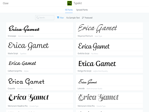
Font: You can choose to use any of the fonts available from Typekit in your Comp CC layout. Tap the currently displayed font name to see the list of all fonts you have synced. Tap on the font you want or click Add to be taken to the Typekit site. From there, you can select and sync more fonts. The interface lets you search by filters—like serif, script, monospace, etc.—enter sample text, and check out featured Typekit fonts. Tap on any you’d like to sync then tap the sync (cloud download) icon.
Style: If a selected font has multiple styles available, select one (or download more) from here.
Size: Use the plus and minus buttons to increase or decrease point size. Tap and hold to move quickly to a particular size. Unfortunately, there’s no way to manually enter a point size.
Alignment icons: Choose left, centered, right, or justified alignment.
Formatting icons: Choose all caps or underlined text.
Spacing: Comp’s Line Spacing is relative to the type size, with 0.0 being the default. That’s equivalent to 120% of type size (InDesign’s default leading) and from that point it’s all a bit of mathematical voodoo, really. I tend to make it look good onscreen and then finesse it in InDesign. Letter spacing is equivalent to tracking. Again, the numbers don’t mean much to this InDesign user, but I tend not to mess with tracking too much, especially here in Comp.
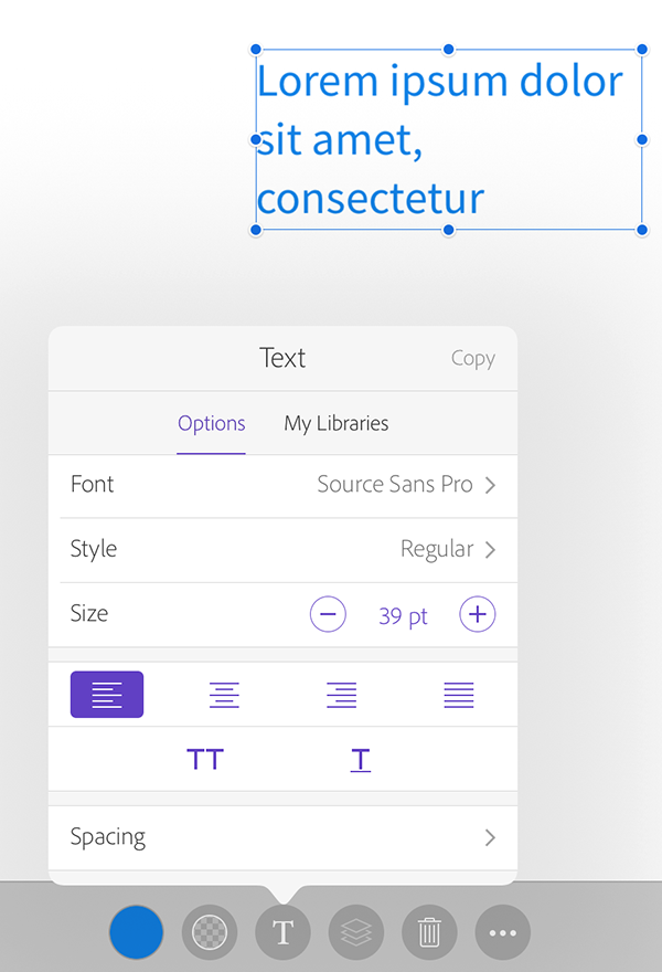
Comp’s text styling options
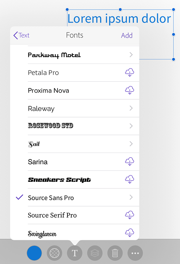
Currently synced Typekit fonts appear here. The cloud icon indicates a synced font that hasn’t been downloaded to your device, yet.
Viewing sample text in several Typekit fonts
Copying Styles
You can copy styling from one frame to another for consistency. What you don’t want to do is select text, copy it, and paste it into a new frame. Doing so retains the formatting of the receiving frame—remember the styling is applied to a whole frame. Instead, tap once to select frame whose style you want to copy. Next, tap the Type (T) button at the bottom and choose Copy from the upper right. This will copy only the attributes found in this panel. Alternatively, select that first frame, then tap the More (…) icon and choose Copy All Styles, then tap any frames you want to apply styling to. This will apply not only the text styling, but also color and opacity. Tap Done when finished to exit the style editing mode.
Moving and Adjusting Frames
Getting frames situated on the artboard is important, whether you’re simply making a mock-up to show a client, or intending to complete the layout in InDesign. If Smart Guides are not already enabled, turn them on in the Settings panel (gear icon) in the Toolbar. This will provide visual feedback to line up frames and other items in your layout.
From that same Settings panel, select Edit next to Grid & Guides to set text column guides, then choose the multi-column icon on the left to set column options. Choose the number of desired columns, enter a gutter amount and set page margins. You can also manually set these options using the plus and minus buttons and the margin handles that appear in this edit mode. Tap Done when you’ve set all your guides.
Even with a multi-column layout you are limited to using single text columns. You can always use a script to convert those frames to multi-column text frames, once the file goes to InDesign. You can also set free-range horizontal and vertical guides in the Grid & Guides editing panel. Choose the icon to the right of the multi-column icon, select Add a Guide, then tap and drag the guide into place. Tap Done to exit the editing mode.

Setting up a page grid and margins in Comp
To move a frame on the artboard, tap it once before moving it. If you jump the gun and don’t tap it first, you’ll end up drawing wayward squiggles on your artboard. After tapping once to select the frame, simply drag it where you want it. You can resize a frame with placeholder text by dragging one of the eight handles. Once a frame has custom text in it, the frame sizes its height to accommodate the text. You can change the width of the frame by dragging the handle on the right or left of the frame.
Grouping Frames
You may find it helpful to group frames together. This applies to frames and items of any sort, and also is useful to keep the individual frames of a multi-column story together. To group items, select one frame, then the More (…) button, and choose Select Multiple. In the editing mode, tap additional frames, then tap Done to exit editing mode. Tap the Group (chainlink) icon at the bottom of the artboard to group the selected items together. Select a group of items at any time and tap the Ungroup (broken chainlink) icon to ungroup.
After selecting multiple items, you might choose to align those items. Choose the Alignment (middle) button at the bottom of the artboard. Align the items horizontally or vertically, or distribute the spacing between the items evenly. This resembles the alignment options in InDesign, so it should seem familiar to you. The Match Size option will make the height or width (or both) of the selected frames identical. To duplicate a frame, choose Duplicate from the More (…) button. Since you can’t copy text and paste it with styling intact, this is the way to get identical copy quickly. The last item in the More panel is the option to lock an item or items on the artboard.
Grouped text can be ungrouped by tapping the link/unlink icon.
Retracing Your Steps with Undo
As you’re learning Comp’s touch interface, you’ll undoubtedly move things you hadn’t meant to, or draw shapes without even trying. That’s where the undo button in the Toolbar comes in handy. Also, Comp CC employs a 3-finger gesture, where sliding left allows you to scroll back through the file’s history.
Beyond the Napkin Sketch
If you keep in mind that Comp CC is for creating a really well laid out piece to serve as a jumping off point for your finished work, you’ll probably be pleased with what it offers. It doesn’t have all the bells and whistles that a powerhouse program like InDesign does, but that’s not Comp’s job. Touted as a “digital cocktail napkin,” where you can sketch out ideas and move seamlessly into your desktop design software, I’d say Comp far exceeds that moniker.
[Walks to front of room carrying soapbox. Places soapbox on floor and stands on it. Clears throat, and looks around.]
Ah, a legitimate platform for my Gripe #2, dealing with text in the Creative Cloud. What wrong with handling text in CC? Simply that you can’t handle it. You can store and transfer almost anything else: pictures, styles, preferences, color schemes etc. But you can’t share text in any sensible fashion between apps or platforms.
That matters because lorem often isn’t enough. A lot of a design is the text content. Advertising slogans, chapter titles, pull-quotes, even the content itself can be a part of what’s being created. Those reviewing a design in Comp CC may find Lorem text OK for the first pass. But before they sign off on it, they’ll want to see it done with the final text. Unfortunately, there’s only two ways to do that:
Clumsy: cut and paste.
Error-prone: Type it manually, often on a less-than-perfect touch screen.
This article talks about copying and pasting that text in, but note that there’s no CC way to manage that text or place—as opposed to paste—it. Nor can users pick and choose what features of that text they import. It’s all or nothing with copy and paste, all the formatting or none.
There really does need to be a way to store and place well-organized snippets of text for exchange among apps. Team users would also benefit from a team that’d benefit from a review and checkoff system. CC needs a definitive way to store and retrieve text snippets.
Without that, mistakes can happen. Many years ago, when I worked for Microsoft, someone decided it made sense to print the manuals for the Draw and Paint programs together. There was only one hitch. When the two texts were merged, no one remember to change the cover. Several hundred thousands copies of a book on Draw and Paint were printed with only Paint mentioned on the cover. The fix was to slap a “Now with Draw” label onto the cover, but a better review scheme would have removed the need for that.
A lot of CC projects may go astray for much the same reason. An ad gets drafted with a preliminary slogan and no one noticed that the text needs changing when that slogan is changed. The right sort of app, one that knows about changes like ID knows when an image has been changed, would be a big plus.
[Steps down off soap box. Picks up soap box, and walks away, muttering to self.]
——-
What’s my #1 gripe you say? It’s the utterly dismal state of spell checkers in everyone’s OS and apps. They’re virtually unchanged since the late 1980s. The vocabularies are inadequate. That in OS X is about the level of a college sophomore and doesn’t seem to be updated often. There’s no way to turn on or off various additional dictionaries for documents, such as:
1. Technical, scientific, medical or legal vocabularies.
2. Specialized vocabularies for a particularly project, either at the corporate or literary level. Add a word to that user dictionary, and it’ll be around forever. Why not have one that’s project or client specific or unique to a single document? That way the weird spelling a company uses for a product won’t become acceptable in other contexts.
Lookup for misspelled words is terrible. In OS X apps, it fails about a third the time. There’s no excuse for that. Enter the misspelled word in a Google search and Google knows the right spelling about 98% of the time. Why can’t apps be as smart? Fiddling to get the right spelling wastes a lot of time.
A lot of features, many of them more cute that useful, have been added to apps over the years. Why haven’t spell checkers expanded to be more useful? And I don’t mean the sometimes dubious world of grammar checkers. I mean enhancing them so they understand all sorts of conventions that are closely related to spelling, for example that “electronic mail” and “e-mail” has been replaced by “email” or that in English no -ly word is ever hyphenated. OS X’s spell checker, in its utter stupidity, will accept as legitimate any two legitimate words with a hyphen between them. Why not make it smart enough to know that “quickly-go” is never right in English? As a book editor, I spend a lot of time fixing that sort of thing.
Keep in mind that this dismal state of affairs makes life hard for everyone. Editors have to fix mistakes that should have been flagged earlier in the process. Those creating content (authors), find themselves caught up in conventions that they are expected to know but don’t have time to learn. (Who wants to read The Chicago Manual of Style?) We need our software to do more of the grunt labor of maintaining text conventions, so we don’t have to bother.
[As he leave the hall, he continues to mutter to himself, while waving his arms about at random.]
How do I change font color?
Tap the text once, there is a circle (probably a black circle) in the lower left, tap that and pick a color from the wheel, themes, or from a CC Library. Make sure the slider in the color picker isn’t all the way to the left, or the text will remain black.