

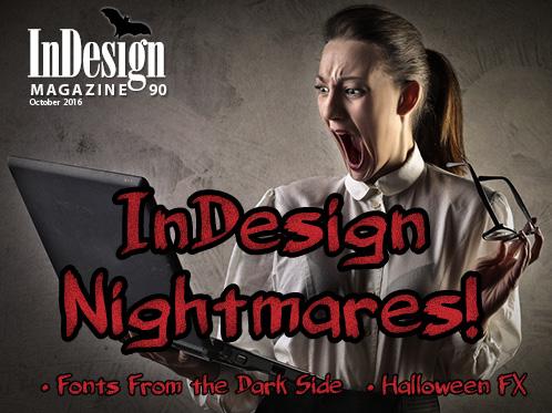
13 Fonts From the Dark Side

Don’t be afraid of the dark! Use these fonts for creating distinctive, impactful impressions with type.
There are countless design briefs that call for heavyweight, assertive fonts. These hefty designs, which are usually reserved for display usage, make a powerful statement while attracting the viewer’s attention with ease. While many of these substantial typeface designs are serious in tone, others can be friendly, ghoulish, and even humorous. I have selected thirteen of my favorite “fonts from the dark side” to share with you. They include black weights that are part of large families as well as single-weight styles. Some are current releases, while others are vintage, historic, or just timeless designs that never get old. But they all make a statement when used appropriately.
. . . .This article is for members only. To continue reading, please sign in, or sign up for a membership today. Thanks for supporting CreativePro!
BECOME A MEMBER
CreativePro membership keeps you up-to-date with the technology, solutions, and resources to strengthen your professional development.
For just $6.50/month (billed annually), you’ll get access to valuable benefits, including:
- 12 monthly issues of CreativePro Magazine, filled with practical, real-world tutorials written by experts
- Downloadable resources including templates, fonts, scripts, design assets, cheat sheets, and more
- Hundreds of members-only tutorial and tip articles
- Top Tips for InDesign, Photoshop, and Illustrator ebook collection
- Discounts on events and books
- and more...
Nice examples, hadn’t heard of Mostra Nuova, classy nostalgia font.