

3 Ways to Fix Runts in Your Text

In typography, a “runt” occurs when the last line of a paragraph ends with a short word or part of a hyphenated word, creating an undesirable look. You can prevent hyphenated runts by turning off the Hyphenate Last Word option in the Hyphenation Settings dialog box.

But to prevent whole short words from showing up on a line by themselves, you need to do something extra. Here are 3 options:
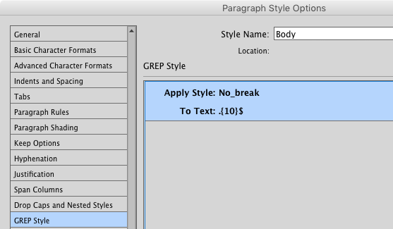
GREP Style #1: .{10}$ This expression will target the last 10 characters before the end of a paragraph. Use it with a character style that applies the No Break option, and you’re guaranteed that the last line of each paragraph will have at least 10 characters. Adjust the number in the brackets if you want more or fewer characters to be “no breaked.”

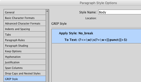
GREP Style #2: (?<=\w)\s(?=\ w+[[:punct:]]+$) This one’s a bit more complex and subtle. It matches just the space between the last two words in a paragraph. Used with a No Break character style, it glues the last word in a paragraph to the final syllable of the penultimate word. Put another way, the last word in a paragraph will always have some company on the last line, even if it’s just part of another word.
Edit the text. This simple, but often overlooked option can fix all kinds of typographic problems. True, you may not be allowed to make edits if the text was authored by someone else. But even a small tweak can work wonders, so it might be worth seeking approval for an edit instead of spending a long time fiddling with settings and banging your head against the keyboard.
In the video below, Erica Gamet shows the GREP Style #1 solution in action:
Do you have a different way of fixing runts? Share it in the comments!
I always go with “edit the text.” Anything else can create problems. We can also add a genuine ‘runt be gone’ to the long list of features Adobe should be adding to InDesign but isn’t.
I’m starting to miss that marvelous Seattle InDesign team I knew when I lived there. They were committed to improving the product and willing to fight the company’s dreadful bean-counters to do that. I’ve begun to doubt that ID-India has that same fighting spirit.
Issues like these illustrate why we might be well-advised to stir up unrest among business users of ID. I suspect there are a lot of companies that have $20 or $50 seats specifically for ID and making print or PDF material. They’re getting ill-treated by an Adobe that’s spending their money or products they have no use for.
When a company rests on its laurels and/or believes in its own hype, it’s in trouble. It will go the way of some politicians in the US and UK. Then it will have no-one to blame but itself. As Judge Judy would say: Put on your listening ears, Adobe before it’s too late!
Case in point: QuarkXPress.
I’d appreciate if people who reply here could keep on topic.
This website has forums for more general discussion.
Thank you, Steve. Michael and Anita, do you have any constructive tips on how you handle runts (short last lines)?
BTW, we should point out that while some people call these widows and other people call them orphans, those terms definitely do not describe short last lines at the end of a paragraph. Those are reserved for other typographic problems. (Orphans are single first lines stranded at the bottom of a column. Widows are single last lines stranded at the top of a column.) That’s why I like the term “runt” when talking about short last-lines.
David, I rather like “runt”, though it’s a newer term to me than widow and orphan.
Since the dawn of typography this has been debated and most scholarly texts avoid the use of either word.
I was taught to call your “runts” word-widows and your “widows” line-widows to eliminate confusion. And that orphans are at the bottom because they were “left behind”, but even today there is still little agreement.
In practical experience, nearly all designers, printers and editors I know and all laymen call any short line a “widow”. “Runt” appears to be a fairly recent use, but seems to be catching on so maybe some day there will be clarity!
Funny how a short line or poorly broken paragraph requires a special word but a misspelled word is just a misspelled word no matter where it is.
Of course, it doesn’t matter what we call them as long as we fix them!
A little reminder: a widow has no past and an orphan no future and can be fixed using the keep options in your paragraph style. In Dutch we call a runt “hoerejong” (child of a hooker) and he/she is always standing alone!
Much better solution is decrease/increase entire paragraph tracking a bit.(<= -10/+10) OR apply full justification to paragraph – it sometimes also helps.
"When a company rests on its laurels and/or believes in its own hype, it’s in trouble."
I couldn't agree more!
I fiddle with the tracking as I have found that in practice a runt is often accompanied by a loose line or two earlier in the paragraph. If necessary, I edit, which I can do because I am usually the editor as well as the typesetter. I would never use ‘no break’ in this situation.
While automatic suppression of runts is desirable, I’d like a lot of control of the parameters if Adobe provided such an option. Not an easy bit of code to write, I suspect.
These grep styles are unvelievably helpful. Thank you!
Useful tips, Mike. I tried selecting the code in GREP Style #2 to copy in order to compare it to a similar GREP string, and it appears that there may be an extra space between the backslash and “w” in the lookahead string.
This is a great topic! According to the Chicago Manual, the rules are as follows:
“The final word of a paragraph is allowed to hyphenate except that a minimum of four characters (not counting periods, commas, and quotation marks) is required on the final line.”
I managed to put together a GREP that pretty much adheres to those rules and wrote a blog post about it a while back: https://www.id-extras.com/indesign-grep-to-avoid-runts
Ariel–thankfully most of my company’s clients follow Chicago Manual, but there are a few exceptions. They definitely allow orphans (per David’s definition), but definitely NOT widows (David’s definition). The publishers I work with (and their editors and proof readers) call the last line of a paragraph at the top of the page a widow, and orphans what some call runts.
Anyway–only a few clients require a full word down. And a few don’t allow hyphenation across pages (which can cause loose lines). But most follow Chicaco Manual (unless you have a rogue proof reader or the author is super-picky).
I want to thank you for these posts–just read the one on consistent leading–they’re VERY helpful! I have this exact ‘runt’ problem often. I usually do have some leeeway in editing text but my current project has content from the military so have to receive permission first. I’ve tried all kinds of tweaking to no avail. The only way I can fix this runt issue is to combine two short paragraphs (both with only one sentence, so it looks better to combine into one anyway). But I will try these tips when I next encounter runts. And now I know the correct name for them (other than vile language!).
I usually just put a non-breaking space between the two last words.
Sadly, I couldn’t get either of these to work. I would love another option than tweaking the text.
I use a variation of the first example. Since most of my work is with books of one to several hundred pages, I avoid GREP styles as much as possible since they tend to slow ID down considerably. But when I’m getting ready to set my final pages, I use .{7}\r as a find and replace, not with a no break character style, since there might also be italic there, but with no break character formatting. Works great and very simple.
But in fact I use that as the last of a number of find/changes in a Multi-find/change list. I have five saved queries to reduce end-of-line problems. The first finds words after em dashes and changes to no break. The second finds words after hyphens, the third words before em dashes, and the fourth is words before hyphens. And then the last is my derunting query.
After I run that I keep my eyes peeled for loose lines but ID’s paragraph composer is good enough that I don’t find too many.
I use a no break character style and also a italic no break character style.
I have a similar Word that does what your Multi-find/change list does (minus the runt thing), as most of our files are tagged text files. Or, if they are Word files, we tag them and save as tagged text files and import via xTags.
I tried using the .{10}$ GREP paragraph style with a character no-break character style, and it didn’t work :( It deleted all my text except for the first line for some reason. Any ideas why?
I really like Dan Rodney’s “Widow Fixer” script: https://www.danrodney.com/scripts/widowfixer.html
It provides a simple, fast way to add the widow fix to multiple pstyles simultaneously. Very convenient.
Your expression in the body of the text:
(?<=\w)\s(?=\ w+[[:punct:]]+$)
…has a space between the "\" and the "w"—it won't work with this space (or: it didn't for me).
Without the space "\w" works great—thank-you.
I start with looking for loose lines and narrowing tracking on that line, then on the paragraph—I have even used 98 or 99% character width on occasion (and use tenths of a percent)—combining the 2 methods means a smaller change in either, but character-width changes are only for when I am really desperate. Once I get the runt fixed, I increase the tracking by small increments until I find the absolute least that gives the needed change.
Of course, whenever possible, I will try editing the text first—I was surprised that when working on a publication at one workplace, a professional graphic designer said that he had never thought of that as an option; it was what we had done first at a previous publisher.
I have always used “orphans” for “runts” and “widows” for single lines at top or bottom of page—glad to have the accurate terminology; my background is a weird mix of self-taught and training, both formal and on the job.
I am glad to have stopped upgrading InDesign with CS4—last version before subscription-only mode; I keep an older laptop specifically for InDesign, as I am no longer working professionally but do a lot of layout for local groups.
Sigh. So I made an ID file proof (PDF) into what I call a hybrid. It looked like a print ID file but it had all the links it would have for the ePub. I had read a few places that Georgia was not good for print books so I changed it to Alegreya. Then weirdness started. Great for ePub but when I went back to print, it was just not listening to the GREP (?<=\w)\s(?=\w+[[:punct:]]*\r) with a No Break style and Keep Together 2/2. It was also leaving weird gaps at the bottom of the pages, breaking paragraphs in weird places.
I could manually (after a Find/Replace) fix the runts but I had to do | returns to get the paragraphs to break properly. This is not efficient in a 300 page book. Plus, as we know, touching the file this much at a final proof stage is dancing with the devil.
Are there fonts that just don't work for certain automation? Please advise before I commit to making all of these weird changes just for the print edition.
@Diane, I’ve never heard of a GREP style working in one typeface and not another. I’d expect that with fonts using Roman characters 99.99 percent of GREP expressions would work regardless of font. But I suppose the [:punct:] might conceivably work differently with different fonts. I can’t think of a quick solution to this, sorry.
Thanks for trying, Keith.
It really is weird and NOT what I need right now. I am able to make a separate style sheet that does the 2/2 to keep four line paragraphs laid out properly but for the three liners that end at the bottom of a page, I have to go in and put a pipe return (I am sure there is a real term for that) in to after the solo line, then it goes back to its brothers on the earlier page. So weird.
Turns out, my paragraph style sheet got corrupt.
I also tried GREP Style #1, and it didn’t work.
Anyone have an update?
(It sure would be nice if there was a “keep” option for last ___ number of words/characters in a paragraph.)
Correction!
#1 does work, I just needed to create a Character Style for “no break” as described in the original article . :)
Thank you everyone!
Just for the record, I have never had a client/employer that was ok with character count ( have tried GREP #1 with both 10 and 15)
GREP#2 works about 75% of the time.
I usually start with tracking + or – up to 15pt, but sometimes, end up just grabbing the last two words and doing a no break.
I really wish there was something that said “No less than one space before paragraph return.”
That’s what GREP example #2 does
Not consistently. :(
I’m using a GREP similar to #2, but including potential footnote references, non-word characters (not only punctuation marks), and possible white spaces at the end of the paragraph.
It’s working for me and my colleagues – but any feedback or ideas how to make it less clunky would be much appreciated!
(?<=w|W)s(?=w+W?~F?s?+$)
… this is weird! I copy-pasted the code in my comment – but all the backslashes disappeared after the comment was submitted. Let me try this again. Just in case, there should be backslashes in front of each “w” (any word), “W” (any non-word), and “s” (any white space).
(?<=\w|\W)\s(?=\w+\W?~F?\s?+$)
Thank you for this article! I have been looking for something like your #2 approach for ever! However (?<=w)s(?= w+[[:punct:]]+$) did not work for me. I found this suggestion on another article to target the space between the last two words in a paragraph and it worked ( *?)(?=w+[.!?]r)
I do not know enough about GREP to understand the two and why one might be working for me and one is not. Can you shed any light?