

5 Bad Habits InDesign Users Need to Break

Editor’s Note: this post was excerpted from Keith’s handout from CreativePro Week.
Why listen to me?
What do I know? Who said I know the “right” way to do things? Years of using InDesign, teaching users how to use InDesign, and examining files built by a wide spectrum of InDesign users has shown me that while there are often many ways to accomplish the same task in InDesign, there is usually one way that is much faster, easier, and more efficient than the rest.
- You should learn the best way to do things to make your life easier. Nothing wrong with being lazy!
- Doing things the right way is usually the way that others will expect things to be done, making it easier for others to edit your files if the need arises.
- Doing thing the right way often makes InDesign able to compose text, render images, and layout pages the most efficiently, making InDesign faster and more responsive.
There are always exceptions!
As with any generalized “rules”, there are always exceptions. You will encounter situations where some of these tips won’t work, or will be slower or less efficient than certain other methods. But those are the exceptions, and should occur infrequently.
Ready? Here we go!
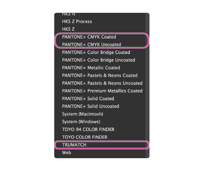
#1: Don’t specify spot colors when printing with CMYK
If your project is going to ultimately be printed on an offset press with CMYK inks, don’t specify PANTONE spot colors (colors from the PANTONE+ Solid Coated or PANTONE+ Solid Uncoated systems). Instead, obtain a Trumatch Colorfinder fanguide or a PANTONE CMYK Color Guide and locate the color you want in the guide. Then, in InDesign, choose the corresponding color from the matching library.
#2. Don’t blindly convert everything to CMYK
Your images probably came to you as RGB. Leave them that way as long as possible. For more information about RGB workflows, see this article.
- RGB is preferable for PDF output that will be distributed via the Web
- RGB is preferable for most desktop color printers and office color copiers
- RGB is can be easily converted to CMYK as the PDF is exported.

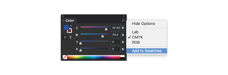
#3: Always create color swatches
There are many ways to create or choose a color in InDesign. But to make it easy, accurate, and efficient to assign the same color to multiple objects throughout your project, always make a Swatch out of any color that you create. Then, next time that you need the color, choose it from the Swatches panel.
#4: Don’t use ruler guides to align objects
Ruler guides are very helpful for helping establish a grid system or other boundary markers on Master Pages. But dragging in ruler guides onto document pages just to line some objects up is so 1988. Instead, use Smart Guides or the Align panel.
Smart Guides
- You can toggle Smart Guides on by choosing View > Grids & Guides > Smart Guides (command/ctrl+u). But I prefer to leave smart guides off all the time, and just activate them temporarily by holding down the ctrl key on the Mac while dragging an object. This is a Mac-only tip, unfortunately.
- Unfortunately, Smart Guides don’t work with objects on the pasteboard
- Smart Guides only activate for objects within the field of view on the screen. So on complex pages, it can be helpful to zoom in so that only the objects you are trying to align are visible before trying to drag an object with Smart Guides.
The Align panel
- The Align panel is located in Window > Object & Layout > Align (shift+F7). Some of the functionality of the Align panel also appears in the Control panel at the top of the screen, but the panel contains more alignment options, particularly if you choose Show Options from the Align panel menu.
- See this blog post: for more Align panel tips.

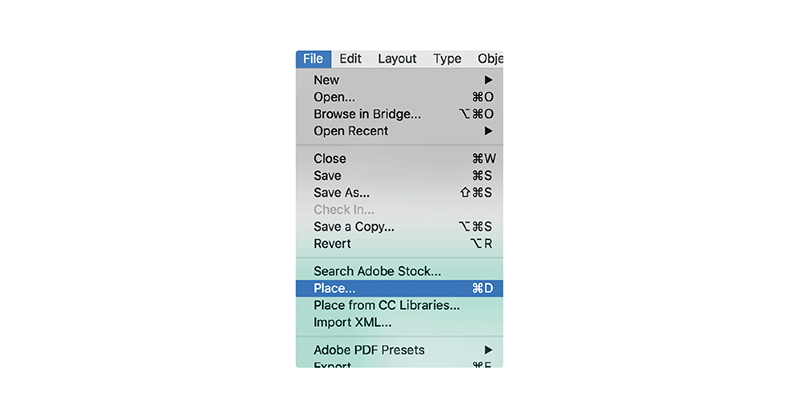
#5: Don’t paste bitmap images or large vector art into your layout
Yes, you can copy and paste from Photoshop into InDesign. But under normal circumstances you shouldn’t. Pasting images into InDesign has at least 3 disadvantages over using File > Place.
- The Info panel (Window > Info) doesn’t display resolution and color space information for pasted graphics.
- Pasted images can’t be color managed.
- Pasted images make the InDesign file much larger and theoretically more likely to become corrupted.
Thanks Keith – great advice for someone new using InDesign and many experience users as well.
If I can add to your comments, especially about using spot colors vs. CMYK builds, how many people actually print with spot color nowadays? Most clients are trying to save a few bucks and for us designers seems like the cut back is at the printing stage. And if they do use spot colors, just don’t change to a CMYK build, use the Pantone Bridge (or talk to your printer) and get the right build. For all you young designers or production artists – keeping your images in RGB and using a RGB workflow is highly recommended – you can always view your photoshop images in a CMYK space, and see what’s gonna be lost in conversion. If you don’t need to convert – don’t, now again information is king, talking to printers and certain situations will dictate what your outcome will be. So ask questions!
If I can also add one more to your list – too many InDesign users don’t and it drives me nuts use “STYLE SHEETS” serious – I get and understand the need to explore and maybe if your working on a simple ad, or maybe a single sided 1-sheet, ok possibly no style sheets – but anything involving multi-pages need to establish paragraph styles, character styles (and there’s a difference!) and even object styles into their workflow – watch a video, read an article – but start using them all the time, it will save you in the long run!
I think that one of the reasons spot colors can be justified for commercial printing is to maintain a corporate identity. If a corporation or other business/non profit entity wants to make sure that their logo colors on its various printed collateral PRINTS THE SAME, using spot color inks (which in North America would usually means PANTONE spot colors) is the best way to do it. The printer uses a custom recipe to produce the ink. Hence, it will look the same, whether printed in San Francisco or London or Tokyo.
But many graphic designers just get in the habit of specifying PANTONE colors just because they see other people doing it, when their printed pieces will actually be printed in CMYK. As Keith correctly points out above, that is NOT the way to do it.
Hi Keith, hope you could help me around this issue. Whenever I place convert to outline eps text file in InDesign it increases the PDF file size when I import. Is there any other format to place in InDesign so when I export PDF it doesn’t increase file size. Hope you could help me with it.
@Abdullah: Yes, converting fonts to outlines always increases the file size because outlines are far more complicated than just including a font. We do not recommend converting text to outlines in most workflows. See: https://creativepro.com/outlining-fonts-the-2016-edition.php
1. Use Paragraph and Character Styles
2. Use Bleed
3. Be aware of your image resolution
4. Dont use spreads when creating a pdf
5. Be sure to package all fonts and images
6. Set you tabs, dont use spaces or many tabs to line up
These things are some of the many things we notice.
Great article Keith and really good comments.
Although you might not consider the following bad habits, I thought I would add some of the most common problems we see: Documents not built to trim size, type too close to trim, no bleed (already mentioned), lo-resolution images and occasionally 100% black for large areas of black that should be rich black.
James, the formula for rich black depends on the output device. (In our shop, rich black is 40-40-40-100 for the offset press, but for the digital press and large format printers, it stays at 100k. AYP*!
*Ask Your Printer
I second all of this ^
Hi Keith, thanks for the tips. When use off spotcolor and cmyk in one doument you’ll get very bad pdf’s the squares of placedbitems will be visible that’s why I use 3 pdf profiles: printer, press and screen they all are customized!
Are you referring here to those odd fine white lines that surround items on a hi-res pdf, but never print? I have always wondered why they appear and it confuses many people who think there is a problem. I don’t use spot colours and on items sent for print everything is CMYK.
@Steve: We wrote about those “fine white lines” here: https://creativepro.com/when-you-see-thin-white-lines-in-your-pdf-files.php
We supply our printer with a hi-q pdf (at their request). They don’t care what kind of color-space the doc uses. I inherited some docs with 14 spots, 22 cmyk, and 10 rgb swatches. I try to clean them up and eliminate duplicates, but our printer just doesn’t care. I have always tried to eliminate rgb altogether, keep spots to a minimum, and use cmyk for most things.
We DO have corporate logos and the like with specific color values, but the style manual specifies cmyk, rgb, lab, and hex color numbers.
My question is, it seems to me that I don’t need to worry about what’s in this article unless I go to work for a different company, their policy changes, or the print house changes. Am I correct?
I should have been more specific: The corporate style manual lists each of the colors in the corporate logos in all of the color spaces I mentioned above; so, the green is listed with cmyk, rgb, lab, and hex numbers. They don’t seem to care, and perhaps the printer’s policy is why. I try to be uniform whenever possible (always using the same color space), but I wonder if that’s necessary given the above parameters.
Thanks for any clarifications!
Sorry, I should have been even more specific: My queries refer only to the color space issues mentioned above, not the entire article.
Good article! I’d like to add to #5 another reason for linking, rather than pasting images into InDesign – version control! If you’re working on several documents for the same project (a flyer, leaflet and banner, say), then linking a common graphic means that any changes you might make to it are updated through all its instances.
Absolutely never change colour spaces. If someone has suoplied a mixed bag of cmyk/rgb/pantone then it goes to the RIP that way and it sorts it out.
The only change might be to never specify your spot colour as Corporate Blue… as the RIP won’t understand that.
Always use an exact Pantone colour. Any printers or RIP worth their salt should be able to convert the mixed bag PDF to the correct colour space.
Another bug bear is people who embed their colour profiles. RIPs will strip those out anyway.
Truth is, if you don’t know how to do it, why to do it, or when to do it, leave it as it is. Give your file to the professionals.
All this about pantone vs trumatch vs rgb vs cmyk is all cool if you’re producing fine art books or high end magazines.
But for most printed material containing stock photos, no brand guides etc you are safe to do conversion.
If they have brand guidelines, supply these to the printer.
If you are a printer, you should be able to do all this routinely.
Amen! Pretty much everything I was going to say in regards to color space for images & use of Spot colors, even when the intended device is 4c. Any properly calibrated & maintained digital press (Indigo, iGen, etc.) should be using its own PMS lookup table and will do a MUCH better conversion than plugging those numbers into InDesign yourself. Similarly for offset jobs, let the RIP handle the conversion. That’s one reason we paid the big money for a state-of-the-art RIP, it loves to chew up those 30+ PMS swatch jobs! :D
Also, since were speaking about RGB and CMYK colours. I think a big one is to watch out when using Indesign’s generic Black swatch colour, I have seen designers blindly use the black in Newsprint and Magazine layouts to see that the black does not knock out and the shapes and images in the background come through the black shape they may be using. I always use the rich black that Photoshop provides. C= 75, M= 68, Y=67, K= 90.
To the contrary, Photoshop, InDesign and Illustrator all produce the same generic CMYK conversion for RGB black. It’s never optimum when a designer blindly uses it in a document intended for CMYK printing.
The generic RGB-to-CMYK conversion adds up to 300% ink coverage, which is pretty much at the limit of what an offset press can reliably handle without bronzing. Depending on the press and the paper stock being used for a given job, it may be over-limit. You can get away with this much of the time because the prepress operator will quietly fix it for you, but a) you can’t rely on that, and b) it’s unprofessional.
InDesign’s 100% K black isn’t “generic”; it’s precise. The problem isn’t that someone “blindly” uses the standard black swatch; it’s that untrained designers sometimes don’t know the difference, and use a rich black when they should use 100% K, or vice versa, or don’t know when and why to turn off “Overprint [Black] swatch at 100%” in InDesign’s preferences.
Rich blacks are best when they are tailored to the output device, but I’ve yet to see (or use) one that uses more than about 240% overall ink coverage or a black plate at less than 100%.
Keith, I think there’s one fairly common exception to #4. Correctly aligning text of widely different sizes or side bearings in separate frames (such as the headline of an ad with some copy further down the page) isn’t possible with Smart Guides or the align panel. You have to use ruler guides or calibrated eyeballs. :)