

Adding CC Library Assets to Adobe Comp

Adobe Comp CC is a mobile-only app that gives you the ability to easily work up a comp design—using actual assets instead of placeholders—that you can then send to the desktop to finalize the design. But that doesn’t mean the workflow only moves in the direction of mobile to desktop. Working in the Creative Cloud ecosystem allows for two-way flow, with Creative Cloud Libraries controlling all the traffic on this busy thoroughfare.
See Also: CC Libraries
Assets that you place in Comp can come from so many places: Adobe Market, Adobe Stock, other Adobe mobile apps, your camera. But pulling from a well-curated and individualized CC Library is a great way to streamline a workflow and ensure only the necessary assets end up in the Comp—and final desktop—file. Putting items in a library means they’re there when you need them…whether you’re working in Photoshop, InDesign, or Illustrator on the desktop, or in one of the Adobe mobile apps, like Comp.
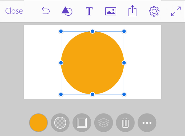
There are several areas in Comp for adding assets to a composition. Three of them—Shapes, Text, and Graphics—live in the top menu bar. Tapping once on either of these three icons will bring up the option to create or import a particular asset. The other two places are for assigning color to fills, strokes, and text, and appear along the bottom of the composition when an eligible item is selected. All five of these options give you the ability to select an asset from a CC Library of your choice.
Adobe Comp’s top and bottom menu bars
SHAPES AND GRAPHICS
Shapes
If you’ve tried working with CC Libraries on the desktop, you might know that graphics of all types—JPEGs, PNGs, AI files, and SVG shapes—are lumped together in one section labeled Graphics. In Comp, you’ll have to know what type of graphic you’re looking for to know where to go for import. If you’re looking for a vector shape that was created using the Adobe Capture mobile app (or its predecessor Adobe Shape) you need to go to the Shape icon in the menu bar. By default the App Shapes option is selected, but you’ll want to tap on the second option labeled My Libraries and choose one of your libraries.
Once you’ve selected a library, the My Libraries label will go away and will show the last library you chose. Tap Change Library at the bottom to see the list of libraries again. Each library in the list displays how many shapes are stored in that particular library. Scroll to the shape you want and tap once on it to place it onto the composition. If you need to place multiple shapes, continue to tap on shape thumbnails. When you’re ready to return to the composition, tap anywhere on the composition layout.

Graphics in a library in InDesign (left) with file types indicated; the same library in Comp CC (right) without the SVG shape
Graphics
Tapping the Graphics icon in the menu bar brings up options for placing all other non-shape graphics into your Comp file. The import tab provides several options for importing graphics from places such as the device’s camera, Adobe Stock, camera roll, and new graphics from the CC Marketplace. But we want to limit our search to assets that already live in a CC Library.
If placing a simple shape was akin to driving on a quiet country road, we are now merging onto a much busier two-way street. Even though we’re working towards creating a comp layout on our mobile device to move to the desktop, assets we choose in the Graphics section may have started life back on the desktop. These might be objects that were created in Photoshop or Illustrator, or that were purchased as stock photos and placed into InDesign. If you’re going to be working within this type of workflow, with CC Libraries at the core, my suggestion is to get in the habit of adding most items to your library. That means if you make an item in Illustrator that will be placed in the traditional way (by placing into InDesign), do yourself a favor and also throw that AI design into a library. That way, when you’re working up a new piece for that same client using Comp while you’re out and about, you will have access to the actual AI file. And when you send that Comp file to InDesign when you’re back at your desk, a trip up to the Links panel will reveal the image is being linked to the original AI file.
Images and other graphics are probably the most difficult assets to keep track of, especially when round-tripping between the desktop apps and the mobile ones. Like any adventure, having a route mapped out ahead of time cuts down on unexpected detours and wrong turns. Having a set workflow with a good asset management strategy is essential, even when co-ordinating everything through CC Libraries. I try to only place items into libraries from their native app, so as to avoid confusion as to its origin. For instance, if you place a JPEG file into InDesign, then add that file to a CC Library, the file type tag will indicate it’s an InDesign asset. When that item is placed into a Comp file from the library, then sent back to InDesign, the Links panel will reveal that it’s still a JPEG linked to its original location. It would be less confusing to add that JPEG in the beginning from Photoshop, so at least the file type will reflect that.
TEXT
The feature that really sold me on Comp when I first saw a preview, was the ability to use real working fonts within the mobile app. Currently, Comp can only access fonts available from your Typekit subscription (which you have as part of the Creative Cloud). Although having access to every font loaded on my iPad would be ideal, knowing that if I stick to Typekit fonts, I can work on my desktop or mobile app and not have to deal with missing fonts. And how often can we say that?
See Also: Working With Text in Adobe Comp CC
Having given you the spoonful of sugar about text in Comp, now comes the medicine: Text styles in CC Libraries are, and I mean this lovingly, a bit of a hot mess. Being able to save a style to a library, so I don’t have to remember or otherwise indicate what fonts I used and at what size, is a thing of beauty. But because each application—whether on the desktop or mobile—deals with styles slightly differently, it’s not the smoothest of transitions. For instance, you can now save both paragraph and character styles from InDesign to a CC Library, but in Photoshop, an added paragraph style becomes a character style. That’s not all bad, because Comp can only use character styles.

Viewing available text styles in the same library in InDesign (left) and in Comp (right)
Whether you’re creating a new text frame (from the text icon in the menu bar), or editing existing text (by selecting the text frame then the T icon at the bottom), the second tab in the text options lists your CC Libraries. Choose one from the list, or select Change Library to see the full list. The number of styles in that library is listed below, but even that is a bit deceiving. First off, paragraph styles are completely ignored, with only character styles being included in that tally. And, tapping that library name may bring up an even smaller list than expected, in that some styles may be unsupported. These unsupported styles come from character styles that either contain unavailable fonts, or were defined with simple parameters, such as “italic” or “Bold” only. If you see a cloud symbol next to a style you want to use, tap it and the font will be synced to your device from Typekit and available for immediate use. Tap an available style once to either create a new text frame or to change the currently selected text.
COLOR
When you select an object created in Comp, or a text frame, you have the option of changing its color. With an object shape, you can change the fill as well as the stroke; text is limited to fill only. Selecting an eligible item brings up a color dot in the bottom menu. Tap on that to bring up the color panel. The third tab lists your available CC Libraries: choose one or Change Library at the bottom of the panel. The top section reveals any color themes that you’ve added to your library, while any individual swatches will be listed at the bottom. Tap on the color you want and the color is applied to the selected item, though there is no visual indication you’ve actually selected a color. If you want to apply that color to other items, tap Copy, then tap the items you want to change and hit Done.
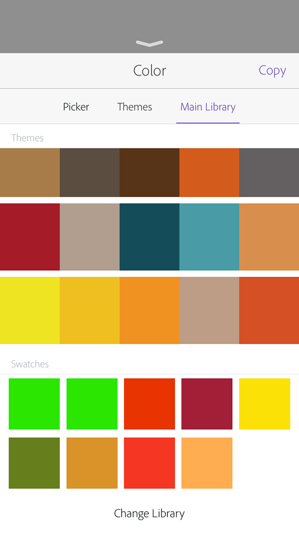
Color themes and swatches available in a library in Adobe Comp CC
Keep in mind, although the colors will retain their color values when they get sent to the desktop, the color’s name gets lost in translation somewhere. For instance, if you have a swatch named Teal in a library and assign it to an object in Comp, you won’t see Teal in your Swatches panel back in InDesign. You’ll have to manually re-assign the named color to a selected item, by selecting the swatch in the CC Library and choosing Set Color.
FINAL THOUGHTS
Creative Cloud Libraries are still in their infancy and don’t always behave as expected. That being said, using them in a workflow that includes Adobe Comp CC is the quickest and easiest way to import assets and to use those same assets once a file migrates from Comp to the desktop.
I’d love to be able to do more book layout with Adobe Comp. But unless it is hidden so carefully it defies my hunting, the Creative Cloud fails in one most important area. I can share almost everything imaginable through CC but the one that matters most—actual text, meaning characters grouped into words independent of any styling. For that, I find myself expected to type those words and get them right, often using a pitiful touch-screen keyboard. The only alternative, cut-and-paste, puts users back into the 1980s and requires some third-party app to store that text.
For what I do, books, that’s a mere nuisance. For those doing magazine layouts and advertising copy, that strikes me as a critical failing. For the latter, the precise wording is critical. It needs to be written, edited, reviewed and checked off in some way that doesn’t permit typing errors.
I’m not sure how this text sharing would work out in practice, but the CC needs some way to organize and store actual text and share it efficiently between apps as easily as pictures, colors and styles. The organizational structure should make it easy to find snippets of text. For the benefit of teams, the system might allow review and approval in the cloud. Adobe might even consider adding the ability to revise text edits much like new images can be updated inside InDesign. Something could be written while an advertising slogan, book title, or product name was still in flux and then have all uses of that text snippet updated to the final version.
I just wanted to send Erica a quick message to thank her for her articles and the knowledge she puts into them. Easy to understand, timely, and just plain terrific…thank you!
Thank you, Wendy! I’m glad you are enjoying them, more are on the way!