Adjust the Space Between a Drop Cap and the Next Letter with Kerning
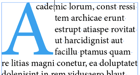
When you assign drop cap formatting to a paragraph (so that one or more letters at the beginning of the paragraph drop down more than one line), InDesign creates the drop cap in a rectangular area. That means the text to the right of the drop cap does not runaround or wrap to the contours of the character:
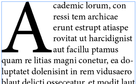
There are ways to cause a non-rectangular runaround (I wrote about it here, and Anne-Marie shows the technique in a short video here). But some people just want to bring the first line in a bit closer to the drop cap. For instance, in the image above, the first word (“Academic”) appears to be two words because there is too much space between the drop cap and the rest of the word. If only we could make that first line snug in closer to the drop cap!
You may already know the kerning trick: If you place the type cursor between the first two letters of the word, you can set the kerning to a negative number, which brings the letters closer together… but it also changes the spacing for all the subsequent lines:
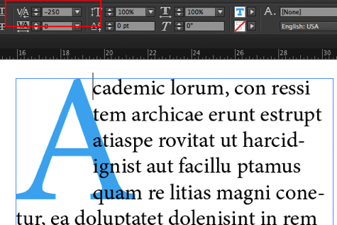
(In the image above I set the color of the drop cap character to blue to make it easier to see. You can see the kerning value is -250 in the Control panel.)
This kerning trick is pretty cool, and in fact, you can push it to the extreme, making the drop cap appear entirely behind the text itself:
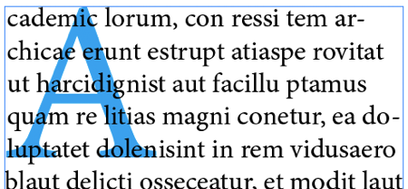
However, this is not what we’re trying to achieve… we just want the first line to be kerned in! Fortunately, one of our eagle-eyed readers named Janet pointed out a trick shared by Petteri Paananen on the Adobe forums: If you place a non-joiner character between the drop cap and the second letter, you can then kern the space between that non-joiner and the following letter (the “c” in the example above). That brings just the first line in!
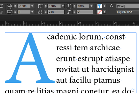
See that little light blue symbol that looks like it’s after the “c”? That’s the invisible character (Type > Show Hidden Characters) indicating there’s a non-joiner there. It’s really before the “c” but it appears to be after it because of the –1000 kerning. By the way, here’s how I inserted the non-joiner character from the Type menu:

Unfortunately, InDesign has a maximum kerning limitation of –1000, which makes it tricky to bring the word even closer in to the drop cap. The solution: Add another non-joiner character with more negative kerning:
By the way, you don’t have to use the non-joiner; you could use the End Nested Style Here character. These special characters are both “zero-width” and don’t break the word into two. That means the word still spell-checks correctly!
Of course, zero-width characters (especially when they’re kerned like this) are difficult to select with the Type tool. For example, if you later decide to delete one, the only good way to do it is to click elsewhere in the paragraph and then use the arrow keys on your keyboard to move the cursor into position. Not a big deal, but takes a little attention.
Thank you to Petteri (our friend from eDocker) and Janet for pointing this out!


cool. I’ve tried to find a way to do this easily forever.
Love this tip. Have to throw in here that the easiest way to insert the non-joiner character is to use Quick Apply! Click an insertion point where you want it, press Command-Return to call up Quick Apply (Control-Enter on Windows), type the first few letters of the menu item (“non-“) to select it, then hit Return/enter to enter it in the text. Press Command-Return and then Return again to enter the second non-joiner.
In the last paragraph it talks about selecting the non-joiner character. Is it possible to select it in the story editor to change it if you had to?
inkeye: You know you should be able to, but as it turns out it’s kind of clunky selecting it in Story Editor, too. But it’s not that hard to do it by placing the cursor and then moving it around with the arrow keys. You know you “have it” when you press an arrow key on your keyboard and the cursor doesn’t move at all (because it’s a zero-width glyph).
Um… I love you guys, but that final example looks HORRIBLE! I’d actually rather have the block-type alignment than that first line hanging over the rest all on its own.
What I wind up doing is kerning the top line over to where I want it, inserting a non-joiner before the leftmost character on the next line, and kerning that over. Repeat for as many lines as your drop cap occupies. The upside is that as you kern each line from top to bottom, the subsequent lines reflow as appropriate before you move on to the next line.
Of course, the downside is that you are manually scattering non-joiners and there will be cleanup if things change, but it’s definitely the only option for me until Adobe automates this. Why it’s not yet automated is *so* beyond me, but that’s for a different discussion.
Anthony: I appreciate that you don’t appreciate the design, but some designers like it that way. If that’s what the art director calls for, then it’s important to know how to give it to them. Personally, I prefer a diagonal wrap in these situations.
David: I guess I’ve neither ever worked for nor been that Art Director, so that’s news to me.
Also, I appreciate that you appreciate that I don’t appreciate the design, but what about the love? Do you appreciate the *love*? :-)
This method isn’t working at all for me. I’m setting the kerning to as much as -1000 and the nonjoiner space doesn’t move.
Rich: Maybe the cursor is in the wrong place? It should be between the non-joiner and the next character.
My bad … I was trying to adjust the TRACKING rather than the KEARNING. After all this time, now drop cap “A” actually doesn’t look bad. Thanks.
Hi,
This seems a great trick as a one of but how can you make that work as a paragraph style. I am using a lot of drop caps in my document and too me rather than too far I reckon it is too close and want to increase the space between the drop cap and the lines on the right next to the drop cap. Do you know how I can do this as part of a paragraph style?
Marijke: You could do a simple kerning by making a character style for the drop cap that contains positive tracking and then applying that automatically in the Drop Caps and Nested Style pane of the paragraph style.
Hi thats a Cool Thread!!!!
MOVIEZ https://www.9xvid.com/
Queste manifestazioni si riassumono costellazione di sintomi non facilmente distinguibili da quelli provocati da altre malattie epatiche fase acuta.
Can you tell me how I would, when using a drop cap paragraph style, allow more space between the drop cap and the first letter of the second line? Adding a white space just causes another word from the first line to flow into the second line, which just duplicates the same problem.
An even easier way is just create a tab to the distance you want the others lines to align to after the drop cap