Adjust Word Spacing in Paragraph Styles
MH wrote:
We are doing a series of children’s books and ample space in between words is crucial — but I want the tracking between letters to stay the same.
I know just what you mean: My son is steeped in the mysteries of how letters form words right now and word spacing is crucial! I wrote about word spacing last year, but I focused on using InDesign’s secret keyboard shortcut. When you’re doing a whole book, you certainly can’t rely on the shortcut; you need to define the word spacing as part of the paragraph style. Fortunately, this isn’t hard to do.
As I alluded to in this other H&J post, the trick is to adjust the Justification settings. “But my children’s books are all flush left,” you protest. That’s fine; the Justification settings apply to all text, even flush left.
Here’s how you might set up the Justification pane of your paragraph style dialog box:

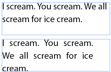
The result is dramatic. The image below first shows the default settings, then the widespacing style applied:

Should Adobe change the name of the “Justification” pane to “Word and Letter Spacing and Other Things That Relate to The General Composition of All Text”? Sure, but it might be hard to fit in the dialog box.


Once again, you guys come through and make me the happiest GD in the world!!
I think your example is a good one (you need to add word space for a very specific reason). But, and I’m sure there are no design hacks here
:), adding extra word spacing while keeping the letterspace constant isn’t a great typographic design practice. YOU probably do it with caution but for typo newbies, I had to put in my 2 cents that you almost never want to add wordspace. Letterspace, yeah (in which case the wordspace would adjust accordingly). Leading, yeah. But word space is has a proportional relationship to letterspace. Other than that, I couldn’t come up with a reason that seemed convincing enough when I told design students not to add word space. I just directed them to the bad wordspacing on highway signs. By the way, is wordspace 1 word or 2?
Jane, many designers would say just the opposite: Always use wordspacing (I refuse to decide whether it’s one or two spaces) and never use letterspacing. I believe it was F. Goudy who said something akin to “”Anyone who would letterspace blackletter would steal sheep” (though my understanding is that he didn’t use the verb “steal”).
Ultimately, I think it’s all about balance… finding the right balance for the font and job at hand.
Hi, I think Goudy was talking about lowercase and I think he did say “steal”. And then Erik Spiekerman wrote the good type book “Stop Stealing Sheep”. Anyway, I should have qualified my comment by saying it’s okay to letterspace all caps or even some naturally tight lowercase but whatever, the word spacing should usually expand or contract along with the letterspacing. But there are probably fonts where something could be improved upon.
I was late to the game on your podcasts. Love them!
To reduce spam, comments have been closed for this post. If you want to start a related discussion, head over to the Forums and create a new topic.