

Automatically Add Space Around Em Dashes and En Dashes

In many fonts, there is not enough space around em dashes and en dashes for my tastes. For example, see how close the dashes are to the characters around them in this text frame using Minion Pro:

It’s not terrible… in fact, some designers like having it that tight. But I don’t, so I want to add space on either side. Of course, you could manually add a thin space (or some other white space character) to the left and right of each dash. You could even use Find/Change to add those spaces quickly to all the dashes in your document.
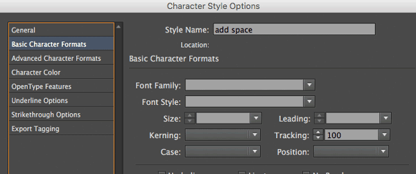
But there’s another way: use GREP Styles to apply the space automatically wherever it finds them. To use GREP Styles, you first need to create a character style. Here’s a simple one, which just adds 100 units of Tracking:
Now we can apply that character style inside our paragraph style definition by choosing the GREP Styles pane, clicking the New GREP Style button, selecting the character style we just made, and then typing in the GREP expression: /w~_ which means “any word character followed by en em dash”.
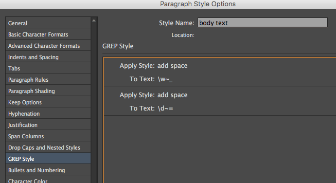
In the image above, you’ll see I added another GREP Style, too, which applies the same “add space” character style to any number followed by an en dash.
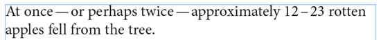
The character style adds tracking to the character before the em or en dash, and the dash itself. And tracking extends the space between the character and the one immediately to the right of it. So the result is that space is added before and after the dash:
Of course, that second expressions only works for numbers—it won’t work if there’s a letter before the en dash. So you might want to change the \d to \w (which catches both numbers and letters).
Mara Z, a reader whose question originally inspired this post, also later suggested using \S~_ instead, which means “any non-space character followed by an em dash (such as symbols and other characters).
I always add a Thin Space on either side of an Em Dash, but in my case it’s such a habit I just type it manually. But of course there are situations where I’m handling other people’s text. Good tip.
I’ve usually done this with kerning but wonder if there’s a way to apply the desired kerning with GREP. I’ve got a small cabal of characters (with differing kerns) I could use it for.
Thanks for this tip, David. Hope you are well!
Matt Bargell