

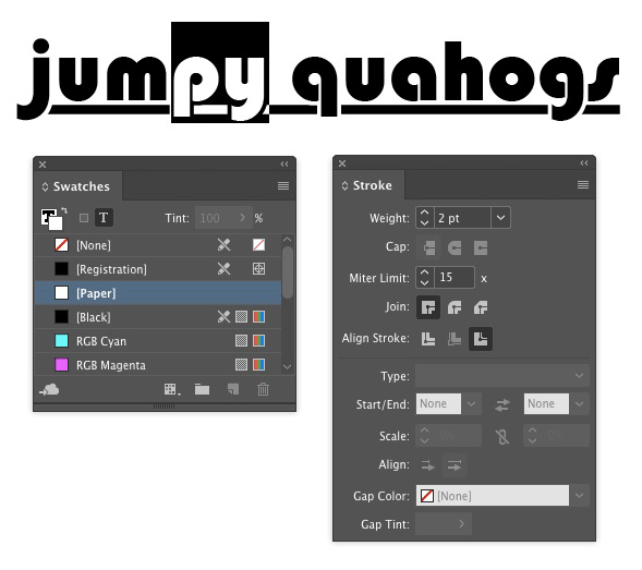
Breaking Underlines for Descenders

If you’ve ever tried to design type with underlines, you may have run into a problem where the underlines overlap the descenders of some characters and make things hard to read.

You could try using all uppercase or move the underline down further, but there’s a better solution: interrupt the underline with a stroke applied to the descenders. You can apply the stroke manually, or use a GREP style if you expect to have to do this kind of thing often.
If the text appears over a white background, you can simply apply a white stroke to the descenders.
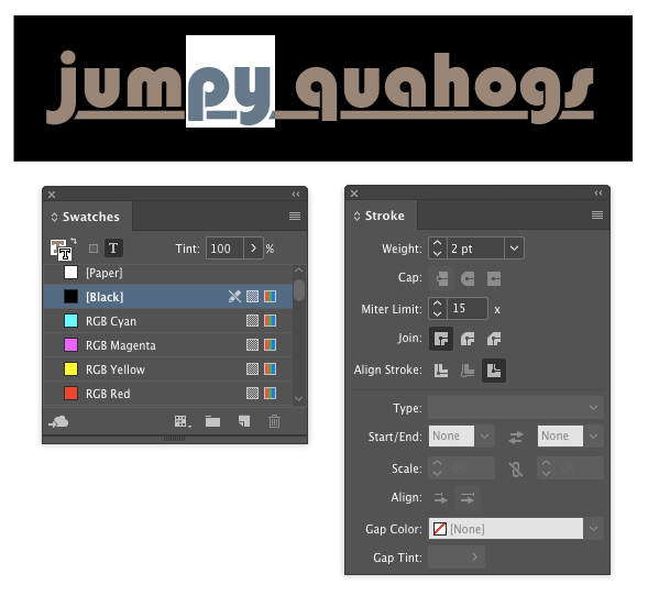
Or if the type is over a solid color background, use that color for the stroke.
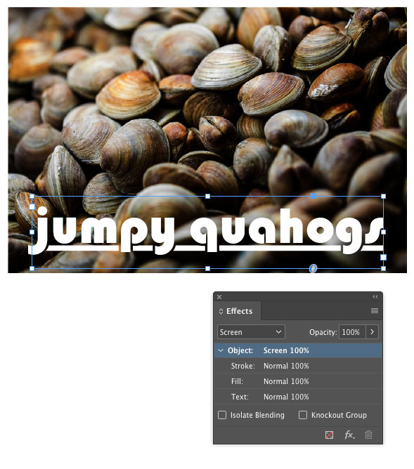
Things get more interesting when the background is a gradient or a photo. In those cases, you’ll have to use a transparency trick to make the stroke knock out the underline.
In this example, I set the stroke color to black.

Then selected the text frame and used the Effects panel to set the blend mode to Screen. This leaves the white text and underline unaffected, and causes the stroke to knock out the underline.

As I mentioned above, a GREP style can automatically apply the underlines to descenders. Something like this will do the trick. It applies the stroke character style to the letters q, j, p, y, or g. If you’re using a script font, you might also need to add the f and z.

Great tip!
I managed to get the solid background to work.
Couldn’t get the image to work with screen mode.
… same here. The result of the “screen” gives a b/w rendition of the graphic below the stroke.
I think Mike left out one caveat on the last trick (the one that says set it to Screen blend mode). I think it only works when Edit > Transparency Blend Mode is set to RGB.
So the method where you use just a solid color background works great in all situations, but the Screen one might not be appropriate for all documents.
Sure enough … worked as advertised by changing the “transparency blend space”
If you’re going to go the GREP route, then you don’t need to mess around with transparency at all! Simply, create a Character Style with no underline and specify the letters with descenders.
True, but wouldn’t that eliminate portions of the rule? The section between the p and the y, for example?
Good point!
The problem with this is that it only works with text that is set loosely. In the example, there appears to be no kerning at all.
Registeration-color is better than Black for screen-trick.
I wonder if there is a use for a “knock-out” ink?
Worked well for me. In addition I created an object style in which the text blend mode is set to Screen, so I just need to apply the object style to the block and voilà!
Love this trick!
I’m hunting for a solution to an issue that suddenly occurred. My gmail (current Chrome) has decided NOT to underscore any descender letters and it looks choppy – I don’t like it and I don’t know what made this happen. Could it be an extension I may have allowed in my chrome? I have a very few. I do not fool with my texts in changing stuff as written and described in this webpage. I just want my underscore to underline ALL letters – above and below the “line”. Any hints why this happened? I do not use shortcut keys and made sure that feature is disabled. Any help would be appreciated.
Wow! Thank you so much! You saved my day :D And I found the GREP solution for multiple characters here, too. thxthxthx