

Broken Ligatures

I think David and Anne-Marie mentioned this on a podcast, but I didn’t find a post dedicated to the subject, so I thought I’d write it up.
Diane Burns (one of my favorite desktop publishing gurus) called this to my attention:
In a typeface such as Hoeflet Text, the ligatures for fi get broken under certain circumstances.
Here’s an example of the problem:
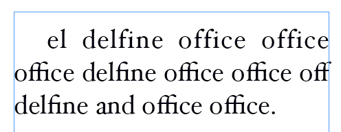
Notice that the ligatures for fi are broken in the first line, but show up correctly in the second and third lines.
One cause of the problem seems to come from the justified text. But the other part has to do with the Justification setting for Maximum Letter Spacing. When the Maximum setting is greater than 0%, the ligatures break. But some of the ligatures don’t break because the Letter Spacing doesn’t kick in for those lines.
But before you scream bug (as I did), I think this actually isn’t buggy behavior. It existed in CS2 as well as CS3.
What I think we’re looking at is simply a lack of the control that XPress has had for a long time. In XPress there is an option to not break ligatures unless they are over a certain tracking amount. I assume that would also apply to letter spacing applied as part of the H&J’s for justified text.
InDesign needs such a control. So that ligatures stay together even if other parts of the letter spacing cause the text to separate.
Don’t you think that first line would look utterly ugly if the ligatures kicked in?
InDesign doesn’t give the user control over this, but it does have a spacing threshold at which point it determines that the ligature would fail to serve its purpose if used. I recall at some point in the past seeing what that value was, but I can’t recall it right now.
Dave
This has happened to me, and there is a way around it until it’s fixed on InDesign’s end. You need to searh and replace all the “f f i” (individual characters) with “?” (the glyph) . I use it sparingly as the ligatures look awful when widely tracked.
Take it from a guy with veins full of lead – what you are seeing is correct. If you do not like the effect then turn off all letterspacing. This is where we need to use our human skills, examine every line and use manual word breaks as required for colour. If you do not like word breaks but still want to justify the text then you are breaking one of the basic common-sense rules of typography.
My old Comp room foreman would spin in his grave if he saw that.
Cheers, John
I fully agree with Dave Saunders. (In fact, I think the first line looks utterly ugly as it is. If I had my way, the option totletterspace would be removed from InDesign altogether.)
Ligatures exist to solve the problem of parts of letters bumping into each other. If a text is letterspaced, that problem doesn’t exist anymore. So, no need for ligatures.
I think it is getting confused between contextual forms. I don’t think it’s considering the context of the letters around it or it’s proximity to the end of the line. The character AE is a vowel in Danish and Icelandic, but when it’s used in it’s Latin form can be a varient in English which is commonly printed as seperate letters. Some German vowels with the two dots over the letters (umulauts?) are sometimes printed as eo in the digraph form. There’s so many ways a ligature should and shouldn’t be used. Isn’t it still widely undecided whether the author or the typesetter should decide if a ligature is used or not? Does InDesign use the XeTex engine?
I’m confused as to why you all think that to have ligatures in one line but not in another looks good.
It’s the combination of on and off that I think is wrong.
I made a mess of my post, I didn’t put in what my point was… and I can’t remember what I was going to say.
Sandee, I don’t think in this modern world that the bog standard reader of magazines and books cares if there are ligatures or not or if the letters are spaced evenly. All I do is exactly what the author asks, if they say it’s too tight, then I go for a looser spacing, and vice versa. Older typesetters, like my former boss, would constantly insist on it, but then again he was measuring type on my screen with a rule, so it’s hard to know what’s right and what’s wrong in the crazy world of typesetting.
Not that I’m dissing your post or anything… gosh I have to think before I write this hour of the morning.
Eugene,
I don’t take your post as “dissing” me. (And I understand your reluctance to commit to anything early in the morning.)
I think the problem, as I said before, is simply the mixture of ligatures on and off in the same paragraph. That’s the kind of thing that jars on the reader.
Ligatures are only added to text to make it easier to read. The combination of the end of the f and the dot of the i, when too close together make a jumble of dots in the printed text. A ligature just makes it easier to read.
Obviously when the letters are tracked or spaced out, the end of the f and the dot of the i don’t collide that much making the need for the ligature less vital.
That’s fine. But I believe the reader’s eye is bothered by the inconsistency. That’s what I would like to fix.
Aoccdrnig to a rscheearch at Cmabrigde Uinervtisy, it deosn’t mttaer in waht oredr the ltteers in a wrod are, the olny iprmoetnt tihng is taht the frist and lsat ltteer be at the rghit pclae. The rset can be a toatl mses and you can sitll raed it wouthit porbelm. Tihs is bcuseae the huamn mnid deos not raed ervey lteter by istlef, but the wrod as a wlohe.
Just thought I’d share that, if you hadn’t seen it before, it’s been going around for years though.
Sandee I agree, readability is the most important thing, and if you can notice then so will others. What kind of engine does InDesign use for detecting ligatures? Is it the XeTex engine or their own, I don’t know a lot about it?
> What kind of engine does InDesign use for detecting ligatures? Is it the XeTex engine or their own, I don?t know a lot about it?
Hell, you know more about it than I do. I didn’t even know there was an XeTex engine. (And would have sworn it was something you find on a NASCAR.)
https://en.wikipedia.org/wiki/XeTeX
I think the important pieces of this puzzle are:
1. When you allow positive letterspacing in justified text (in the Justification dialog box), or when you manually letterspace text (via tracking or kerning), ligatures get turned off.
2. There really should be a control in InDesign, as there has been in QuarkXPress for over a decade, to control how much letterspacing should break apart a ligature. There are many fonts with which adding 1 or 2 units of letterspace should definitely not break the ligature. (That is, the result of the two characters so close together just looks far worse.)
I agree with Saunders, Nixon and Pinske in that the ligatures should only be where they’re needed, and that it looks fine with one line having them and one not, just like a small variation in spacing is fine as well in justified text. Personally, I wouldn’t allow InDesign to space my characters enough to break them, but that’s another issue…in this case ID is doing the right thing.
I know nada about the actual code buried InDesign, and hadn’t heard of XeTeX either, but I have read in several places that much of the excellent justification engine inside ID is based on algorithms in Donald Knuth’s TeX typesetting program, which is used a great deal by scientist and mathematicians to typeset articles with heavy-duty mathematical requirements. See: . I have a friend who’s a quantum physicist, and he composes his writings in LaTeX, the GUI frontend for TeX. I have briefly tried LaTeX. It has built-in templates for typesetting scientific articles, and it produces quite nice typesetting — though I think it can’t handle advanced OpenType glyphs. But I would hardly trade in my copy of ID CS3 for LaTeX! Still, it’s interesting to compare these semi-competing technologies. See:
Oy, my links just died — why they heck can we use angle brackets for some tags, but not for link?!
Thes were my links:
https://en.wikipedia.org/wiki/TeX
https://en.wikipedia.org/wiki/LaTeX
I think I’m having a broken ligature problem but only when I print a book. The glyph ‘?’ is printing in certain ‘f’ combinations. If I print the pages one by one my ‘f’ combinations are fine. Any ideas how I can get my book to print properly?
This sounds like a font substitution problem. In the Print dialog box, go to Graphics and make sure Download PPD fonts is chosen.
[…] I like justified text, I think it make the content look sharp. LaTeX seem to agree with me on that point, at least in the style I used (report). Justified text in LaTeX has one drawback however. Sometimes the letter spacing between certain letters become too small, resulting in what I surmise typographers call “broken ligatures”. The term “ligature” seem to simply refer to a specific part of a letter. A broken ligature, then, would happen when the ligature in a preceding letter “floats into” the next one. […]