

How to Center Capitalized Text Vertically in a Frame

As part of my day to day job I often encounter InDesign documents created by by others, and there’s one thing I come across often…

Unthreaded text frames, filled with a colour and a single line/word of capitalized text that is horizontally and vertically centered. Sometimes I spot the following:
- text is repositioned vertically using a baseline shift
- or in some cases text is set in a separate text frame and arranged in front of an unassigned coloured frame.
Depending on the scenario there are other ways to tackle a similar look. Let’s look at the ‘Framed-alternative’ :)
Frame it
If we look at the framed text scenario. There is certainly a quicker and easier way to get capitalized text centered vertically, and that is to use the Vertical Justification setting in the Text Frame Options dialog or the Control Panel.
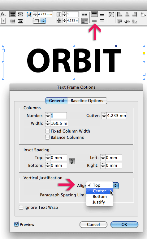
Ok, I hear you say “yeah right, but I still need to apply some baseline shift, as my very keen designers eye tells me the capitalized text isn’t quite centered after this’.
Very likely your text will not be nicely vertically positioned in the text frame if you click ‘OK’ in the dialog box at this stage, and that’s because there’s a default setting that controls the assumed ‘baseline’ position of the text that we need to change…
Click the Baseline Options tab in the Text Frame Options dialog to access these settings.
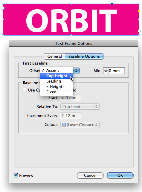
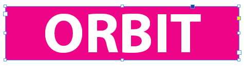
InDesign by default has the First Baseline offset, set to ‘Ascent’ … when working with vertically-aligned capitalized text, change this setting to Cap Height, and you should see a more accurate vertical centering:
Great tip. We use the same technique for perfectly centred Upper-case spine lettering for book covers.
If you are using upper and lower case lettering, then selecting ‘x-height’ for First Baseline Offset, gets you closest to a visually centred spine. However, a tiny bit of nudging by eye is sometimes still needed to get you spot on.
Nye, excellent example of this technique: using it for book-spine lettering :-)
Really good tip. I never noticed the baseline options under Text Frame!
Personally, I like to use the Paragraph Rule “Line Above”, tweak it a little bit and make a Paragraph Style out of it.
It stays in-line just where it belongs, and I have fewer pieces to worry about on my layout. And if I need to tweak it for copy-fitting purposes (space before/after), I only have to do it once!
@Design instructor. Use of paragraph styles definitely has its place :-) where text lines such as headings/ subheadings are designed with a background colour.
It’s one of the other incorrect uses I encounter when reviewing people’s InDesign documents :) Only just the other week I showed a group of long-time InDesign users how their document set-up could be revised and how easy it was to turn unthreaded frames into text with a paragraph style attached to it.
(was actually thinking of writing that up as my next contributor post).
For smaller documents, such as Ads, poster-designs, book-covers framed-text definitely continues to have its place as well ;-)
… see also https://creativepro.com/headingsrul.php ;-)
Don’t EVEN get me started on InDesign documents created by others! (Especially DESIGNERS!)
@Richard Groff….
PS who else use Indesign?!?! Duhh ;) dont see the IT section using
great tip, thanks, definitely will come in handy
Awesome, I’ve been searching for this everywhere
thanks a lot
Man this was bugging me for life… ;) i always used a seperate text field, quite stupid. Still it doesnt align always so i do custome baseline shift per text frame
when i’m make a text center inside of a text frame if i move the text frame that text change its position to down and up some time hiding. i don’t know how to solve this problem
What about a shortcut? I miss a shortcut to assign vertical justification :(
Excellent tip. It also works in table cells.
Coming back at this, had forgotten about :) Now the issue with numbers never centering correct ;) Is there something up with that too perhaps?