Colorizing Grayscale Images (with transparency)
Georg wrote:
I have a problem with placed grayscale images in InDesign. Normally I can set a color for the image with the swatches palette. But if the image has transparency (in PSD or TIFF) the image stays gray.
You know that story about how InDesign and Photoshop work together so well in the Suite? Well, it’s mostly true, but this is a great example of how the interactions are not perfect. For those of you who don’t know what George is talking about: You can colorize a grayscale TIFF or PSD file by clicking on it with the Direct Selection tool (so the image is selected, not the frame) and then using the Swatches palette.
But this stop working as soon as your image has transparency in it. Why? Because. (I assume there’s a better reason than that, but the only answer I have is, “Because.”) Fortunately, there is a workaround.
First, save the file as a monotone instead of a grayscale image:
- Open the grayscale image in Photoshop and choose Image > Mode > Duotone.
- In the Duotone Options dialog box, choose Monotone from the Type popup menu.
- Click on the color swatch and choose any color (not black). I suggest picking some neutral gray or flourescent green or something obvious.
- After you click OK in the color picker, give the color some obvious name, such as “map me to the correct color”
- Click OK and save your duotone (monotone, actually) file as a PSD.

Once the image is saved as a monotone, you can import it into your InDesign document and apply the proper color. But first you need a color:
- If you already have a color swatch you want to apply to the image, select it in the Swatches palette (make sure nothing is selected on your page when you click on the swatch) and hold down the Option/Alt button while clicking the New Swatch button. This creates a duplicate of the swatch you selected. Set the Color Type popup menu to Spot and make sure it’s named something appropriate.
- If you don’t have a color swatch already, make one now in InDesign’s Swatches palette with the color ingredients you want — but make sure you save it as a Spot color (even if it’s specced with CMYK colors).

Now it’s time to do the deed, and apply the color to the image:
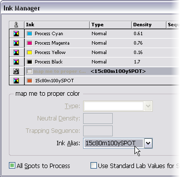
- After you have created your new spot color swatch, choose Ink Manager from the Swatches palette menu.
- In the Ink Manager, click on the imported image’s spot color (“map me to the correct color”) and then choose the new swatch you built in the Ink Alias popup menu.
- If the swatch you just made was supposed to be a spot color (for example, you’re applying a Pantone color to the grayscale image), then skip to the next step. On the other hand, if the color swatch was actually supposed to be a process color, click on the little icon next to it in the list of inks. Don’t enable All Spots to Process because that turns off the ink aliasing that we’re depending on.

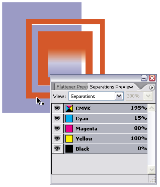
After you click OK to leave the Ink Manager, you’re done: The grayscale image is mapped to the new color. If you don’t see the color on screen, there’s an easy fix: turn on View > Overprint Preview. Ink aliasing (mapping one spot color to another color) is only visible when Overprint Preview is enabled. If you want to make sure that the effect worked, open the Separations Preview palette and hover the cursor over the image.

Should there be an easier way? Sure! But in the meantime, it’s helpful to understand the concepts of monotones, spot colors, and ink aliasing.


well, now i see the advantage over quark
not!
Jeff: That’s funny! Have you tried doing any of this in QX? Can you assign color to PSD or grayscale TIFF images that contain transparency in QX? Can you alias one spot color to another?
There’s no doubt that this is a painful workaround to what should be a simple solution, but that’s sort of what this whole site is about: workarounds and tricks. If you want comparisons of QX and ID, check out QuarkVsInDesign.com.
This worked for me! I’m happy. The job was at the press and needed the one color conversion. Thank you!
I had need recently for a spot colour image from a greyscale with transparency.. I wasn’t able to quickly find an immediate solution so I made my greyscale a monotone of the CORRECT colour then saved the image as a PSD PDF and imported that.. worked great!!! anything wrong with that?? incidentally just got CS2.3 can’t wait to get my hands on CS3
Piers, nothing wrong with what you did at all! I should have mentioned in my post above that if you know it’s only going to be in that one color, then go ahead and choose that in the duotone mode. The ink aliasing route I talk about is good when you’re not sure what color you’re going to assign to the image.
You know, this is the only place I can see mention of this problem. While your work-around works ok, it really isn’t a long-term solution for what seems to be a bug in the software. It really seemed to start doing it out of nowhere, as well, perhaps a bug in one of the updates, but its driving me b.s.insane. Thanks for this work-around, though, it helped me get ahead in my project.
I have a problem that sometimes my images won?t print when I apply color with swatches palette to grayscale image. How can I fix this problem?? It seems random?
Hm. That seems strange, Rae. Just the image doesn’t print? Or the whole page? I don’t have a good solution for you, as I haven’t seen this problem before.
It’s just the image that won’t print. I’ve tried resaving them as psh, flattened, with and without compression, new name, but no luck. . .
my grayscale tiffs, when set to overprint, will overprint over each other, but they knock out text that they’re on top of :(
isnt setting something to overprint supposed to prevent it from knocking things out?
@roy: Actually, overprinting is trickier than that, especially when a color is “overprinting” something else in that same color. That’s why using Multiply in the Effects panel is far more reliable.
why not just choose multiply in the transparency setting to knock out white backgrounds in tiff files? works for me!
OMG!!! It’s like cracking the DaVinci code!
Thanks so much for the posting. What was so bad with Pagemaker!
FINALLY! After months of wondering about this, I had some time to research it today and you solved the puzzle! Thanks so much!!! As a former Quark user, this was the ONLY thing I missed when switching to InDesign. Thanks again!
hi! i try but doesnt work for me. i mae something wrong. when yoy say: “Should there be an easier way? Sure! “. what is the other way? to colorize psd grayscale with transparent backg…
thanks!
I can’t get it to work. My ink manager lines say 0%. Where do I change that?
@Marujo: When I say “Sure!” I mean, that I wish there were a better way.
@Lesle: I’m not sure what you mean. Where do you see 0% in the Ink Manager?
Thanks so much, this is amazing and it’s working like a charm. Been looking for something like that forever and it’s been here for over 3 years! Instant bookmark, keep up the good work and thanks again!
Thanks very much. I knew it could be done but didn’t know how to apply the swatch Pantone using Ink Manager. Very helpful.
thank you so much!! you saved my life!!
it’s cool that a solution written 4 years ago is so helpful after all this time!
merci! merci! merci! :-)
Or just save a copy as a flattened tif and apply the color to that. Seems way easier to me.
Thank you for that explanation, it was made plain and simple. It had me foxed for some time. I should have come here earlier!
Thank you again!
This is still the best work around IMHO. It is amazing to me that with all the truly useless “so called improvements” that Adobe makes us pay for now on a yearly basis and probably soon to be forced on a monthly basis. That they can’t make real features like this easy. If we can get there it should be a no brainer! Someone mentioned Pagemaker having abilities. It’s true there are still many abilities in Pagemaker that have never found there way into InDesign and most were things that made workflow easier. Of course that product was designed by Aldus not Adobe. Adobe did a great job of evolving the problem areas that kept Pagemaker from being the dominant force in page layout but missed the bus on porting some of the already great features.
Barny suggest just editing the flattened file. When Barney in many cases that can be very bad. This forces everything to postscript an not native pdf anymore, so a lot of the native transparency support is gone. This introduce in cases of transparent images over other images graphical corruptions.
Best to stay native PDF if you can.
There’s an easier way to do this. Simply place a grayscale .bmp (bitmap) file in InDesign. Select the image and choose your spot color from the swatches palette.
Unfortunately, the issue with this technique is that it doesn’t support images with transparency.
After all this years this keep being the best solution, thank you.
Hi,
BMP file format images will suitable for print? Please advice.`
Okay, took me a few takes to wrap my head around the necessary steps but, once all is said and done, this technique is pretty sweet.
This is where my brain got hung up ➔ It’s not a direct replacement for the simple InDesign technique of placing a single (non-transparent) grayscale image an infinite number of times, and tinting it just as many times. Instead, what it does allow you to do is create a number of monotone images (that contain transparency) where you can control their colours from the InDesign swatches palette.
Love it! Thanks! :)
How would a printer print a transparent image coloured with a direct ink? Wouldn’t there be registration issues?