Creating Charts and Graphs Automagically with Data Merge and Chartwell
Charts are among the hardest visual effects to create well in InDesign. Most people try to import charts made in Excel or another program into InDesign. Others use a script such as Claquos to do it. But one of the coolest ways to make charts in InDesign is with the Chartwell font.
Chartwell lets you make a number of different types of charts — pie graphs, bars, lines, etc. — out of numbers in a text frame. That is, you type something like 20+30+50, apply the font, and violà, you have a chart. As you can see in this earlier article about it, it’s really quite astonishing.
But someone recently asked me about how one might create a lot of different charts based on data in a spreadsheet or database, and it occurred to me that the Data Merge feature could do the trick. Colin Flashman wrote up an amazing-but-very-complex-solution for this a while back, but it occurred to me that Colin probably didn’t have the Chartwell font! Chartwell makes this whole thing far easier.
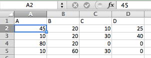
Here’s the example spreadsheet I’m working with (I just chose A, B, C, D as the column headers so I’d have something to work with in data merge; normally you’d use something more descriptive):

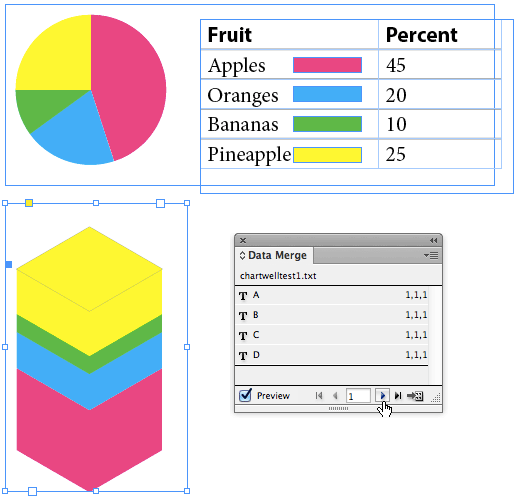
Now I can select that as my Data Source in the Data Merge panel. I’ll make a text frame and click the first variable in the panel, then type a plus sign, then the second variable, then a plus sign, and so on:

Next I select the text and apply the Chartwell font and the Pie style, then increase the size. And finally I assign different colors to each of the variables. (I used a nested style to apply them automatically.) Of course, it doesn’t look right at all until I turn on the Preview checkbox in the Data Merge panel, which replaces the proxies (like <<A>>) with the real data.
What’s great is that you can use the same data from the Data Merge panel multiple times in a document. So for example, here I’ve used the same data to create two different charts and also insert the actual numbers into a table:

I love that I can click through each row of data while the Preview checkbox is on to see how it will look in the final merged document.
Currently Chartwell is sold by Vectro for $40 per style, or in a bundle if you need all the different kinds of charts.


Love that Data Merge twist!
We talked about creating charts in an InDesignSecrets podcast last year, and had some great links to the resources and solutions we mentioned in the Show Notes:
https://creativepro.com/watch_listen/indesignsecrets-podcast-173
I’ve been using this technique for a couple of years and it has saved me countless hours of production. I regularly work on large reporting projects where I produce the same charts over and over with different data sets.
You really have to plan things out ahead of time and nail you template down. You still have to get creative every now and then when things don’t work but once you crack it you WILL BE AMAZED!
Here’s a free movie that Anne-Marie did about Chartwell for lynda.com: https://blog.lynda.com/2011/09/22/indesigns-secrets-building-graphs-with-the-chartwell-font/
Had read about the chartwell font before but wasn’t sure how well the solution would work. Now that i’ve had a chance to look at the fontfont site in more detail, may well be worth the pennies for future projects!
The one limitation of the fonts is that the values must be between 1-100 and integers (no fractions). For a pie chart, the chartwell font solution is indeed better than my complicated method; but for bar graphs that need to go beyond 100, no.
I do like the solution though!
I can’t even get my own details correct! Just re-read the Chartwell instructions, and it clearly says “For Bars you can use values up to 1000”.
Think i’d better go and get this font set!
Can I merge charts from excel into Indesign? I have 15,000 employees data in Excel with charts to show the percentages of employee and employer data.(each employee, I do not want to manually place a chart image) I would like to have the chart that is created in excel to merge with the data in Indesign CS6. Is there a script etc. ?
I’m running into a problem. Although this font is great… My issue is when I have zero as a value. See Below.
83+4+1+0+11+1+0
When I covert the text over to the actual pie slices, I get 2 charts instead of 1. It appears a zero value causes this. Does anyone know a way to correct this? When the numbers all have values it’s fine. the “0” seems to throw things off.
I’m having the same issue. Seems like it’s zeros in the middle of the string in particular.
Here is a quick youtube tutorial on creating graphs with Adobe InDesign https://youtu.be/9H0E-0iUeuc
Love it!!!!
I made a post back in 2013 and I figured out the solution shortly after. I’m sorry it took so long to get back about the issue I was having but I forgot all about posting thins. The +0 issue was all corrected within the Excel file. You have to write a formula so that all values of “0” (zero) are changed to “blank” (empty). Then you have to make sure the “+” for that value is also “blank” or you could end up with “++” which also causes issues. You need to write custom formulas to fix the issue(s). Once the Excel file is perfect you will no longer have a double pie chart error. Everything starts and ends with the Excel file. It has to be 100% correct in order for Chartwell Pie Charts to work flawlessly. If not you will be doing a lot of find/replaces and nobody’s got time for that.
Pete, I have been banging my head against the wall trying to figure out a solution like this in InDesign rather than the Excel file. Thank you for giving us a direction to follow. I’m dealing with a data file of 1,500 employees where I need to label the piechart data points in a key below the piechart. How do you solve applying colors to the wedges when some may go away completely?
Can you show me the formula you used for that?
how do u scale the pie or graphs to increase the size after creating them ?
Because Chartwell is a font just modify the character attributes.
Can someone expand upon the coloring of the values? I have several charts with 8-10 values – let’s say, apples, pears, plums, grapes, etc. I’d like all apple segments red, pears yellow, etc. in each chart. One complexity is that not all charts have all of the fruits in them, so it is more than just coloring in order.
Good Afternoon,
I am in a bit of a time crunch and need help with some very direct indesign chartwell font directions.
1.) How do I make the data merged text boxes move with the coinciding color part of the pie chart so I am not having to move the text boxes every time to output to one pdf…I want the pie chart to move with the % labels.
2.) when I export the entire data merged document, the pie chart stays static and doesn’t change…how do I fix this?
Thank you kindly!