Creating Double Outlines Around Text
 Konichiwa from the Tokyo InDesign Conference. Japanese trains and subways are filled with print ads (as well as soundless video ads on monitors in the train walls), and each time I’ve come here over the past 16 years I’ve noticed that much of the text is outlined. As you know, you don’t have to convert text to outlines in order to stroke it in InDesign. But it’s quite common in ads here to have double outlines — as though someone drew a line around an entire word. Unfortunately, you cannot apply any of the cool Stroke palette features (such as custom strokes) to text! So it appears that to achieve this effect, you need to convert text to outlines (Type > Create Outlines)… or do you?
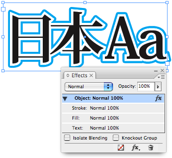
On one particularly long subway ride the other day, the answer came to me: Use a regular Paper stroke around the text and then (here’s the trick) use CS3’s Outer Glow effect. The glow effect is usually a soft, blurry, edge, but you can force it to become a hard edge by setting its Spread value to 100%.
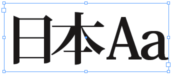
Here’s before:

Here’s the Effects dialog box:

Here’s after:

Of course, these glows are always bitmapped, not vector, so they will be slightly pixelated on the edge. However, it’s my understanding that when a drop shadow or glow has a Spread of 100%, InDesign’s transparency flattener automatically doubles the resolution of the raster output, so you get a relatively clean edge, especially when you use the High Resolution flattener.
Here’s a closeup of one corner, with High Quality display turned on:

If you need a pure vector outline, you’ll likely still need to create this in Illustrator, or by converting text to outlines in InDesign. But in many cases (particularly when putting this on top of an image), this trick should work pretty darn well.
Of course, you can also add additional effects to the text. For example, in the little thumbnail at the top of this story, I added a drop shadow for more excitement. ;)


A very nice technique, especially since you can save the settings in an object style.
The resolution it seems is tripled in CS3, i.e. you’ll get a 900ppi image when you use the [High Resolution] flattener and 450ppi for [Medium]
This is also true when you export to PDF 1.4 or higher.
Awesome tip. I do a lot of designing in japanese, so this will come in handy.
In CS2, you can come close to this by using a drop-shadow set to an opacity of 100, offsets of 0, blur of 0p1 and a spread of 100%.
I’m not sure about the quality of the resolution flattener in CS2 though.
or you do… make text with outline / copy / paste in place / double the point size of the outline / send backward under original text. It’s vector and you don’t need AI.
Misha has the technique I’ve used in the past.
I like David’s way. I’ve been doing this for a while for quick effects in InDesign, also in CS2 the way Dave explains it.
What I like about this way is that the text remains searchable. Very important when exporting the files for different applications or uses, i.e., outputting for web or RTF.
I find it odd that you can’t use the strokes for text though. You could have a double, triple, quadruple outline, dotted, dashed, etc., stroke for text. Maybe in the next Edition of CS it will. Sigh.
I am very impressed that while zooming along in one of those high-tech subways on the other side of the world in a 1500 year-old country that you would be pondering how to create double text borders in InDesign without converting the characters to outlines first.
Misha, you are right that this is simple to do if you convert the text to outlines. However, that breaks my Rule #1: Always keep your options open because someone will ask you to change it!
Anne-Marie, I can’t help myself. I see InDesign challenges wherever I go! ;)
David, this works on plain text, no need for outlines. Of course when the clients makes changes -as always- you have to edit both text-blocks or delete and recreate the effect.
See also my new post on how to make triple strokes that DO maintain a vector edge!
Make sure your text has a fill color. I tried to do this with text with an outline and no fill color and nothing happened. When I changed the fill color to white the outer glow appeared.
Thank very much for this article
AHHHHH! Fabulous!! did exactly what I needed it to do. Thank you, David…you guys ROCK!