Creating a “Fold Back” Effect for a Heading in InDesign
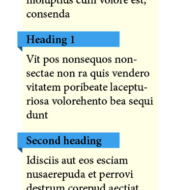
You’ve seen this effect, right? A rectangle that appears to bend or fold backward behind itself:

How on earth did I do that? Well, I used two different methods in the image above. However, in both cases, the blue frame behind the heading was created with a Rule Below — a really big, thick rule that has a negative vertical Offset, and a negative Left Indent (which makes it stick out the left side of the frame):

I should also point out that the text frame in question has a text inset on the left side, which I set up in the Object > Text Frame Options dialog box. I could have also just used a left indent for the text. That keeps the text away from the left edge of the text frame a little bit.
Okay, here are the two ways I made that rule below appear to “fold back”:
Anchored Object
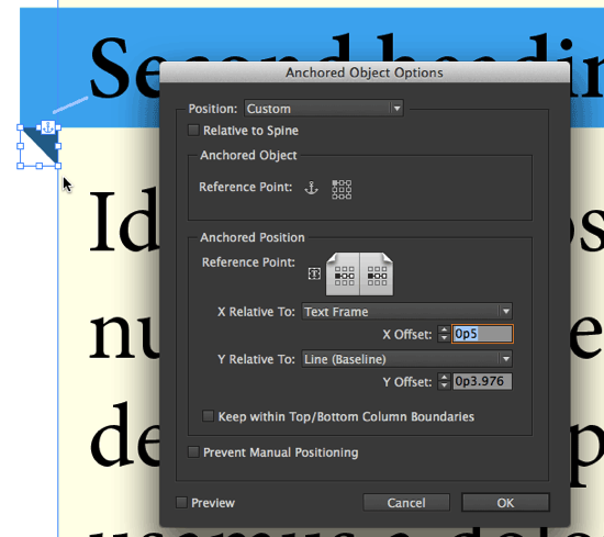
In the second heading, I created a small triangle, exactly the size I needed it, and then made it an anchored object. I anchored it at the beginning of line of text, and then I used Object > Anchored Object > Options to adjust the position so that it was relative to the text frame (horizontally) and the line (vertically):

Like so many things in InDesign, it takes a little while to get the first one correct. But once you have one of these, you can make an object style from it (you definitely should), and then copy and paste the anchored object from place to place.
If you have a hundred of these to copy and paste, then you’d probably want to use Find/Change to do it. You can do that with a GREP find/change… I’ll write that up in another article soon.
Custom Font
The second way that I created the fold-back effect was to make a custom font out of it. (This was suggested to me by Mike Rankin, the master of all things InDesign-effectsy.) The benefit of having a custom font is that you can make the effect right inside the text itself, without any anchored objects.
There are lots of ways to make custom fonts, but one of the coolest is the IndyFont script. You can see a short IndyFont how-to video here, and an article about IndyFont here. (You can find IndyFont here, on the Indiscripts site.)
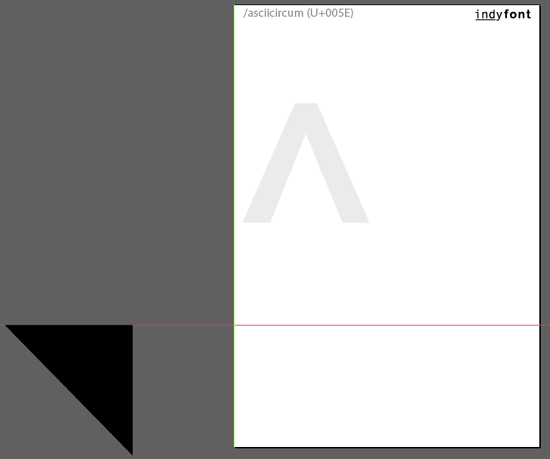
So I used IndyFont to make a font template document with a single character (in this case, I used the caret ^ character, but I could have used almost anything). Then I made a triangle and placed it in the template, far to the left of the left side bearing:

I also moved the green “character width” guide to the zero marker, which means this is a zero-width character, and the triangle will sit far to the left of where you think it would.
Now all I need to do is type a ^ at the beginning of the heading and set it to my new font. It’s easy to make that caret get the correct font: you just add a grep style to the paragraph style that applies the proper character style:


In other words: the grep style looks for a caret at the beginning of the paragraph and applies the character style; the character style applies the font, the color, and a baseline shift to move it into position.
How did I figure out:
- Where the triangle should be in the custom font?
- How much baseline shift I should apply to position it correctly?
The answer to both is: trial and error. I had to tweak it at 4000% view, re-generating the font about 10 times and adjusting its position about 8 times. But it only took about 10 minutes to do, and once again: When you’ve done it once, you can use it over and over again. In this case, now every time I want that effect, I just place a caret at the beginning of the paragraph and click the paragraph style. Boom, it’s done.
Once again, there is a simple grep find/change that allows you to insert that caret at the beginning of every heading throughout your document in about 2 seconds. I’ll write that up separately.
If you want to play with this document, you can find an IDML and the font I created here.


Cool David, thanks :)
Looking forward to see you in June…
Very geeky! Love it!
This is great, David. Thanks. If only the rules could end on an angle, it would be possible to do it with a rule above and below. I’d love to see one of the developers create a little plug-in to change the ending of rules.
Ah, please. I hate seeing this sort of thing. This tip reminds me of the things that Word–yes, terribly bloated and hateful to use Word–can do that InDesign can’t do.
Heading the list is Words marvelous ability to shade or put a box-like frame around a paragraph. And I’m not talking about creating an anchored object behind a paragraph and fiddling to get its size just right. I’m talking about a simple-to-apply parameter that avoids the fiddly stuff.
Is there any chance someone out there could create an ID plug-in to do those those Word-like things along with this clever fold back effect and perhaps quote bubbles and a string of other effects to set off blocks of text without users dealing with anchored objects or custom fonts?
I used this trick myself. But it doesn’t really need a custom font with non-standard codepoints. System fonts provide all sorts of geometric shapes including such triangles: https://en.wikipedia.org/wiki/Geometric_Shapes
Using paragraph or character styles you can also easily position the triangle like you want it.
@Ralf: I don’t see how you would position the character outside the text frame using a normal font. InDesign does not make that easy. (I guess you could do it by including two characters and then doing a massive negative kerning, but that is problematic in other ways.)
Love it!
Cool, cool, cool.
Also, lynda.com subscribers can see a video on how to accomplish this from the InDesign FX series: https://ow.ly/sExZG
How to get the yellow panel behind the text?
I’ve made the text box yellow, but I don’t see how to leave a space on the left side for the triangle to give that effect of being outside the box as it were…
Joshua: Try downloading the IDML file at the end of the article and see how I did it. It’s not the only way to do it, but it’s a starting point.
Hi, interesting. More interesting is when the effect is reversed depending on whether it is a left page or right page!
Hi,
Nice trick, indeed. Well done!
I’m wondering however if it wouldn’t be simpler to call the foldback triangle by setting it as a bullet of the heading style?
Joshua