

Creating a Screen Printing Effect in InDesign

by Ben Richardson
This tutorial will show you how to simulate screen-print effects directly in InDesign, rather than using Photoshop and then placing the artwork into your layout. If you’ve ever played with blending modes in Photoshop, chances are you’ve created this effect at some point on your own. The blended colors can look lovely, the artwork gets more personality and depth, and it’s all very easy to accomplish. By working in InDesign you can change the layout and color, or implement new elements later on, without the fuss of switching between programs. And you can have one element as a PSD file that you can repeat as many time as you like in the document, and each one of them can be in different color.
To begin, you will need to save the image(s) you want to use in bitmap mode, including a halftone (or similar) texture to be used as a background.
Editor’s note: You can grab some great free patterns created by David Blatner at CreativePro, including:
The patterns are in vector (PDF) format, which you can open with Photoshop and convert to raster.
Line drawings and rough-looking fonts tend to look best, and you’ll need to save them as PSDs or TIFFs in Photoshop. Resolution should be over 600 ppi for line art, although 1000–1200 ppi is recommended. In my experience, InDesign tends to work best with Adobe-native files, and PSDs are generally smaller files than uncompressed TIFFs, so I recommend saving them as PSDs.
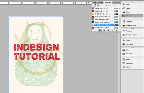
Once you have all the elements ready, place them in your InDesign file and organize them roughly on the page. Make sure they overlap, so you can see how the colors mix as you work.
Select one of the images with the Direct Selection tool and open the Swatches panel. Change the fill color as you like.

Lighter colors make mixtures more evident, while dark colors can turn out quite muddy, which can result in the overprint effect not being as visible.
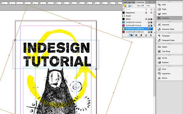

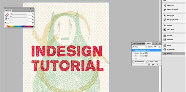
Select all the elements, open the Effects panel (Window > Effects or Shift+Ctrl/Cmd+ F10) and set the blending mode to Multiply to see the colors blend. Technically, if you’re not using a colored/textured background, the element on the bottom can be set to Normal. However, since you might want to change the stacking order later on, it’s easier to set them all to Multiply at once (here we are going to have both colored and textured background, so in this case it’s necessary).
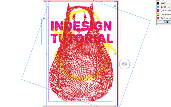
Resize elements as desired and change the stacking order, by either right-clicking each element, choosing Arrange and then Bring/Send to Front/Forward or Back/Backward.
Choose Window > Color > Color to open the Color panel and explore different color combinations. Sometimes, just like when screen-printing in real life, happy accidents happen, and you might be surprised by different ways colors can mix.
Set the color mode in which you’re mixing colors by choosing from the Color panel menu. You can also Shift-click on the color ramp at the bottom of the panel to switch modes.
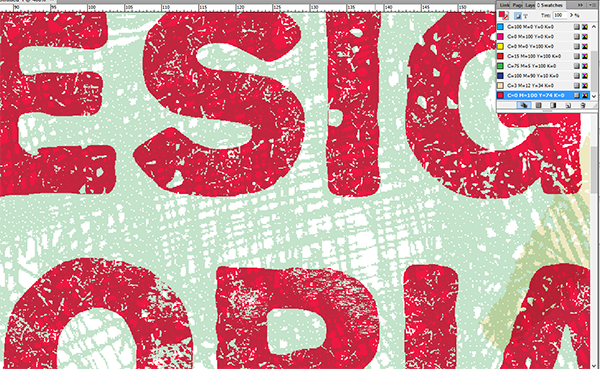
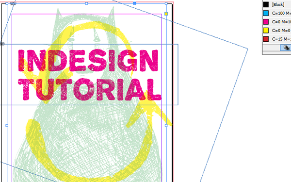
Close up showing how colors mix and how bitmap mode actually simulates the silk screen look by adding tiny white dots
Add a background with a Rectangle tool for more depth.
Place a halftone texture image and set it to Multiply in Effects panel, just like you did with all the other elements.

Depending on what colors you selected and the overall feel you want to achieve with this artwork, set the halftone texture’s opacity to 5%–25%, lower for softer, and higher for stronger colors. Try placing the texture on top, in the middle, or the bottom of the other elements, for different color combinations. Experiment with textures in colors for more versatile effects.
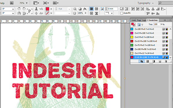
As with real life screen-printing, the key to success is being playful with colors and experimenting with the way you layer elements. And now that you can easily do it in InDesign, you can experiment and play within the same file as much as you like, and prepare it for print more conveniently.

***
Ben Richardson is director of Acuity Training an IT training business based in Guildford, UK and is sharing some of the tips that delegates have found more useful from their InDesign classes.
Too cool!
Thanks for posting this tutorial! I would love to know how to replicate this affect, but I must be missing something with how my image files are set up. When I try to change the fill color of my images in direct selection mode, either Indesign fills in the entire frame with the color (and not the drawing itself), or the swatch panel is grayed out and I can’t choose any color. I’ve tried setting up the images differently in photoshop (psd, tiff, bmp), but I still can’t change the color of the line drawing in Indesign. Am I missing something obvious? Thanks in advance.
Hi Cathy,
Try this…
To change the negative space of the text frame, simply click on the frame and then a swatch in the swatch palette.
To change the positive space (the image) of the text frame, drag the swatch from the swatch palette into the image frame.
This also works with grayscale images, although if you want to change the positive image color I think it needs to be saved as a tif.
Hi Chris,
Thanks for the additional help! I’ve found some success with tiff files doing just what you suggested. As long as the background is white, it works great, but if I preserve the transparency in photoshop, (so I can overlay images in Indesign), I lose the ability to recolor the image. It must have to do with my image settings in photoshop since it works great with tiff files that came from a clipart collection. (I can’t get it to work with straight PSD files.) I understand it can be difficult to solve issues through a blog post, so no worries if you don’t have a solution. I did learn something and I appreciate you going the extra mile!
I have saved free downloadable files, opened in Photoshop, changed to bitmap mode and have saved as a psd and tiff file, When I place into ID and go to color swatches, it colors the white space and not the black pattern?
What am I missing?
Hi Marlena,
It’s a bit tricky at first, but all you have to do is go to the swatches palette and drag the swatch into your image area. The black portions of the bitmap will turn the color of the swatch.
To fill the white area, first click on your image and then click on the swatch in the swatch palette.
Saving as bitmap will allow you to make the white areas transparent, greyscale doesn’t do this, so you’d have to use InDesign’s transparency blend modes.
Does that help any?
omgosh thank you so much. It works wonderfully!