Don’t Apply Baseline Shift to Move a Paragraph Up or Down
Here’s another installment in a series I like to call: Please, for the love of all that is pure, don’t do this in InDesign!
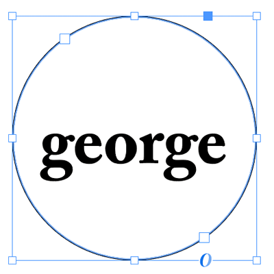
Today’s topic: applying baseline shift to an entire paragraph. I know it’s tempting… your text just isn’t in the right place on the page and you need the whole paragraph to move up or down a little—or perhaps a lot. A common example of this is when placing text inside a circle and then setting it to “Center” in the Vertical Alignment section of the Text Frame Options dialog box:

See how the text is sitting slightly below the the centerline of the circle? That’s because InDesign uses the height of the “slug” of the font (including the space from the descenders to the ascenders, if there were any) to figure out where the text should sit. You can see this easier if you select the text:

So we want to move the text up a little, right? But how? The natural inclination is to reach for the Baseline Shift feature. And, okay, I guess if it’s just this little bit of text and you’re just going to move it a little bit, it’s not the end of the world. But I want to strongly recommend that you avoid Baseline Shift for anything more than a few characters.
That is, the Baseline Shift feature is designed for moving a character up or down a little bit—and it’s great for when a bullet is too low, or a trademark symbol needs to move down, or something like that. But it was not designed for setting the vertical position of a whole line or paragraph!
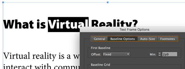
The biggest problem with using this feature on a whole line or paragraph—especially when you move it more than just a very small amount—is that it becomes difficult to select and format the text later, because… Well, here’s an example… look what happens when I double-click on the word Virtual:

You can see that InDesign actually “thinks” the text is above, at the top of the frame. But it appears down below. That’s because that first heading was moved down with baseline shift.
Honestly, the worst part about doing this that if you give this file to someone else to work on, they will quietly (or not so quietly) curse your name.
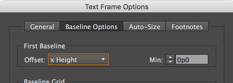
So don’t do it. Instead, if you need to adjust the vertical position of text in a frame, use other features. For example, the First Baseline Offset feature, inside the Text Frame Options dialog box:

In the case of the text in a circle, changing the Offset pop-up menu from Ascent to “x Height” fixes the problem immediately, because InDesign measures the text position from the top of the x-height (the height of a lower-case x) instead of the height of the ascenders.
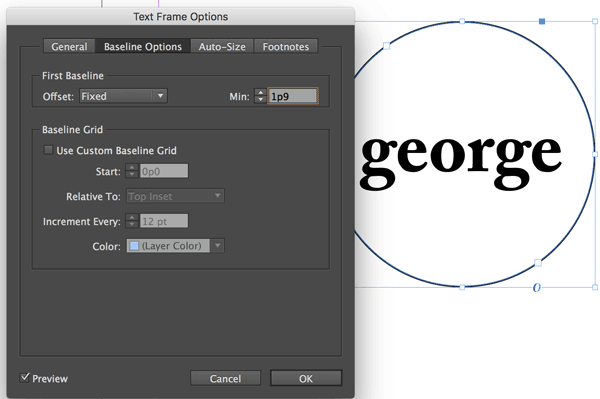
If you want even more precision (and you usually do), then change the Offset popup menu to Fixed. Then change the Min field to move the text up or down. (In this case, you should also probably set the Vertical Alignment in the General tab back to Top.)

In the case of moving the first headline down, you can see that the Fixed offset lets us set exactly where the text should sit in the frame:

If you’re trying to adjust the vertical position of text that isn’t the first paragraph of a frame (that is, it’s in the middle of a story), then you should probably use the Space Before or Space After feature. For example, I added space between the headline and the following paragraph (in the image above) by selecting the heading and adding Space After in the paragraph formatting controls of the Control panel.
Baseline Shift is great for making wacky effects, or adjusting where superscripts and subscripts sit, or fixing the vertical position of a bullet or inline object. But you should avoid using it for larger amounts of text, as it will only get you (or your colleagues) into trouble down the line.


Yes, it is indeed very annoying when someone does this.
We had a customer who did this sometimes because they wanted the chapter header in each chapter of their books to start way down on the page. They couldn´t use only space before, because that only works if there is something on the page before, so some of them did this. That resulted in the actual selectable text to be waaay out of line with the visible text, which obviously made it very difficult to edit text in the chapter headers.
Because they wanted the entire book as one continous article and all their chapter headers to start on odd pages, leaving some left sides blank, they then had to introduce an empty line before the chapter header with a special paragraph style that makes the blank line start on odd pages. After that, space before worked for the chapter header.
I don´t like having to introduce blank paragraphs to solve problems like these, so I came up with another solution, that will prevent you from having to use basline shift, or blank paragraphs in this case. Maybe someone would be interested in the solution I came up with, so here it is:
Edit the object style named “basic text frame”, go to the tab “baseline options”, and choose “leading” under “first baseline offset”.
Make a paragraph style named “chapter header” or something similar. Set all styling as you want, and a normal leading, then edit the paragraph style, and go to “drop caps and nested styles” Add a “new line style” under “nested line styles” that affects the first line only. Choose to create a new character style in the menu for character style, and name it something like “first line leading for chapter header” or something similar. Change only the leading for this style to reflect the pulldown you want for your chapter header.
If you want the header to always start on a right page, also change “top of next page” at “start paragraph” under “keep options”.
This will result in the chapter header always starting on a right page, leaving a left page empty if neccesary, and the first line (important if the header wraps to more than one line) of the header will have a large leading, resulting in the header starting way down the page, without having problems selecting and editing text.
I think it´s strange that you have to jump through loops like this to get this effect, but it works, without having to add a blank paragraph.
I meant to write “top of next odd page” in my instructions, of course, otherwise your header will not start on the next right side page.
Am I missing something? Isn’t the rule before and keep in frame trick the obvious solution if you want a title to begin a bit lower in the page (I mean in this particular case, with a book)? Cant remember where I read about it, most likely here on this website…
Yes, it definitely is. I didn´t know about that trick until David gave me the link to a discussion where this solution was mentioned.
I will use that solution in the future instead.
I think the system you’re describing is more painful than just applying baseline shift (and a lot of space-after) to the chapter title paragraph style.
Admittedly it is initially a little difficult to select the text of the chapter title if it has baseline shift applied, but one soon gets the knack of it, and that’s the only real disadvantage of using baseline shift.
So, for chapter titles, using baseline shift on the whole paragraph is the best procedure, IMHO.
Arei: Oh my gosh, I couldn’t disagree more — especially for things like chapter openers! Ugh! There are far better solutions for moving chapter titles (or numbers) down, such as: https://creativepro.com/topic/chapter-title-strategies and https://creativepro.com/push-down-the-first-line-of-text.php
I’ve tried them all, and they’re worse that baseline shift.
1. The invisible line above: This works only if you’ve not got your text frame first-baseline to fixed. If it’s fixed, the trick doesn’t work. I always have my text frames set to fixed, so that’s ruled out (no pun intended). Also, it’s a counterintuitive way of working, and who wants hidden lines hanging around?
2. The “first baseline leading” setting: This is what Billy, above, is advocating. But again, setting it up is a hassle. It requires a new character style. And, importantly, it’s not very easy to change if you decide you want to adjust the position of the title.
3. The separate master-page for the chapter opening page. This does make sense (and I always have a separate master anyway — it’s easy with Mastermatic ;-) ). But… changing the height of the chapter title by adjusting the margins of the page is a horrendous, roundabout way of working. And having a text frame on a master page is also something I try to avoid.
The baseline shift method has a lot of advantages, and one disadvantage.
The biggest advantage is that it matches the way a book designer works: Normally, an important part of a chapter opening page design is choosing what baseline the first line of text should be on. By far, the easiest way to set this is by simply applying “space after” to the chapter title paragraph style. You want the text to start on line 11 and the leading is 13pt? No problem: 130pt after the title and you’re good to go.
Now that that is fixed, it’s a question of adjusting the chapter title drop. When you play with the baseline shift, you have complete control of where the title chapter goes, and changing it does not affect anything else on the page! All the other systems mean that for every test and adjustment you make to the chapter title, you’ve got to adjust a bunch of other parameters to compensate and make sure that first text line stays in place.
The disadvantage of the difficulty in selecting the chapter title text is more than offset by all these advantages.
I’ve played with all the techniques, and in the end, baseline shift is the way to go. But only for chapter titles (and maybe subheads).
In 90% of cases, I agree with everything in the article!
Ariel: I’m in shock that you’re advocating this method. It literally makes no sense to me.
You just said that you always have your First Baseline Offset set to Fixed. So why would you not use that opportunity to set the Offset to the value you want down the page, as I suggested in the article?
Maybe you and I are talking about different things. Changing the baseline shift for a chapter opener is crazy because the title would sit on top of the text that is already there, like this:

How is that helpful?! Of course you could then adjust the spacing of the other text using space before or after, but why bother when all you had to do was change the Fixed Offset once:

OMG! That first link you gave me has a MUCH simpler solution. The solution Theunis is talking about in that thread is AWSOME. So simple:
“A rule Above, with a color of None and a good distance in Vertical Offset, and switch ‘Keep In Frame’ on”.
Thanks for the link. I will suggest this solution from now on.
I still think this is a hack though, and it should be possible to do this with just a checkbox somewhere in the paragraph style.
All I do is make a separate master page with the appropriate top margin to sink my chapter openers, and a fixed amount of space after the chapter title. If I have heads within text that need to sink at the top of pages for even lines, I use a rule above (colored none).
I don’t understand why Ariel thinks changing the head margin on chapter opening master page is horrendous. What’s so bad about it. One needs a separate master page anyway as they don’t take running heads, so why not change the top margin while you’re on that master? It takes all of two seconds.
I also use a rule above (color none) on space breaks so if they fall at the top of the page, I will see them. Then I have another style sheet that has my ornaments for top of page and use that (with the ornaments and no rule above). There is nothing more frustrating than paging a job and then realizing you missed a space break at the top of a page and the space dropped off). By doing that, there is one less thing I have to look for when paging. Even if I miss putting in the ornaments, at least it has the space above at the top of the page.
I only use baseline shift for bullets (though that is usually not required) or some weird thing in a table.
As a note–I hate baseline shift (I deal with a few designers who use it). It wouldn’t be so bad if they at least knew how to use it. It makes it extremely difficult when you need to space above/below extracts or verse when it’s all on locked. To me, using it in book design is just pure laziness.
So, Dwayne, if I understand correctly, you’ve got a special master page for chapter openings. The top margin of that master page is larger than other pages, correct?
So, if things move around (the chapter opening gets shifted to the next page, say), how do you make sure that the text frame readjusts?
Are you using Layout Adjustment? Or are you using Primary Text Frames? Do you have a text frame on the master page itself?
Just trying to understand exactly what how the method works.
But in any case, lets say you want to adjust the drop of your chapter title (but keep the first line of regular text in the same place). So, you would need to go over to the master page, open the margins and columns, adjust, go back to the live page, check how it looks. If it’s okay, change the space after of the chapter title to reposition the first line of text. Have a look. Not so good? Repeat and rinse.
Unless I’ve misunderstood the method, I think it’s much easier and more intuitive to modify just one setting: the baseline shift of the chapter title style (no need even to open the Paragraph Style window — just modify the live text as needed, and hit Ctrl+Shift+Alt-R!). Couldn’t be simpler, and the first line of text stays where it is whatever you do!
Oh, I’m starting to understand your madness, Ariel. You don’t want to change the text frame… you want to change the text… because you don’t know what page the chapter opener will be on and you don’t want to change the master page.
That does make sense. However, I still think Baseline Shift is really the wrong way to go about it. It makes far more sense to set the First Baseline Offset to Leading, so that you always know where the first line is going to sit in the frame, and then use the Rule Above (with color set to None) trick to push it down.
That said, if you’re the only one touching your documents, then of course you can do it any way you want! But I’m telling you that if you send your files to someone else, they’re going to hate you for messing with baseline shift like that.
First, just to emphasize David’s essential point in the article: When in doubt, don’t use baseline shift! I think that’s excellent advice almost always.
But, back to chapter openings — I find it convenient to make an exception to the baseline shift rule here.
David, you’re suggesting setting the First Baseline Offset (FBO) to Leading. But again, that implies using that setting for all frames throughout a document!* And that’s really no good, because the text in the first line of all frames will not necessarily have the same leading (for instance, subheadings set in larger type will probably have more leading, and they will almost certainly land on the top of some page in a document). Meaning that on some pages, the first line of text will not align with other pages.
That’s why I prefer to always use the “Fixed” setting for FBO.
Also, as I mentioned previously, playing around with the leading and/or rule above will shift the position of the first line of body text on the chapter-opening page, which is inconvenient. Using baseline shift avoids that issue.
But yes, I’m the only one working on my InDesign files, so the issue of others finding my files confusing is moot…
—–
* (Because the chapter opening could wind up anywhere — stuff moves around as edits and changes are made.)
Ariel
Just I have a separate master page for chapter openers, part openers, etc. The the to margin is bigger.
I don’t have any text frames on the masters, and I use Layout Adjustment.
If the chapter opener shifts to another page, I just option + click the chapter opener master page for that page.
It takes all of two seconds.
I set it all up when I’m doing my page test and the necessary space below is in the chapter title paragraph style. I just option + click the CO master page when I want to apply the chapter opener.
Separatee master page for chapter openers is good if you have separated chapters prepared for working with “Book”.
But, if you have only one document file, “Rule above” is the best as David mentioned (see pictures) with these settings: line “width” set to 0 or line “color” set to none, “keep in frame” checked and you adjust only the “offset”. But it is also important that the chapter paragraph style must be set to start on Next/Odd/Even page.
Just wondering where we are on the “make space before function at top of an empty column”. I can understand why the default setting is not the case and never was, but I’d love to get feedback on why a checkbox couldn’t be added to the space before paragraph option, avoiding any bizarre workaround.
Hi Franck! Good to see you recently. I agree with you: I wish Space Before did work at the top of a frame (or at least allowing that as an option).
Back in mainframe days the Script language had two spacing commands: “space” (always do it)and “conditional space” that executed only if it was NOT at the top of a column or if a subsequent absolute space was less than the conditional space. The later was useful when you had a bit of a collision with two styles one having “space after” and the next “space before”. I’ve often thought the need for special “bullet-start” and “regular bullet” could be eliminated if there was “conditional space”.
Once I saw a complete book (300 pages) with all the text witha a 6pt baseline shift.
Francisco–I saw a similar thing once. I was in total shock.
I once saw a title page of a book where the leading was 100 points. The title, sub title, author name, and imprint name were all separate lines with hard returns. Baseline shift was used to move stuff up or down, instead of changing leading or using space before/after in the style sheets.
What I hate (and off topic): When I get a sample from a designer for a 600 page book I have to have done in two days–and not one single style sheet was written.
Or when the publisher buys the rights to a UK book that I have to redesign, and when I get the file–zero style sheets. Everything based on “Normal” with a + next to it.
I can understand why the original designer would do that. I don’t think he didn’t use any style sheets at all (especially if the file is properly designed), he just considered them his tools and he wouldn’t share those with you. Its not nice of him…
@albastru–Hope you see this as there is no “reply” button to you.
I did think that was a possibility (i.e., that the designer/pager unlinked the style sheets. And yeah–it’s not nice.
I remember reading about that nonsense at the Adobe forums years ago.
I could see if a job was yanked from someone and given to someone else (i.e., revenge factor), but that wasn’t the case. And I would never entertain such an idea, especially if it’s a straight-going book with only a dozen or two style sheets.
This thing of intellectual property is crazy when it comes to things like this.
And the only thing it ensures is that the publisher won’t ever use that designer again once they are told what he/she did.