


On a recent book project I decided to use Glyph Scaling as a justification parameter in addition to my long-standing practice of allowing subtle letter-spacing adjustments, and of course basic word-spacing adjustment.
As far as possible I like to keep a consistent baseline for the last line of each page in a book — i.e. to have full text-frames on each page. This of course happens by default if a paragraph breaks cleanly across a page boundary or if a paragraph ends precisely on the last line of a page.
But there are many pages where this does not occur because:
- Breaking the paragraph so as to fill the text-frame would produce an orphan line at the end of the page or a widow line on the following page.
- A heading falls close to the page boundary causing it to be taken over to the next page and leaving a number of empty lines at the end of the preceding page.
Unfortunately InDesign is not smart enough to find solutions for these problems on its own, and requires some manual assistance.
One way is to create styles for “tighter” and “looser” versions of frequently occurring text paragraph styles. One can then look for paragraphs which have, for example, very few words on the last line. These are candidates for being tightened up and made one line shorter. Similarly, paragraphs with almost-full last lines are candidates for being loosened, thus making them one line longer.
In this way it’s possible to move the position of a page-break a few lines forwards or backwards in the text to where an aesthetically pleasing page break occurs which also fills the text-frame without widows or orphans.
The trick with this is to make the process invisible to the reader. How can one tighten or loosen a paragraph without ending up with very wide or very squashed word spacing?
Adding subtle, variable letterspacing can make a big difference to the overall length of the text in a paragraph — easily adding or subtracting a line to the paragraph’s vertical measure. But too much letterspacing becomes noticeable (anybody remember old newspapers with narrow columns?).
Enter the possibility of using subtle changes to the widths of glyphs as an additional justification parameter. This provides a third degree of freedom to the paragraph composer. As an example, in a recent book project I created a “Normal tighter” style with the following justification parameters:
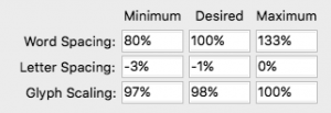
Part of the InDesign (CS6) Justification settings dialog for “Normal tighter” style.
Let’s look at what these settings do.
- Word Spacing: the Minimum word spacing is less than that for a normal paragraph. This allows words to be squashed together just a little more in this paragraph. But too close and it becomes difficult to read.
- Letter Spacing: Subtle negative letterspacing of –1% pushes together all the glyphs in the paragraph very slightly. In addition we are permitting the paragraph composer to push the glyphs even closer together (–3%) if required to optimise the paragraph line breaks.
- Glyph Scaling: In a normal paragraph the desired glyph width is 100%. Here it has been set at 98% — making each glyph in the paragraph fractionally narrower. And if need be we are allowing the paragraph composer to scale the glyphs a bit more to 97% of their normal width.
Giving the paragraph composer all these extra degrees of freedom to squash and stretch the content in a paragraph makes more paragraphs eligible for adding or subtracting a line or two — resulting in fewer pages with under-full text boxes.
So, what’s the downside?
At first glance — on a high resolution retina screen zoomed in close to the text — there isn’t any. The small variations in glyph spacing and width are almost unnoticeable as shown below.

Animated gif showing the effect of horizontal glyph scaling captured from a high resolution screen display of some glyphs from the book text. The top row is the default glyph width (i.e. no glyph scaling). The second row shows glyphs from a line of text that has glyph scaling. The third row alternates these two. Notice that the difference in widths of vertical stems is very small. At text size on a page it would be unnoticeable.
Problems can occur on output however, and this is what I discovered on the recent book project.
A computer screen can reproduce many levels of grey. When rendering type on screen, anti-aliasing (i.e. pixels filled with greys) is used to simulate subtle variations in the widths of glyph stems. For a (monochrome) laser printer on the other hand individual toner dots are always black. Either there’s a dot of black toner or there isn’t. In other words, when rendering text glyphs, the rasterising software in the printer (e.g. a Postscript interpreter or similar) has to decide how many whole pixels to allocate to the width of a glyph stem. Hinting in the font software helps the rasteriser to make good choices which keep a consistent “colour” for all glyphs in the same font at the same size.
But when a glyph is scaled horizontally, there comes a point when the decision about how wide to make the glyph stem in whole pixels has to change by one whole pixel. For a low resolution printer (e.g. 600dpi) this change in stem width by a whole pixel is definitely visible to the naked eye. The font glyphs look “lighter”, as if they are not properly inked.
And this is what I discovered in the printed books. The effect is subtle and many readers will not notice it at all. However for someone accustomed to looking at subtle details in the design and reproduction of type, it is noticeable. A lesson for next time.

The same glyphs from the same lines of type scanned from a printed book. The top row is the default glyph width (i.e. no glyph scaling). The second row shows glyphs from a line of text that has glyph scaling. The third row alternates these two. Notice that the difference in widths of vertical stems is now quite large and very noticeable, even at text sizes on a page. This is due to the low 600dpi resolution of the printer which rounds glyph widths to a whole number of laser dots.
I doubt this problem would occur if outputting to a high resolution film imagesetter or platesetter. These devices typically have resolutions of 2400 pixels per inch or more — i.e. at least four times that of a 600dpi laser printer. Hence steps in the width of glyph stems would be at least four times smaller and far less likely to be noticeable to the eye.
Thanks for the suggestions. I publish POD, so it’s helpful to know the issues that may arise with that. I’m fortunate that I can usually rewrite a paragraph to ease troublesome page breaks or add or remove some content to get chapters to end on left-hand pages. My frugality gets offended if a chapter ends with a blank left-hand page.
Your remarks involve justification inside paragraph styles. I’ve been working on a book whose designer compressed body text by 10%. In most cases, that’s acceptable, but occasionally ID compresses a line a bit much to make it fit. The result is that character pairs such as “ff” come too close together and the space after a period seems to disappear.
Have you experimented with a using specialized character styles that adjust kerning or tracking to deal with the occasional line that seems too tight or loose without changing the paragraph style or even the paragraph as a whole?
Here’s where Adobe discusses the two:
https://helpx.adobe.com/indesign/using/kerning-tracking.html
I had something similar to this happen with low-res galleys. I assured the client that the final high-res output would be fine, but it was a hassle in the meantime. I decided not to use glyph scaling in the future.
I think it’s critical to note (as the author did) that this probably is not a problem on higher-quality/higher-res printers. In general, I almost always allow 1 or 2% of glyph scaling! See: https://creativepro.com/what-are-your-favorite-word-and-character-space-settings-for-hjs.php
Great post!
For books I always use sets of 3 variations of body styles: *-normal, *-plus and *-minus. They differ in hyphenation and justification settings, incl. glyph scaling. The POD systems I use sometimes are high-end ones, and they can handle the text down to 6pt without visible changes in stem widths.
Michael, I haven’t experimented with character styles to tighten or loosen runs of text within a paragraph, but it’s an interesting idea. I’ll think about it for next time.
Query about what may be a related issue. We have a book that we have had printed by the same print shop for some years. They give us a very good price but it is dependent upon their being allowed to reduce the page size by 1%-2%. I send them a PDF of the letter-sized document at the actual size and the reduction is handled at their end. I have always thought the job was printing light and a colleague suggested that the phenomenon described above might be the cause. What do you think? I’m afraid I don’t know the resolution at which they are printing.
Lindsey,
My article is about variations in glyph stem widths which occur on the same page, even in the same paragraph, due to some lines in a paragraph being squashed more than others and this resulting in glyph scaling, when glyph scaling is allowed by the H&J settings.
What you’re talking about is different — uniform reduction in the size of all glyphs on a page due to scaling of the page as a whole. But of course the same phenomenon could apply when you scale an entire page on a lower resolution printer — the glyphs on the scaled page might appear noticeably lighter than the glyphs on an unscaled page due to the font rasteriser needing to choose a smaller number of whole pixels to represent the width of each vertical stem (ascender/descender, etc).
I guess this is a generic problem with lower resolution printers — the need to round the widths of glyph stems to a whole number of pixels which might make the glyphs appear lighter or heavier than the font designer intended or than they would appear on a high resolution output device (e.g. film or platesetter).
Paul, thanks for the answer. I’ll have to check the resolution this printing house is using. Or, find another printer though, oddly, these folks give us the best price on this one job year after year.
Hi everyone.
I have a question; does the inaccurate printing happens also when the letter space is increased?
I got couple of examples this week and seems like because of letter spacing (on the same machine, with the same DPI) some glyphs are too narrow.