

H&J Styles in InDesign


Many users moving to InDesign from QuarkXPress are surprised the program doesn’t offer an H&J Styles feature. Instead of being able to set up Hyphenation & Justification styles beforehand (as shown on the left — these are the default H&Js with version 7) and then choose the one they want from a dropdown list when they’re creating a Paragraph Style (as shown on the right) …
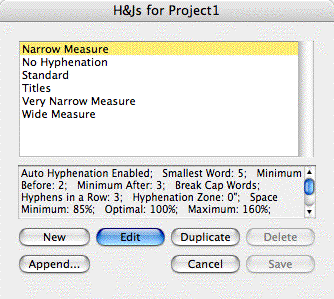

… InDesign requires users to spec these from scratch in two separate areas, Hyphenation Settings and Justification Settings, for every paragraph or style that should have different specs than the ones in the default [Basic Paragraph] style.
For most users, this is a minor bump in the road, and its significance pales in comparison to overwhelming number of other time-saving features in InDesign that other layout programs lack.
However, if for you the bump is more like a roadblock, you should know that you can get close to replicating H&J Styles functionality via InDesign’s Paragraph Styles panel. I’m not saying it’s the best way to go, but it is an option.
Create H&J Paragraph Styles
The basic strategy is to create one or more Paragraph Styles that carry the different H&J settings you want to use in the publication. Don’t bother changing anything about them other than their Hyphenation and Justification settings, you’re not really going to apply these to text. Then, after you create your “real” paragraph styles, base each one on the H&J paragraph style it should use.
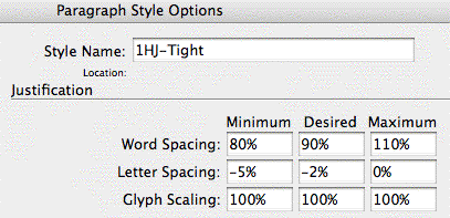
For example, I’ve duped the [Basic Paragraph] style (by dragging and dropping it onto the New Style icon at the bottom of the Paragraph Styles panel), renamed the dupe “1HJ-Tight” and edited its settings in both the Hyphenation and Justification panels to force type to take up less space. Here’s a close up of the Justification settings:
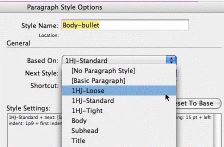
Then I duped it twice more, named them 1HJ-Standard and 1HJ-Loose (I’m adding the “1” to force the style names to be grouped together at the top, but that’s only required if you’re using CS2), and edited their H&J panels accordingly.
Now as I create my “real” styles (Body, Subhead, etc.), I can quickly populate their H&J panels by just choosing one of my H&J styles as the Based On paragraph style:
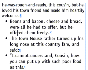
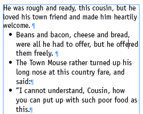
Here’s an example of how it works in practice. First, three paragraphs formatted with “Body-bullet” with 1HJ-Loose as the Based On style:
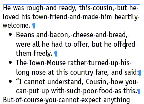
The same text, but this time Body-bullet is based on 1HJ-Standard:
And finally, Body-bullet based on 1HJ-Tight:
If you like, you can download the InDesign document I created with these styles. Click H&JStyle.inx to download a 140K .inx document you can open in CS2 or CS3.
Caveats
Subverting the Based On Style feature in this way means that you can’t used Based On as it’s normally used, so that changing, say, the typeface in the “parent” style ripples through all the other styles based on it so they change in unison.
Also, remember that as soon as you edit a style to change it from one based-on H&J to another, that new setting applies to all the text you formatted with the paragraph style throughout your document. So changing Body-bullet’s based-on style to 1HJ-Tight would tighten up all the bulleted text (text formatted with Body-bullet) throughout my document.
For more control, the best way to go is to create variations of the same style. Instead of just one Body-bullet style, create two: Body-bullet Tight, and Body-bullet Loose, for example. That way if I need to squeeze a few bulleted paragraphs in, I could just select the Tight variation for them, and no other bulleted text would be affected.
Terrific idea. I think that “based on” is one of the most overlooked and under used features in the program.
How to extract the Paragraph/Character style available in indesign template.
Is there a way to set H&Js for just a chunk of text within a larger block of text? I thought I could do this in Character Styles, but see I cannot. What I am looking to do is highlight some copy and alter the justification.
This is indeed the closest way to get Quark’s (far more useful) H&J styles. The ability to independently and quickly apply looser or tighter settings is extremely important in making books and other text-heavy pieces.
But to me the logic of this tutorial is backwards. I do the reverse: set all my Paragraph style sheets according to my design using a basic (usually customized) set of H&Js. Then, for the style that need adjustment (usually text, extracts, sometimes things like bibliography text and so forth), I make multiple ‘based on’ Paragraph style sheets with a range of H&J settings. Thus ending up with text/text-loose/text-looser/text-tight/text-tighter and so forth.
This way there are no errant settings in the primary style sheets, since the primary style sheets are the main ones you’re using. (I noticed in the downloaded example that 1HJ-Standard uses Times where the actual design would call for Officina Sans. It’s good to avoid the possibility of applying a style sheet that has the wrong settings for a given design.)
Hope this helps — Sam
Crap, just read the last paragraph. Sorry for to reiteration. I guess my only comment is that the last paragraph of the tutorial is the far more secure, less worrisome and less prone to error method. The less ‘based-on’ stuff I have to keep track of in my head, the better.
I have an issue with the Justification values:
Does somebody know how to convert the %value of Letter spacing and Word spacing into the tracking units (fractions of an EM)?
We know that an EM is 1000 units.
We know the in ID a tracking value of -10 correspond to 10 units of an EM (1000/10)
I’m asking that because these %values for the Justification of Letter Spacing are very abstract for me.
What is not abstract for me is what a -20 tracking will to for my body.
I would like to know how much these -2% of Letter Spacing would be in (negative) Tracking?
e.g.
Justification settings:
(90%) – 100% – (130%)
(-2%) – 0% – (2%)
(98%) – 100 – (102%)
Is this consideration correct:
1000/100 = 1% = 10 units (tracking)
does
– 2% corresponds ot – 20 tracking ?
2% correspond to – + 20 tracking ?
Is the same ratio applicable for letter spacing?
Or is this all nonsense because ID is taking into consideration other values?