

How to Save the Planet with InDesign

InDesign’s dark user interface has created a lot of controversy since its appearance in InDesign CC, version 9.0. Some people love it, some people hate it.

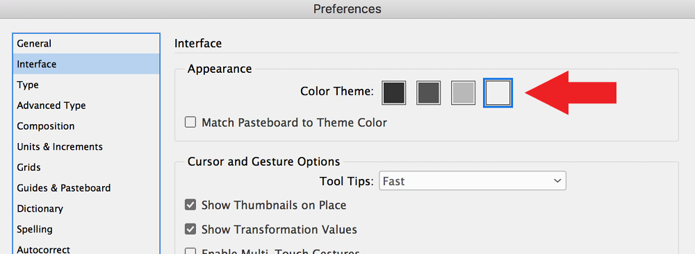
At any rate, you can control the brightness of the interface in Preference > Interface:
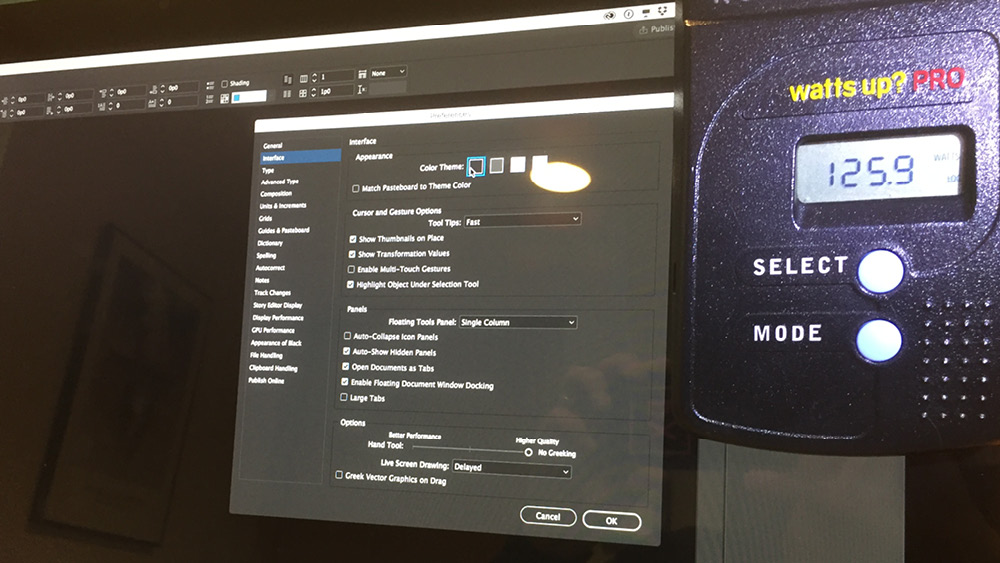
When I was talking to an Adobe engineer one day, he claimed that the dark UI required less power than the light UI. I was skeptical, so I decided to bring this into Gilbert Consulting labs and employ advanced scientific methods to determine if this is true.
I obtained a wattmeter and plugged my external Apple Cinema display into this device.

I was careful to adjust my settings so that the monitor was not set to automatically adjust its brightness based on surrounding light sources. Then, I ran InDesign with the display set to the lightest UI value and measured the power used by the monitor.

Then I switched to the darkest UI and measured the power consumption again.
There was a consistent, repeatable, 4 watt difference between the light UI and the dark UI! At the rate I pay for electricity here in the midwest, this could save me a whopping $2.34 / year!

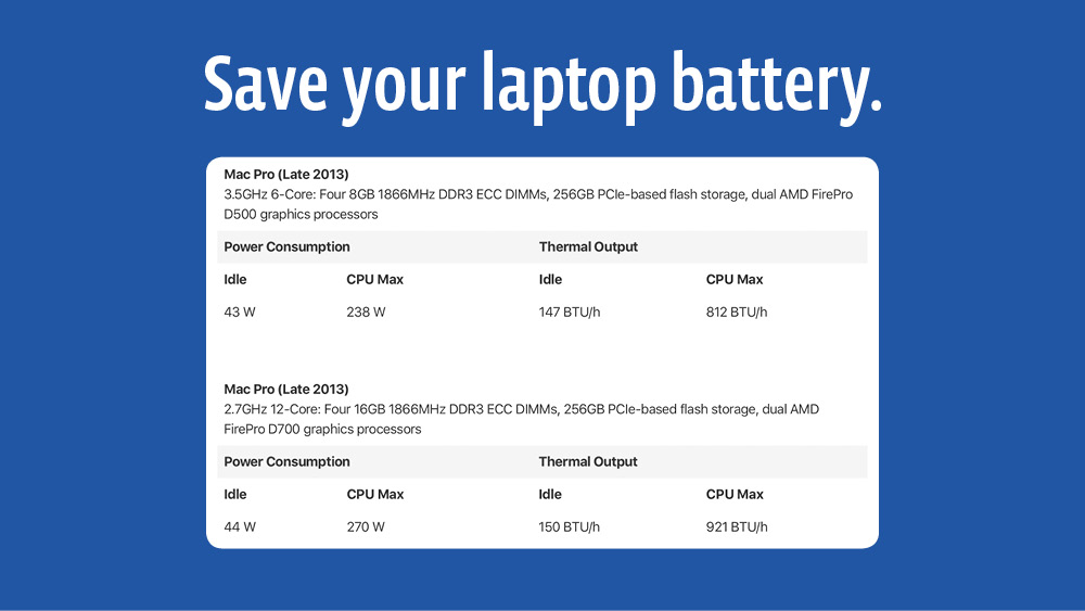
While this isn’t much of a cost savings, it could make a difference in laptop battery life. From my quick research, it appears that most laptops draw somewhere between 40 watts when idle, to 220-300 watts when working hard. It’s hard to know how much of this power consumption is from the laptop screen, but a savings of a few watts could be enough to allow you to eke out a few more minutes of work (or Netflix) on a long flight.

That was interesting to know. Thankfully I do my work on either my Mac tower at home or my iMac at work.
I personally think the very dark setting is too hard on the eyes. But that’s just me, personally.
I hope others chime in and say which setting they prefer. My setting is the lightest one.
I like the 2nd darkest one. I would prefer the darkest one except I don’t like the pasteboard to be that dark, but I don’t like it to be white either. The 2nd to lightest one seems too flat and weird and the lightest one makes my eyes tired. That’s just personal preference.
Side note: I work on a Windows machine since I’m working in the engineering field. I haven’t used a Mac since I got out of publishing. I’ve never used SolidWorks, AutoCAD or any other drawing programs on a Mac, but it’s definitely not the industry standard. So I’m not sure what the new INDD UI looks like on a MAC other than the screenshots above.
How do we break this news to Anne-Marie? She’s a major advocate for light-colored interfaces!
When working on my own projects, I’ve come to prefer medium dark interfaces.
However, I’m a teacher. Dark interfaces don’t work well when projected in class, where I switch to a lighter interface.
It’s like many things in the world: “Different strokes for different folks.”
Why’d they take away the Slider though? Getting used to the Medium Dark, c’mon Adobe – quit messing with my already aging eyeballs!!!
For the most part, I like the darkest interface but the scroller (scroll box, thumb, etc.) in the scroll bar is almost invisible.
I use the second-lightest interface. The other interfaces make my end of day eye strain worse. But that only seems to be a factor with InDesign-I used the darker interfaces with both Illustrator and Photoshop for quite a while before switching them. I generally work in a well-lit office with two large monitors, and I think that makes a big difference–high contrast on a larger screen has always been difficult for me.
Might be only 4 watts saved on one machine, but multiply that by the hundreds of thousands if not millions of machines running the apps and a lot of kW/hours of power could be saved. Small changes can make a difference …
Not all monitors use less power while displaying dark images. The ones that truly does are OLED displays – not what most people have yet. Standard LCD and LED displays actually use MORE energy to display black.
https://www.quora.com/Does-a-white-background-use-more-energy-on-a-LCD-than-if-it-was-set-to-black
The Quora article appears to not be definitive for all monitors. In other words, it appears there are lots of exceptions based on the various technologies used in various monitors. I did my testing on an Apple Cinema Display, which is an LED display.