

Three Ways to Improve Your Hyperlinks

One of my favorite new-ish features of InDesign CC (version 9.2) is the overhaul of how hyperlinks are created and managed. One aspect of this is that now, when you create the first hyperlink in a document, a new Character style named “Hyperlinks” is created. By default, this character style only has two attributes: a character color named “Hyperlink” (a light blue), and a standard underline.
But, there are a few things you should do to improve this character style.
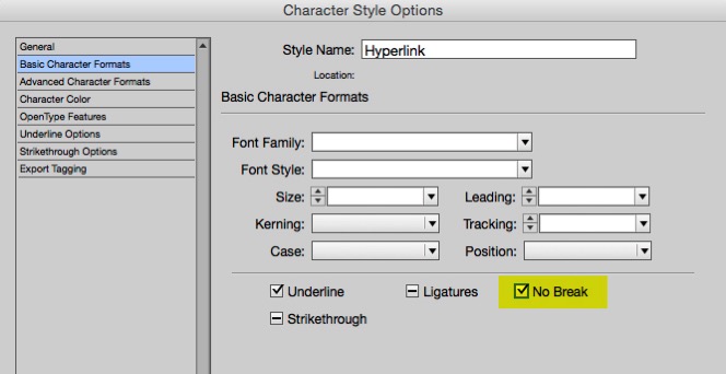
1. Add the “No Break” attribute. This will prevent long urls from breaking at the end of a line.
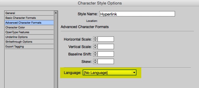
2. Change the language to “No Language”. This way, when you use Edit > Spelling > Dynamic Spelling, the URL will not display with the red underline that indicates a misspelling.
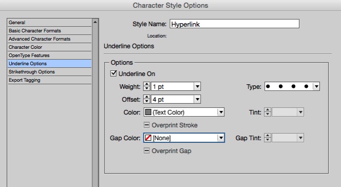
3. Change the appearance. The blue-type-with-an-underline harkens back to ye olde Netscape Navigator days. Nothing says that hyperlinks must be blue and underlined. I like to try to find a type and color combination that works well throughout the entire scope of a project, so that all hyperlinks can have exactly the same appearance. I often create a custom dotted, colored underline.
Good tips!
Another point that might be worth reminding people is that if your document is not printed – i.e. a PDF for instance – you don’t have to spell out the URL. For instance, in Endnotes, you can just highlight the name of a journal article and add the hyperlink to it without having to repeat the whole URL in the text.
InDesign Magazine does a good job of this.
For those URLs that you do have to spell out, I really wish Adobe would come up with a URL language that we could apply that would know how to apply the line-breaking standards of the Chicago Manual of Style (i.e. break the line BEFORE the punctuation and have the punctuation begin the next line so you don’t think it’s the end of the URL).
All good tips.
I don’t like to apply the nobreak style to the urls as those pesky urls that are too long for a line of type will not show up if no break is selected.
For this reason I just select No Language and let it break where it breaks.
You could be crafty and add a no break character style to sections of a url using crafty GREP styling for URLs but that’s more trouble than it’s worth.
Fix the long ones yourself and if someone points one or two that needs tidying up then fix those too.
I second Matt’s remarks. I often layout scientific books that include in the print-version footnotes or endnotes with horrifically long http links. Applying ‘no break’ doesn’t work, the links are so long they trigger dreadful line breaks. “No language” isn’t a good idea either. What is needed is a specifically http-smart language that knows how to break web references in ways that aren’t confusing. It’d know how to prevent problems with that must-have line break.
1. Treating a http reference as a regular language means it breaks at some characters (i.e. /) but not others. That’s results in erratic line breaks. Web references should be allowed to break almost anywhere. They aren’t real words.
2. Hyphenation-like breaks are necessary for those long references but it should NOT include an added hyphen, since readers may regard that as part of the web address.
Following Chicago is a good idea too. I like the fact that is deals with almost every issue that can arise, but I’d much rather have ID be Chicago-savvy, so I don’t have to consult those rules.
All great advice Keith! The following code, used in combination with a Character Style set to No Language, will automatically find and set a No Language Character Style when used as a GREP Style:
(?i)\b((?:[a-z][\w-]+:(?:/{1,3}|[a-z0-9%])|www\d{0,3}[.]|[a-z0-9.\-]+[.][a-z]{2,4}/)(?:[^\s()]+|\(([^\s()]+|(\([^\s()]+\)))*\))+(?:\(([^\s()]+|(\([^\s()]+\)))*\)|[^\s`!()\[\]{};:’”.,?«»“”‘’]))
I didn’t want to hijack Keith’s article about hyperlinks and turn it into an article about how to find URLs with GREP. You can read a whole long discussion about this on the Treasures of GREP Facebook group. But, here is a quick summary of how I do this (I don’t use Language settings at all):
I use a 2 step GREP find/change in conjunction with 2 character styles: “break” and “nobreak”. The first query finds all the punctuation in the URLs and applies the “nobreak” character style to it. It’s a rather scary looking, long string of GREP code I found online, and it works, but it also makes most of the text disappear into overset because the lines cannot break. Then, I run step 2, which finds all the punctuation in those “no break” strings, and inserts a discretionary line break before it with the character style “break” applied to it. It sounds like a hard way to do this, but it actually works quite well. I do minor cleanup afterward, mostly to avoid breaking https:// and so forth.
If you only have a couple of them, doing it manual is fine, but in academic publishing you can get a ton of really long URLs in citations, so it’s a serious time-saver.
Great points guys. Regarding the No Break tip, I’m sure Keith was referring to hyperlinks with shortened URLs, or no URL at all represented on the page, as opposed to the full-length URLs with all the gory details that have to be broken with care—or included on a fold-out page ;)
I actually find it most irritating that InDesign CC suddenly introduced the default Hyperlink style. Many of us still work primarily in print, so to automatically style a link as anything is really counterproductive. It not only applies an unwanted look, but it also removes any other character styling that has been applied. For example, in a list of references, a report title is usually italicised (using a character style). If I create a link to the title, it is no longer italicised (AND becomes blue AND underlined).
When this first started happening when InDesign CC was updated, I had to reapply all the italic character styles manually. It took me a while to figure out how to stop this from happening automatically, but I eventually realised that in the New Hyperlink dialogue box I could change the character style to [Same style] and that seems to stick for all future new hyperlinks.
It would really be helpful if in future Adobe could not only let us know when they change default settings such as these but also how to change the default back to what we are used to. New features can be great but aren’t necessarily desired by everyone!
Lan: I’m glad you figured out that the character style setting is sticky. Another option is to change the Hyperlink character style to apply no styles, so it has no effect when it is applied.
So, I tried to click on the hyperlink to Keith’s blog, and I got, “Sorry, that’s a 404, good buddy.” Amusing.
Suggestion: if a URL must be displayed, but too long, you could substitute it using a new, created short version. Free sites like bitly.com allow you to create one – often unique to your need. It is great for those who are not web savvy or can’t change/create a new webpage on that site. A great benefit is you can also track how many people use that new link to access that website or destination. Of course, this will not work for all situations, such as a client needing to promote that site with the original URL or tracks SEO.
Great tips Keith!